 |
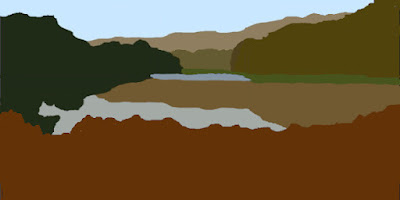
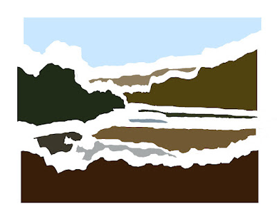
| Composition for Parkmill Pond (1:2) |
Lesson 34 of
Drawing and Painting the Landscape by
Philip Tyler is a the last lesson in the chapter on Composition. Phillip starts by pointing out:
Changing the format of your image can have a profound impact on your work.
He urges:
Don’t fall into the trap of complacency, stretch yourself, challenge how you approach the composition of the landscape.
He goes on to suggest a number of ways to train your compositional muscles, but doesn’t suggest a specific exercise. One of his first suggestions is to cut up an image so you can see all the positive and negative shapes because:
Often, good composition is a way of ensuring that each shape in your image is interesting and different, yet their overall effect is to create harmony through the opposition of different forces.
As an exercise I decided to break a photo into shapes and use them as the basis for a composition.
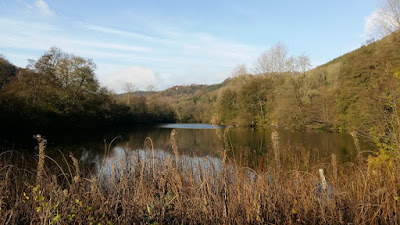 |
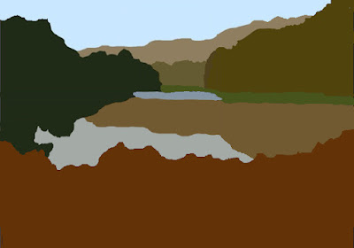
| Parkmill Pond, Woodchester Park |
This is Parkmill Pond in Woodchester Park.
 |
| Parkmill Pond (17 Shapes) |
My first attempt at identifying shapes, resulted in 17 shapes. The frilly foreground overlaps the objects behind it, dividing them into multiple small shapes. This is too many -
Tom Hoffman suggests a maximum of 10 shapes in the
Five-Value Monochrome Study from his
Watercolor-Painting.
 |
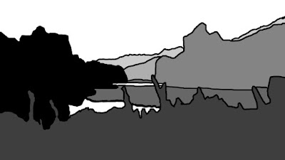
| Parkmill Pond (10 Shapes) |
Simplifying the foreground shape, reduces the overall shape count to 10. I plan to paint the foreground grasses overlapping the water, but these are adornments. The "bulk" of the foreground shape is the simpler object in this second picture.
 |
| Parkmill Pond - Separating the Shapes |
Separating the shapes shows they are interesting and varied, but they are predominately horizontal - they don't provide any contrast between horizontal and vertical. My plan is this tension will come from the rendering of the shapes. There will be lots of vertical lines to suggest the textures in the grasses, trees and reflections.
After identifying the shapes, the next step was to answer two compositional questions:
- What format to use for the picture?
- What is the focus / centre of interest?
Towards the end of the lesson, Phillip suggests:
By limiting yourself, maybe to a particular format or a particular use of media, you can begin to clarify your intention, to know what you want to say.
My initial format choice was 7 by 10 because I paint in water-based media (watercolour, acrylic and gouache) and I have two Arches watercolour blocks (a small and a large one) both with proportions of 7 by 10.
What is the centre of interest? There is a tower (“The Tower”) tucked away in the background trees, but this is a painting about the lake, so the patch of bright water towards the rear of the lake makes a good focal point.
I investigated a number of ways to resize the image to 7 by 10:
- Just squashing it all in
- Various zooms and crops
I also explored the position of the bright patch of water using a rule of thirds grid and a phi grid (see Drawing and Painting the Landscape – Rule of Thirds)
 |
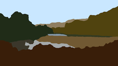
| Composition for Parkmill Pond (7:10) |
After a bit of tinkering, this is the result. I prefer the 1 by 2 version at the top of the post. There are some landscapes, probably those with mainly horizontal shapes, that I think look better in a more panoramic format. I've decided to limit myself to 3 formats for watercolour paintings: 7:10, 1:1 and 1:2. I chose 1:1 and 1:2 because they are simple to measure and they seem to work well for some subjects (see
Drawing and Painting the Landscape – Root Rectangles).


