Showing posts with label Geoff Kersey. Show all posts

Sunday, 13 January 2013

Silver Birch

Silver Birch
(Based on Geoff Kersey's Trees, Woodlands and Forests)
Watercolour on Paper
11cm x 16.5cm (4.25" x 6.5")

This is my version of another demonstration from Geoff Kersey's programmes about “Trees, Woodlands and Forests” on The Painting and Drawing Channel.

I have being using Geoff’s demonstrations from these programmes as warm ups at the start of each painting session (see Warming Up and Scratching and Scraping). They are ideal for this purpose because they are small vignettes rather than full-blown paintings.

The challenge in this picture is to make the tree trunk look solid and cylindrical. It is an exercise in modelling. The solution is to decide where the sun is relative to the tree. In this picture, it is to the left. The side of the tree facing towards the sun is practically white and the trunk becomes darker as it curves away from the direct sunlight.

The background is a simple wet in to wet wash of different greens. When the background was dry, Geoff wet the whole of the tree trunk with clean water. He added a pale purple mixture to the middle and right hand side of the trunk. While this was wet, he added some blotches of browny orange to the right of the middle and some dark brown at the extreme right hand edge. These colours merge and mingle to give a gradual darkening from left to right, which reads as the change from light to shadow on a cylinder. (I should have put a shadow on the ground to emphasise the direction of the sun).

Geoff finished the picture by adding the distinctive black rings to the bark of the tree. These curved lines help to accentuate the cylindrical effect. It is important to remember that the marks below eyelevel appear to curve downwards from the edge and the marks above eyelevel appear to curve up.

Cross-sections of a Cylinder

Before I started the Natural Way to Draw, I had to think about this sort of thing. Now I have done so much modelled drawing, it is second nature.

Geoff used dry brush marks to indicate the rings. He let the brush skate on the rough paper to create broken marks. This is something I didn’t get right in this picture and which I’ve been practicing since.

Sunday, 2 December 2012

Scratching and Scraping

Winter Twigs
(Based on Geoff Kersey's Trees, Woodlands and Forests)
Watercolour on Paper
18cm x 15cm (7" x 6")

This is my interpretation of another demonstration from Geoff Kersey's third programme about “Trees, Woodlands and Forests” on The Painting and Drawing Channel.

In this demonstration, Geoff painted a dark background and then used a craft knife to scrape the branches and twigs out of the wet paint. He finished by continuing the branches on the white paper.

Timing is everything with this technique. If you scrape too early, the paint fills up the line. If you leave it too late the paint dries and will not scrape out in the same way.

Geoff used the craft knife to create a variety of line thicknesses, but I found it easier to use a pointed piece of plastic to scrape out the thicker lines. This is a tool recommended for the technique by Ann Blockley in her book “Watercolour Textures”.

Ann differentiates between the techniques of scraping (removing wet paint) and scratching (removing dry paint). Scraping wet paint creates the types of marks shown in the picture on this post.  Scratching off dry paint leaves a bright white highlight and requires a delicate touch to avoid gouging chunks out of the paper.

Sunday, 25 November 2012

Warming Up

Autumn Glow
(Based on Geoff Kersey's Trees, Woodlands and Forests)
Watercolour on Paper
18cm x 15cm (7" x 6")

This is my interpretation of a demonstration by Geoff Kersey. It is from his third programme on “Trees, Woodlands and Forests” from The Painting and Drawing Chanel.

I tend to paint something from the Painting and Drawing channel as a warm up at the start of each painting session. It gives me a chance to get into a painting frame of mind and to muster my eye-hand coordination before working on one of my own paintings. It is also a good way to experiment and learn about other people's techniques.

The background in this picture is painted wet in wet. Geoff started by wetting the paper and then adding a yellow gold, a red gold and a purple. The colours merge into each other to create gentle transitions and a soft golden glow.

After the background was dry, Geoff used a dry brush technique to create the broken effect of the foliage. He applied stronger mixtures of the same colours (and an autumnal green) using the side of dry brush to skate along the surface of the rough paper.

He used a similar technique to create the broken texture on the trunk and branches to give the impression there are leaves in front of them. The final step was to add some opaque yellow leaves to increase this effect.

I’ve had a productive day - I painted the picture on this post, finished painting my Christmas cards and did some more work on the painting of Coverack Harbour (see Preparations for Coverack Harbour).

Sunday, 22 July 2012

Sky Washes 8, 9 and 10


Sky Wash 10
(Improve Your Skies in Watercolour - Demonstration 3)
Watercolour on Paper
25.5cm x 15cm (10" x 6")

These pictures are based on the demonstrations from Geoff Kersey's Improve Your Skies In Watercolour programme on The Painting and Drawing Channel.

The first two demonstrations (the second and third pictures on the post) are wet into wet skies.

Sky Wash 8
(Improve Your Skies in Watercolour - Demonstration 1)
Watercolour on Paper
25.5cm x 18.5cm (10" x 7.25")

I found it difficult to achieve results that look anything like the demonstrations. Geoff makes them look easy, but they are not. He suggests these skies need repeated practice and he is right.

The most difficult aspects to gauge are the wetness of the paper and the dilution of the paint. These factors govern how much the paint disperses and the strength of the resulting colours.

In both of these exercises I used paint that was too strong and added it while the paper was too wet.

I am not sure I would use either of these skies in a painting (even if I painted them perfectly), but trying to replicate them is a good way to practice wet into wet technique.

Sky Wash 9
(Improve Your Skies in Watercolour - Demonstration 2)
Watercolour on Paper
25.5cm x 17.5cm (10" x 6.75")

The third demonstration (the picture at the top of the post) is my favourite.

Geoff started by wetting the paper and leaving some dry patches as starting points for the clouds. He added the blue and blotted out some more cloud shapes with a paper towel. He then let the sky dry before adding the grey cloud shadows.

An important part of this sky (and most realistic skies) is that it appears lighter towards the horizon. One of the techniques Geoff uses to achieve this is to paint the top part of the sky when his brush is full of paint and the lower parts as it runs out.

Sunday, 24 June 2012

Sky Wash 7


Sky Wash 7
(Geoff Kersey's Winter Barn)
Watercolour on Paper
25.5cm x 16.5cm (10" x 6.5")

Geoff Kersey is a master of the wet in to wet background. He uses the technique to create soft background shapes with colours that gently blend into each other. It is particularly effective for distant trees.

This is my version of the Winter Barn from his programme on the Painting and Drawing Channel.

Geoff wet the paper down to the barn and the horizon line. He painted the sky using the side of a large brush. He used angled strokes and made the sky darker towards the top and lighter towards the horizon to give a feeling of perspective.

While the sky was still wet, he applied a dark brown mix to create the soft edged shapes of the background trees. He spiced this up with a few warmer orangey brown patches and then finished by adding the fir trees and dark green bushes to the left of the barn. He did all this before the sky had time to dry.

Previously, I have had problems with this type of background. I have tended to add the trees while the sky is still too wet. The result is the paint spreads wildly and creates shapes that look more like horrible clouds than trees.

This time I was more careful and paid attention to Geoff’s advice. The crucial moment to add the trees is just as the shine starts to leave the wet paper. When you look for this, it is quite easy to spot. The other important factor is the paint you are adding has to be less watery than the paint already on the paper. This gives the desired effect - soft edged trees that don't crawl off the paper.

Sunday, 22 January 2012

Sky Wash 1

Sky Wash 1
(View from Gunthorpe Bridge)

Watercolour on Paper
28cm x 19cm (11" x 7.5")

Last year, I was inspired by the blog One Hundred Washes to start each painting session by experimenting with a watercolour wash. My intention was to loosen up before stating work on the main painting and to learn more about working with watercolour.

Some of the results were good - the picture on Happy Christmas 2011 started life as one of these experiments, but overall, I realised I have a lot to learn about painting with watercolour.

I've decided to go back to basics and practice some simple sky washes. I have picked 7 or 8 different washes from John Lovett’s Splashing Paint DVD and from programmes on the Painting and Drawing Channel.

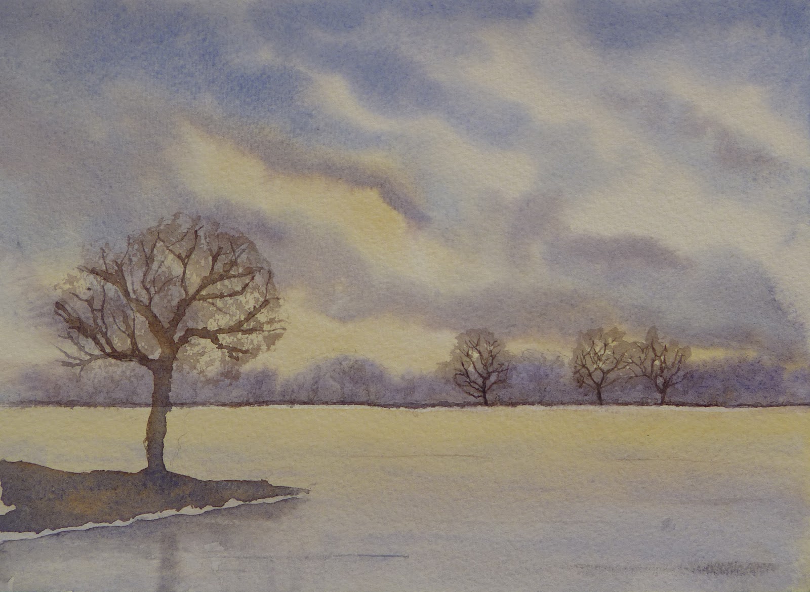
This first sky is from Geoff Kersey's Top Tips for Watercolour Artists. The sky is painted using two wet in wet washes (wet in wet means paint is applied to paper that is already wet with water or paint. The paint spreads out and creates soft edges, adjacent colours merge into each other and the edges of the wash merge into the background).

The first wash is a pink wash, which I applied to the horizon and faded out toward the top of the paper. After this had dried, I gently rewet the paper (so as not to disturb the pink wash) and added areas of blue and grey, which merged and mixed together on the page.

After the sky was dry, I decided to  use it as the backdrop for a view of the Trent looking west from Gunthorpe Bridge. I wet the river and the area around the horizon before painting the trees. This gives the reflections and the trees in the distance nice soft edges.

At some point, I will try this again and leave more white in the sky. I will also think more about the foreground I am going to add. This time I left myself with a distinct horizon line at the bottom of the sky, which I didn't need and had to use as the bank of the Trent.