.jpg) |
| Snowy Christmas Tree Watercolour on Paper 26cm x 15cm (10.25" x 6") |
Welcome to my blog. Initially, it recorded my progress as I followed the exercises in The Natural Way to Draw by Kimon Nicolaides. Now, it is a journal of my continuing endeavour to learn to draw.
.jpg) |
| Snowy Christmas Tree Watercolour on Paper 26cm x 15cm (10.25" x 6") |
.jpg) |
| Moorings on the Dart Monochrome Study - Drawing and Painting the Landscape Watercolour on Paper 16.5cm x 24cm (6.5" x 9.5") |
Watercolour is the most difficult painting medium to use well as it is unforgiving, allowing you little room for error.
He also points out:
It is a good idea to create a crisp linear drawing to establish the placement of the key elements of the landscape.
This advice made me realise I’ve let my drawing practice slip and I need to do something about it.
Lesson 35 is a monochrome study in watercolour. Phillip recommends monochromes as a way to get started with watercolour while avoiding the additional complexity of having to think about colour.
The exercise is similar to Lesson 18 Wash Media, but in watercolour instead of ink. It provided an opportunity to experiment with the composition and approach for two pictures I am planning to paint. In both of them, I overdid the masking fluid and applied it too clumsily – lesson learnt.
The study of the boats on the Dart helped me to work out how to build up the layers of the landscape and how to paint the distant background..
.jpg) | ||
| Tree Tunnel - Westonbirt Monochrome Study - Drawing and Painting the Landscape Watercolour on Paper 16.5cm x 24cm (6.5" x 9.5") |
 |
| Aged Fencing Watercolour on Paper 24.5cm x 15.5cm (9.75" x 6") |
You can see the preparation for this and the first step of the paining in Thumbnail Sketches and A Fuzzy Background.
 |
| Decaying Fencing |
 |
| Aged Fencing - A Fuzzy Background - 26.5cm x 19cm (10.5" x 7.5") Watercolour on Paper |
This type of background is usually painted wet-on-wet. The challenge is if you try to paint around the foreground shapes, it is difficult to create a cohesive backdrop. Some people can do this, but I’ve ended up with sections that look like they come from different paintings.
A popular solution is to mask the foreground shapes so you can paint over them. Recently, Steve Mitchell (the Mind of Watercolor) demonstrated how he does this with a combination of masking tape and masking fluid (see https://www.youtube.com/watch?v=NTpTZUZ_PA8&t=295s)
The technique worked well for Steve, so I gave it a go. I scaled up the thumbnail from the top of Thumbnail Sketches, masked off the stile, fence and some foreground foliage, so it looked like this.
 |
| Aged Fencing - All Masked Up - 26.5cm x 19cm (10.5" x 7.5") |
 |
| Aged Fencing - Preliminary Thumbnail Sketch - 15cm x 10cm (6" x 4") Ink and Pencil on Paper Stillman & Birn Alpha Series Sketchbook |
I used this approach recently while preparing for the Aged Fencing topic in Creating Textures in Pen & Ink with Watercolor by Claudia Nice.
Over the summer, I collected a load of reference photos while out walking with Elaine and Doris.
 |
| Aged Fencing |
 |
| Aged Fencing - Preliminary Thumbnail Sketch - 7.5cm x 5cm (3" x 2") Ink on Paper Stillman & Birn Alpha Series Sketchbook |
I drew the slightly larger version at the top of the page to finalize the composition and to think about the tones in the picture. I will do a couple of simple colour studies before starting to paint.
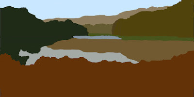 |
| Composition for Parkmill Pond (1:2) |
Changing the format of your image can have a profound impact on your work.
He urges:
Don’t fall into the trap of complacency, stretch yourself, challenge how you approach the composition of the landscape.
He goes on to suggest a number of ways to train your compositional muscles, but doesn’t suggest a specific exercise. One of his first suggestions is to cut up an image so you can see all the positive and negative shapes because:
Often, good composition is a way of ensuring that each shape in your image is interesting and different, yet their overall effect is to create harmony through the opposition of different forces.
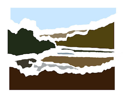
As an exercise I decided to break a photo into shapes and use them as the basis for a composition.
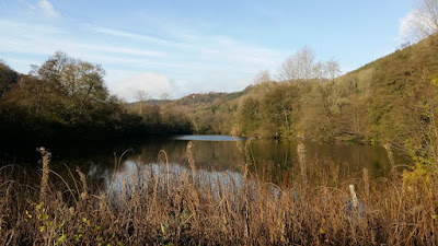 |
| Parkmill Pond, Woodchester Park |
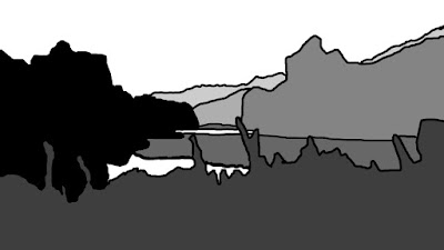 |
| Parkmill Pond (17 Shapes) |
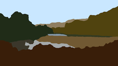 |
| Parkmill Pond (10 Shapes) |
 |
| Parkmill Pond - Separating the Shapes |
After identifying the shapes, the next step was to answer two compositional questions:
Towards the end of the lesson, Phillip suggests:
By limiting yourself, maybe to a particular format or a particular use of media, you can begin to clarify your intention, to know what you want to say.
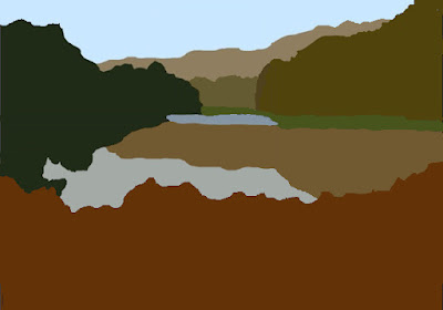
My initial format choice was 7 by 10 because I paint in water-based media (watercolour, acrylic and gouache) and I have two Arches watercolour blocks (a small and a large one) both with proportions of 7 by 10.
What is the centre of interest? There is a tower (“The Tower”) tucked away in the background trees, but this is a painting about the lake, so the patch of bright water towards the rear of the lake makes a good focal point.
I investigated a number of ways to resize the image to 7 by 10:
I also explored the position of the bright patch of water using a rule of thirds grid and a phi grid (see Drawing and Painting the Landscape – Rule of Thirds)
 |
| Composition for Parkmill Pond (7:10) |
 |
| Something in the Woodshed Watercolour on Paper 16.5cm x 24cm (6.5" x 9.5") |
You probably imagine the world is full of slowly decaying painted wood. I did, until I started looking for some to paint - then it all disappeared. I struggled until Elaine, Mum, Doris and I dropped into The Canteen for lunch. There were some great examples in their courtyard, but finding a subject was only the first challenge. This was tricky. It gave me a lot to think about.
 |
| Farm Cottages - Latest Thumbnail - 7cm x 10cm (2.75" x 4") Compositional Principles - Drawing and Painting the Landscape Ink and Watercolour on Paper Stillman & Birn Alpha Series Sketchbook |
Phillip sneaks in a couple of extras. Stillness might be accepted unchallenged, but Photo Manipulation isn’t getting on to a list published in 1857.
The exercise for the lesson involves taking as many different photos of a subject as possible and then making a series of compositional studies.
I selected some local cottages and took a load of photos. My initial experiments concerned the placement of the major horizontal divisions. I tried a few different arrangements before settling on the first one; which is often the way. The next step was a small thumbnail to explore where the buildings fitted into this schema and some initial ideas about tone.
 |
| Farm Cottages - Initial Thumbnails - Each 3.5cm x 5cm (1.5" x 2") Compositional Principles - Drawing and Painting the Landscape Ink on Paper Stillman & Birn Alpha Series Sketchbook |
Then I moved on to slightly bigger thumbnails to investigate the drawing, tones and colours.
 |
| Farm Cottages - Thumbnails - Each 7cm x 10cm (2.75" x 4") Compositional Principles - Drawing and Painting the Landscape Ink, Watercolour and Graphite on Paper Stillman & Birn Alpha Series Sketchbook |
 | |
| Farm Cottages - Off-centre Thumbnails - Each 3.5cm x 5cm (1.5" x 2") Compositional Principles - Drawing and Painting the Landscape Ink on Paper Stillman & Birn Alpha Series Sketchbook |
The drawing at the top of the post investigates colour and tone for the repositioned buildings. I also plan to create some texture in the foreground and add some small flashes of bold colour in the focal point amongst the buildings.
 |
| One of Many Lamps Watercolour on Paper 24.5cm x 15.5cm (9.75" x 6") |
Claudia observes that polished wood has similarities with shiny metal; it has strong value patterns and the possibility of reflected colours.
Our house came with a separate electric circuit for lamps, so we have a quite a few, most of them with lampshades made by Elaine.
The most difficult decision with the painting was what to do with the pattern in the lampshade. I decided it was best not to try too hard.
 |
| Wooden Easel Watercolour on Paper 24.5cm x 15.5cm (9.75" x 6") |
Claudia recommends drawing the grain with a pen or a dry brush. Drawing the pattern in ink proved more difficult than I expected. My initial subject was a plate carved from a piece of Ash. This has a very delicate grain pattern that I couldn’t replicate. I couldn’t match the thinness of the lines or the lightness and variety of the colours. I am probably blaming my tools, but I think you need a collection of technical pens to draw accurate grain studies.
Lesson learnt - I chose the top of Dad's desk easel as my second subject. The grain pattern on this is less subtle and lent itself to be drawn with a brush rather than a pen. The main challenge was making the perspective believable - I had to draw it 5 or 6 times before it looked right.
 |
| Too Hot for Doris Ink and Watercolour Stillman & Birn Alpha Series Sketchbook 8.9cm x 14.0cm (3.5" x 5.5") |
 |
| Courtyard Corner Ink and Watercolour Stillman & Birn Alpha Series Sketchbook 14.0cm x 8.9cm (5.5" x 3.5") |
 |
| Scots Pines Ink Stillman & Birn Alpha Series Sketchbook 14.0cm x 8.9cm (5.5" x 3.5") |
 |
| Harder than it Looked Graphite Pencil Stillman & Birn Alpha Series Sketchbook 14.0cm x 8.9cm (5.5" x 3.5") |
 |
| St Ives Harbour - Buildings - Rule of Thirds |
 |
| Rule of Thirds Grid |
 |
| Phi Grid |
 |
| St Ives Harbour - Boats - Rule of Thirds |
 |
| Sunrise Watercolour on Paper 12cm x 16.5cm (4.75" x 6.5") |
Claudia observes
Traditionally the sunrise has been thought of as pastel and delicate. In truth the sunrise can rival the sunset in colouration.
This matches my experiences – I’ve seen some spectacular sunrises – but not very many - I am usually asleep. I should make more effort to get up to draw and paint in the early morning. Sunrise is an easier time to draw and paint than sunset because at sunset you are racing to finish before it gets dark - at sunrise you can always finish off from memory as the sky gets lighter.
This is another sky based on a Javid Tabatabaei demonstration - How to paint sky in watercolor painting. This one was a learning experience, this picture is my twelfth attempt at the sky and there is still room for improvement. It is critical to have the right relative intensity of yellow and blue (and the right pigments), so you don’t end up with green. Then there is the timing of the different layers – waiting until the sky has just the right amount of wetness before adding the clouds. Javid’s clouds look much more natural than mine – which is something for me to work on.
 |
| Green Pepper Ink and Watercolour Stillman & Birn Alpha Series Sketchbook 8.9cm x 14.0cm (3.5" x 5.5") |
 |
| Nibbles Ink and Watercolour Stillman & Birn Alpha Series Sketchbook 8.9cm x 14.0cm (3.5" x 5.5") |
 |
| Mmm Succulent Ink and Watercolour Stillman & Birn Alpha Series Sketchbook 14.0cm x 8.9cm (5.5" x 3.5") |
 |
| Cheeky Gin Ink and Watercolour Stillman & Birn Alpha Series Sketchbook 14.0cm x 8.9cm (5.5" x 3.5") |
 |
| How Big? Ink and Watercolour Stillman & Birn Alpha Series Sketchbook 8.9cm x 14.0cm (3.5" x 5.5") |
 |
| Old Technology Ink and Watercolour Stillman & Birn Alpha Series Sketchbook 14.0cm x 8.9cm (5.5" x 3.5") |
 |
| St Ives Harbour - Root-4 Rectangle |
Wikipedia defines a root rectangle as
A rectangle in which the ratio of the longer side to the shorter is the square root of an integer, such as √2, √3, etc..
Phillip explains how to draw a root-2 rectangle (√2 rectangle) by starting with a square, measuring the diagonal and extending two opposite sides to be the length of the diagonal.
 |
| Root-2 Rectangle |
You can then draw a root-3 rectangle by measuring the diagonal of the root-2 rectangle and extending the long sides to be the length of this diagonal.
 |
| Root-3 Rectangle |
One of the interesting properties of root rectangles is:
If you divide a root-N rectangle along its long side into N equal subdivisions, all the little rectangles are also root-N rectangles, for example, if you divide a root-5 rectangle into 5 equal slices, all the little rectangles are also root-5 rectangles
 |
| Root-5 Rectangle with Subdivisions |
Philp points out the paper sizes in the A series (A0, A1, A2, A3, A4, etc) are all root-2 rectangles. If you divide a root-2 rectangle in half, both halves are also root-2 rectangles. Cut a piece of A0 in half and you have 2 pieces of A1, cut a piece of A1 in half and you have 2 pieces of A2, and so on.
 |
| A Paper |
 |
| St Ives Harbour - Source Photo |
 |
| St Ives Harbour - Square |
 |
| Javid's Sunset Watercolour on Paper 12cm x 16.5cm (4.75" x 6.5") |
Once again I cross referenced Claudia’s advice with a section in James Gurney’s Color and Light (A Guide for the Realist Painter). I also watched a YouTube video about painting sunsets by Javid Tabatabaei - How to paint sunset and landscape in watercolor. The picture at the top of the post is my version of Javid’s painting. I watched his video in short segments in one room and ran in to another to work on my painting. Elaine asked me to turn off the sound. If you watch the video, you will understand why.
 |
| West Pier Sunset Watercolour on Paper 12cm x 16.5cm (4.75" x 6.5") |
 |
| Porth Mellon Sunset Watercolour on Paper 12cm x 16.5cm (4.75" x 6.5") |
 |
| Divine Mousehole Harbour |
The Divine Proportion has many pseudonyms: the golden ratio, the golden section, the golden mean, the golden proportion, the golden cut, the golden number, the divine section, phi, etc, etc.
If you want to learn more, Wikipedia has an article (see Golden ratio).
Philip defines the divine proportion:
It is the division of a line into two parts, where the small part relates to the bigger as the bigger part relates to the whole.
This is what it looks like - and some equations for good measure
 |
| The Divine Proportion |
 |
| Drawing a Golden Rectangle |
The interesting thing is, the rectangle we add on is also a golden rectangle because golden rectangles exhibit a form of self-similarity.
If we start off with a golden rectangle, and add a square to its long side, we end up with another golden rectangle
 |
| Another Golden Rectangle |
Add another square to its long side, we end up with another golden rectangle
 |
| And Another |
.jpg) |
| Golden Spiral (Approximate) |
Look familiar? (see Drawing and Painting the Landscape - What is the proportion of the rectangle?)
Philip suggests analysing some of your favourite landscapes to see if key parts of the composition conform to the divine proportion.
I studied quite a few pictures - new and old. I didn’t find a lot of correlations. One of the panels was almost a golden rectangle.
 |
| The Beach at Trouville (with a Golden Rectangle) Eugène Boudin From Wikimedia Commons |
 |
| Impression, Sunrise (with a Phi Grid) Claude Monet From Wikimedia Commons |
 |
| Mousehole Harbour |