 |
| Fibonacci Spiral |
Lesson 29 is the first lesson in the chapter on Composition in Drawing and Painting the Landscape by Philip Tyler.
Philip starts the chapter by defining composition:
Composition is the art of arranging the various elements of the image into a whole, a balancing act with the shapes, colour, tonalities and mark making to create a visually interesting, exciting landscape.
Most of the lessons in the chapter are about mathematical concepts that can help with composition, but lesson 29 includes the important message:
Mathematics underpins many things but one shouldn’t be bogged down by it.
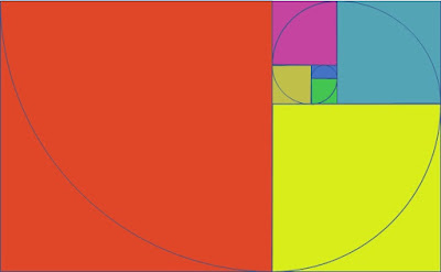
The lesson starts by describing the golden logarithmic spiral. Wikipedia has a good explanation with a nice animation (Wikipedia - Golden spiral).
Philip explains a technique for drawing a Fibonacci spiral - which is an approximation of the golden spiral. He suggests using a pencil and compass to draw the spiral - which I found impossible to do accurately - the diagrams in this post are drawn in PowerPoint. The technique results in an approximation of a spiral. We draw a sequence of circular arcs. As the resulting shape transitions from one arc to another, the distance of the curve from the centre jumps and the centre moves. In a true spiral the centre stays in the same place and the distance to the centre changes continuously and smoothly.
Philip points out the ratios of a lot of off the shelf canvases: 1 x 1, 1 x 2, 2 x 3, 3 x 5 and 5 x 8 are based on adjacent numbers in the Fibonacci sequence (0, 1, 1, 2, 3, 5, 8, 13, 21, 34, 65, 89, 144, 233, …) and the rectangles appear when drawing a Fibonacci spiral (the 5 x 8 rectangle is highlighted in the second diagram).
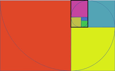 |
| Fibonacci Spiral - 5 x 8 Rectangle |
This leads into an exercise to explore alternative compositions for a scene by drawing it multiple times altering the format, scale, colour and placement. (I think Philip missed tone from this list).
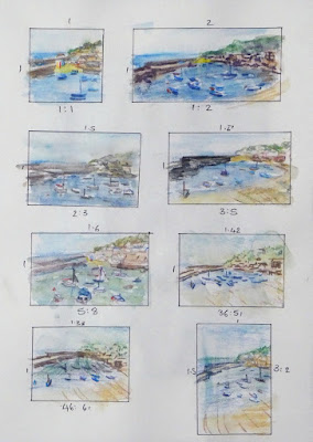 |
| Mousehole - Thumbnails Watercolour Pencil Stillman & Birn Alpha Series Sketchbook 30.5cm x 21.5cm (12" x 8.5") |
I made some mistakes with this exercise.
- The scene is too pretty and too detailed. It would be better to use an image that is simpler and less obviously attractive – something that needs some work to improve it
- The rectangles are too repetitive. I drew rectangles based on the ratios of watercolour paper blocks. It would be better to use fewer more varied rectangles
- Watercolour pencil is not the right medium
- The most fundamental mistake was not doing some monochrome tonal studies first
This was still a useful exercise. I’ve learnt a couple of things that will help if I paint the scene.
My favourite of the thumbnails is top right. I prefer this to the one directly below it which is closer to the proportions of the original photo – this challenges my assumption that I don’t need to work on the size and placement of the scene - maybe I can improve things by zooming in.
Most importantly I realise the importance of creating a pleasing tonal pattern for this scene and my next step will be to draw some simpler monochrome thumbnails using 4 or 5 tones.
No comments:
Post a Comment