
Merry Christmas and a Happy New Year
 |
| Brixham Boat Watercolour and Conté Moleskine A4 Watercolour Album 297mm x 210mm (11.69" x 8.27") |
 |
| Waiting for the Dhoni Watercolour on Paper 190mm x 280mm (11" x 5.5") |
 |
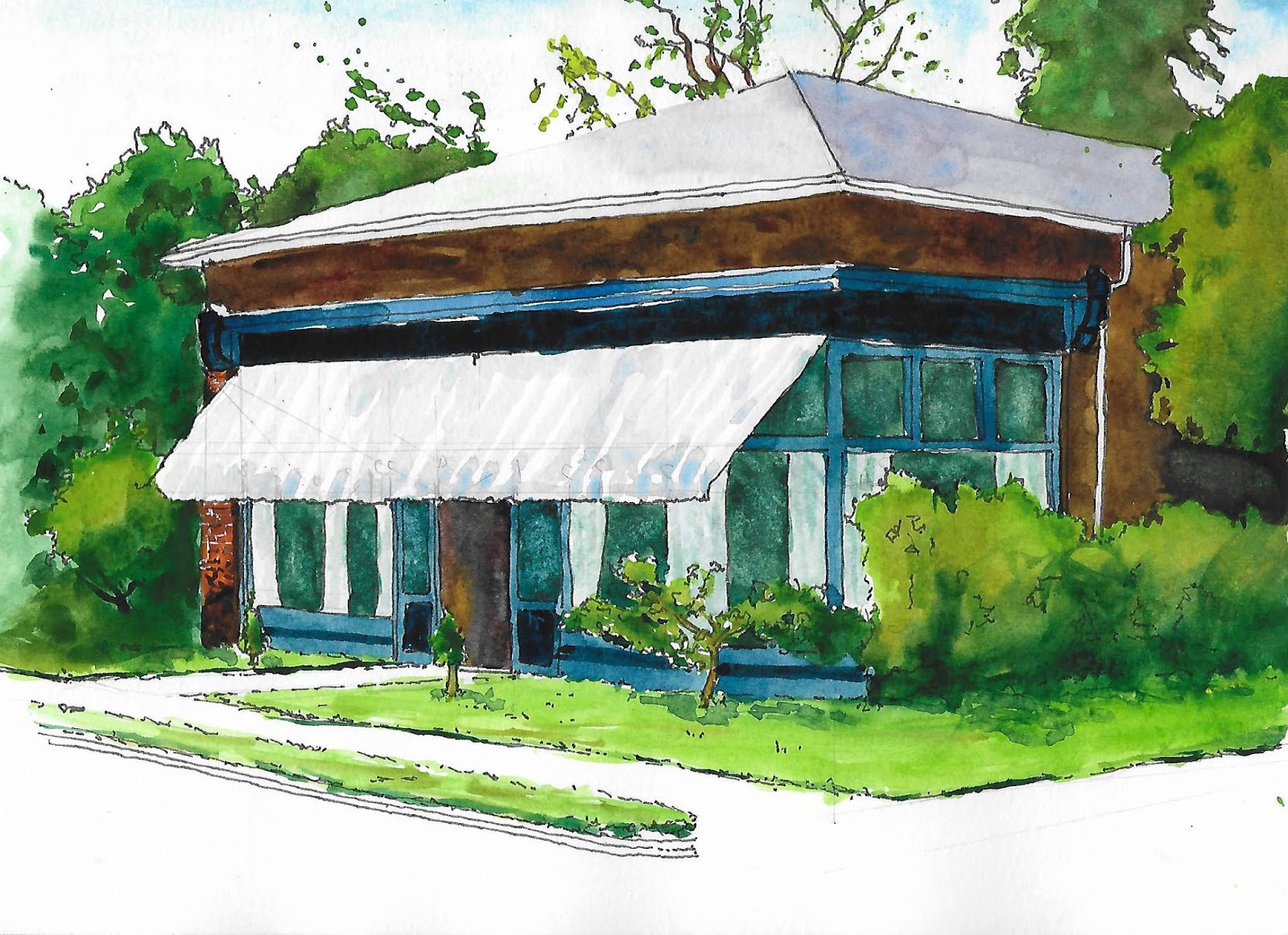
| Small, Far Away |
 |
| Sea Mist Rising Ink on Paper 20.5cm x 20.5cm (8" x 8") |
 |
| Finding a Structure Expressive Drawing - Chapter 10 - Build 2 Acrylic on Paper 59.4cm x 84.1cm (23.4" x 33.1") |
Foundational structure occurs when a series of shapes join to cover (or engage) the entire drawing space, holding the space together in rock-solid fashion.He calls foundational structure the drawing beneath the drawing. It can be obvious or implied and can supply a drawing with clarity and coherency.
 |
| Developing a Grid Expressive Drawing - Chapter 10 - Build 1 Acrylic on Paper 59.4cm x 84.1cm (23.4" x 33.1") |
 |
| Playing with a Grid Expressive Drawing - Chapter 10 - Play 1 Collage 20cm x 20cm (8" x 8") |
 |
| Playing with a Grid Expressive Drawing - Chapter 10 - Play 1 Graphite Pencil on Paper 20cm x 20cm (8" x 8") |
 |
| Starting with a Grid Expressive Drawing - Chapter 10 - Build 1 Charcoal and Wax Crayon on Paper 59.4cm x 84.1cm (23.4" x 33.1") |
 |
| Planned Structure Expressive Drawing - Chapter 10 - Build 2 Acrylic on Paper 84.1cm x 59.4cm (33.1" x 23.4") |
 |
| Finding a Structure - Tidied Expressive Drawing - Chapter 10 - Build 2 Digital from Acrylic on Paper |
 |
| Coaley Peak Constructing Space - Drawing and Painting the Landscape July 2019 Watercolour Stillman & Birn Alpha Series Sketchbook 30.5cm x 12.5cm (12" x 8.5") |
 |
| Constructing Space 3 Constructing Space - Drawing and Painting the Landscape July 2019 Ink Stillman & Birn Alpha Series Sketchbook 21.5cm x 18.5cm (8.5" x 7.25") |
 |
| Constructing Space 5 Constructing Space - Drawing and Painting the Landscape July 2019 Ink Stillman & Birn Alpha Series Sketchbook 21.5cm x 18.5cm (8.5" x 7.25") |
 |
| Perspective Notes 1 Constructing Space - Drawing and Painting the Landscape September 2019 Ink Stillman & Birn Alpha Series Sketchbook 18.5cm x 21.5cm (7.25" x 8.5") |
 |
| The Queen and Albert Watercolour and Ink Moleskine A4 Watercolour Album 297mm x 210mm (11.69" x 8.27") |
 |
| Merry Fisher Watercolour and Ink Moleskine A4 Watercolour Album 297mm x 210mm (11.69" x 8.27") |
 |
| Master Palette Watercolour and Ink Moleskine A4 Watercolour Album 297mm x 210mm (11.69" x 8.27") |
 |
| Colour and Value Studies Watercolour, Graphite Pencil and Ink Moleskine A4 Watercolour Album 297mm x 210mm (11.69" x 8.27") |
 |
| Liz's Cakes Watercolour and Ink Moleskine A4 Watercolour Album 297mm x 210mm (11.69" x 8.27") |
 |
| Summer Collection 2019 (and 2018 and 2017) Watercolour and Ink Moleskine A4 Watercolour Album 297mm x 210mm (11.69" x 8.27") |
 |
| Books in Perspective Simple Perspective - Drawing and Painting the Landscape June 2019 Ink and Watercolour Stillman & Birn Alpha Series Sketchbook 18.5cm x 21.5cm (7.25" x 8.5") |
Linear perspective gives you an understanding of how objects behave in space. It is not a set of hard and fast rules that have to be adhered to, but a little bit of knowledge will go a long way and will certainly help you create a convincing depth in your landscapes, and help clarify how man-made objects, like buildings, recede and converge, making them seem more three-dimensional.
 |
| Single Point Perspective Simple Perspective - Drawing and Painting the Landscape June 2019 Graphpite Pencil Stillman & Birn Alpha Series Sketchbook 21.5cm x 18.5cm (8.5" x 7.25") |

 |
| Contoured Landscape - Drawing and Painting the Landscape May 2019 Graphite pencil, watercolour pencil, conte stick on brown paper 24cm x 13.5cm (9.5" x 5.25") |
 |
| Enjoying the Weather Ink and Watercolour on Paper 23cm x 29.5cm (9" x 11.5") |
 |
| Salty the Sea Dog Ink on Paper 21cm x 29.7cm (8.3" x 11.7") |
 |
| Walking the Dog Expressive Drawing - Chapter 8 - Play 1 Ink on Rice Paper 40.5cm x 20.5cm (16" x 8") |
 |
| Related Drawings - Asymmetrical Expressive Drawing - Chapter 8 - Build 1 Graphite and Charcoal on Paper 59.4cm x 84.1cm (23.4" x 33.1") |
 |
| Related Drawings - Symmetrical Expressive Drawing - Chapter 8 - Build 1 Graphite and Charcoal on Paper 59.4cm x 84.1cm (23.4" x 33.1") |
 |
Flying a Kite Expressive Drawing - Chapter 8 - Play 1 Ink on Rice Paper 40.5cm x 20.5cm (16" x 8") |
 |
| View Towards Gatcombe Farm Measured Drawing - Drawing and Painting the Landscape April 2019 Ink Stillman & Birn Alpha Series Sketchbook 21.5cm x 18.5cm (8.5" x 7.25") |
 |
| Edge of the Common Measured Drawing - Drawing and Painting the Landscape April 2019 Ink Stillman & Birn Alpha Series Sketchbook 16.5cm x 12.5.5cm (6.5" x 5") |
... the objects in the landscape become a series of shapes that are defined largely by an unwavering line. There is a real confidence to the line, finding the rhythms and repetitions of motif within the landscape.
 |
Otter Estuary - Decorative Line Measured Drawing - Drawing and Painting the Landscape April 2019 Ink on Paper 19.5cm x 15cm (7.5" x 6") |
 |
| From the Bench on Fewster Road Measured Drawing - Drawing and Painting the Landscape April 2019 Ink Stillman & Birn Alpha Series Sketchbook 12.5cm x 16.5cm (5" x 6.5") |
 |
| Walnuts Are Brain Food Macro Drawing Keys to Drawing with Imagination Graphite Pencil on Paper Stillman & Birn Alpha Series Sketchbook 14.0cm x 20.3cm (5.5" x 8.0") |
Enlarging an object transforms it. It reveals a level of structure and detail that is otherwise invisible to us.This was a challenge because my magnifying glass is not good. It provides a small distorted field of view with minimal magnification – frankly, I would be better off squinting at the subject. I am also struggling to get back into the swing of modelling with pencil (see Keys to Drawing with Imagination – Creating Destruction). I’m persevering because this is a core skill I want to cultivate.
 |
| Brown Bag Lunch Creating Destruction Keys to Drawing with Imagination Graphite Pencil on Paper Stillman & Birn Alpha Series Sketchbook 14.0cm x 20.3cm (5.5" x 8.0") |
 |
| Coaley Peak Partial Peek - Drawing and Painting the Landscape Ink and Gouache Stillman & Birn Alpha Series Sketchbook 30.5cm x 21.5cm (12" x 8.5") |
 |
| Clouds in the Valley and Ivy Clad Oak Trees Partial Peek - Drawing and Painting the Landscape Ink and Gouache Stillman & Birn Alpha Series Sketchbook 21.5cm x 30.5cm (8.5" x 12") |
Draw the foliage loosely, almost blind without worrying if the tree gets out of control a little.I think blind drawing works best when a descriptive edge is more important than pinpoint accuracy.
 |
| Otter Estuary and Mon & Brec Partial Peek - Drawing and Painting the Landscape Ink and Gouache Stillman & Birn Alpha Series Sketchbook 21.5cm x 30.5cm (8.5" x 12") |
 |
| Rhythmic Drawing with Several Motifs Expressive Drawing - Chapter 7 - Build 3 Digital |
 |
| Rhythmic Repetition Expressive Drawing - Chapter 7 - Play 1 Graphite on Paper 84.1cm x 20cm (33.1" x 8") |
 |
| Horizontal Rhythm of a Vertical Line Bar Motif Expressive Drawing - Chapter 7 - Build 1 Acrylic on Paper 84.1cm x 59.4cm (33.1" x 23.4") |
 |
| Rhythmic Drawing with Several Motifs Expressive Drawing - Chapter 7 - Build 3 Charcoal on Paper 59.4cm x 84.1cm (23.4" x 33.1") |
 |
| Otter Estuary Blind Drawing Drawing and Painting the Landscape February 2019 Ink Stillman & Birn Alpha Series Sketchbook 20cm x 11cm (8" x 4.25") |
Imagine that your pencil point is touching the model instead of the paper. Without taking your eyes off the model, wait until you are convinced that the pencil is touching that point on the model upon which your eyes are fastened. Then move your eyes slowly along the contour of the model and move the pencil slowly along the paper. As you do this, keep the conviction that the pencil point is actually touching the contour. Be guided more by the sense of touch than by sight.
 |
| Langdale Hills Blind Drawing Drawing and Painting the Landscape February 2019 Graphite Pencil Stillman & Birn Alpha Series Sketchbook 29cm x 15cm (11.5" x 6") |
To find a way of getting into the landscape to discover how it might be drawn.I drew a few blind drawings from photographs and one in situ on Selsley common. The common is on the edge of the Cotswolds with views over the Severn estuary stretching as far as the Brecon Beacons and the Malvern Hills. It is almost always blustery on the common, probably because the valley acts like a wind tunnel. Elaine and I were there walking with Doris on a particularly windy day. I took a few minutes to sit on a bench and draw the view of Pen Hill. The exercise reached a natural conclusion when the wind abruptly ripped the sketchbook out of my hands and deposited it a few feet away.
 |
| Pen Hill from Selsley Common Blind Drawing Drawing and Painting the Landscape February 2019 Graphite Pencil Stillman & Birn Alpha Series Sketchbook 20cm x 18cm (8" x 7") |
 |
| Happy Valentine’s Day Elaine |
 |
| Walking the Mon & Brec Canal (May 2018) Revealed Landscape Drawing and Painting the Landscape January 2019 Graphite Pencil Stillman & Birn Alpha Series Sketchbook 14cm x 11cm (5.5" x 4.25") |
 |
| Revealed Landscape Drawing and Painting the Landscape January 2019 Graphite Pencil Stillman & Birn Alpha Series Sketchbook 21.5cm x 30.5cm (8.5" x 12") |
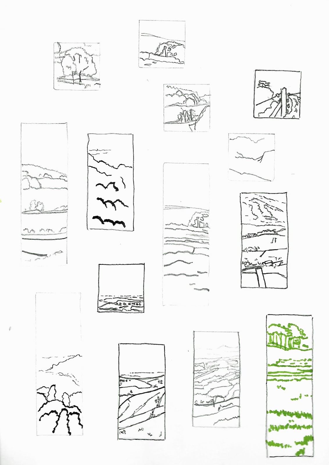 |
| Basic Proportion Drawing and Painting the Landscape January 2019 Various Media Stillman & Birn Alpha Series Sketchbook 21.5cm x 30.5cm (8.5" x 12") |
 |
| Basic Proportion Drawing and Painting the Landscape January 2019 Various Media Stillman & Birn Alpha Series Sketchbook 21.5cm x 30.5cm (8.5" x 12") |