Sunday 20 December 2020

Happy Christmas 2020

Happy Christmas 2020
Watercolour on Paper
7.5cm x 7.5cm (3" x 3")

Happy Christmas and Best Wishes for 2021

May We All Be Safe, Healthy and Happy

Sunday 13 December 2020

Sand

Maldivian Beach Scene
Watercolour and Ink on Paper
26cm x 18cm (10" x 7")

Sand is the second topic in the Earth Textures chapter of Creating Textures in Pen & Ink with Watercolor by Claudia Nice.

Claudia suggests sand can be represented with damp washes textured with spatter and stippling. The important thing is to keep everything light. 

British Beach Scene
Mixed Media on Paper
34cm x 44.5cm (13.5" x 17.5")


The British beach scene was inspired by a tile in our recently refurbished bathroom. I was lying in the bath and all the tiles containing horizontal lines conjured up imaginary landscapes - which was the first lesson in Drawing and Painting the Landscape by Philip Tyler (see Drawing and Painting the Landscape - The Evocation of Memory).

This painting had a difficult beginning. After the initial washes, I could see potential in the sky, but the sea and beach seemed beyond redemption. I painted over them with white acrylic gesso and started afresh. The second attempt looked better, but then I made the mistake of drawing around some rocks in the foreground with dark acrylic ink. The result was dreadful. I diluted the poison slightly by incorporating the lines into deep shadows, but in the end the only solution was to crop them out. Every painting is a lesson.

Sunday 29 November 2020

Drawing and Painting the Landscape – Wash Media


The Severn Estuary from Selsley Common
Wash Media - Drawing and Painting the Landscape

Indian Ink on Paper
16.5cm x 13.5cm (6.5" x 5.25")

Lesson 18 ("Wash Media") is the last lesson in the chapter about “Tonal Drawing” in Drawing and Painting the Landscape by Philip Tyler. In this lesson, Philip discusses a variety of inks and alternative media that can be used for drawing lines and applied as washes.

Coastguard Cottages - Worth Matravars
Wash Media - Drawing and Painting the Landscape
Indian Ink on Paper
18.5cm x 13.5cm (7.25" x 5.5")

The sketches on this post are all drawn with Indian ink which is waterproof when dry – this allows layers of tone to be applied over a line drawing without disturbing it.

Knowlton Church
Wash Media - Drawing and Painting the Landscape

Indian Ink on Paper
18.5cm x 14.5cm (7.25" x 5.75")

The scenes are from atmospheric places. The Coastguard Cottages are on St. Aldhelm's Head in Dorset. Knowlton Church is the ruin of a Norman church built in the centre of a Neolithic earthwork. The view from Selsley Common across the Severn Estuary to Wales took me by surprise when I first encountered it. Elaine, Doris and I were on the common earlier today. It was swathed in mist and we didn't see this view - we couldn't even see the landmarks on the common until we stood next to them.

Sunday 15 November 2020

Soil

Oak Trees in February
Watercolour & ink
Stillman & Birn Alpha Series Sketchbook
16cm x 21cm (6.25" x 8.25")

Soil is the first topic in Earth Textures - Chapter 5 of Creating Textures in Pen & Ink with Watercolor by Claudia Nice.

The soil isn’t the star of this picture, but is an important supporting player. The trees are one of the subjects I've drawn the most (apart from Elaine) and they’ve appeared in a number of previous posts:

I struggled to think of an inspiring image of soil. In retrospect, I should have drawn a close up of a piece of garden – something like Albrecht Dürer’s Great Piece of Turf (https://en.wikipedia.org/wiki/Great_Piece_of_Turf). 

Sunday 25 October 2020

Rust

Heavy Duty
Watercolour and Ink on Paper
240mm x 135mm (9.5" x 5.25")

"Rust" is the last topic in the "Metallic Impressions" chapter of Creating Textures in Pen & Ink with Watercolor by Claudia Nice. This is the largest section in the chapter. Claudia provides advice about depicting rust on household objects and rusty objects in the landscape - like abandoned tractors and corrugated iron roofs. 

I couldn’t find many interesting rusty objects in or around the house and I didn’t want to work from a photograph. I settled for this adjustable spanner that is showing signs of age. The treatment is based on still life examples from John Lovett's books, videos and online content.

Sunday 11 October 2020

Drawing and Painting the Landscape – Pencil Drawing (Part 2)


In the Dunes
Pencil Drawing - Drawing and Painting the Landscape

Pencil on Paper
15cm x 20cm (6" x 7.75")

This is a second drawing in response to the Pencil Drawing section in Drawing and Painting the Landscape by Philip Tyler (see Drawing and Painting the Landscape - Pencil Drawing)

This is based on a photo of the beach at Walberswick - which appeared on the earlier post (Drawing and Painting the Landscape - Duotone).

I am moving on to the Mixed Media lesson, but will incorporate more pencil drawings into my sketching. I want to find a way of making them appear looser and more spontaneous. I am planning to buy some fatter lead holders (5.6mm) to allow me to quickly cover more paper – that might help. 

Sunday 27 September 2020

Drawing and Painting the Landscape – Pencil Drawing


Ladram Trees
Pencil Drawing - Drawing and Painting the Landscape

Pencil on Paper
22cm x 16cm (8.75" x 6.25")

Between the lessons on Erased Drawing and Wash Media in Drawing and Painting the Landscape by Philip Tyler there is a sub-section on Pencil Drawing - in which Phillip recommends making a series of pencil studies,  revisiting imagery you have used in previous exercises.

This is the first of my drawings. I’m not waiting until I have a series because I haven’t posted recently and this felt like a pivotal moment. When I started drawing and painting, this is the sort of picture I wanted to create. I quickly realised (and as Philip points out) this sort of pencil drawing takes a lot of time and I prefer drawings that appear less painstaking.

This is the same scene that appeared as "Near the Otter Estuary" on the earlier post (Drawing and Painting the Landscape - Duotone). I think it is the same stand of trees Ian Sidaway recently included on his blog - June 2020. He has painted them from Ladram bay and I have drawn them from the other side – approaching them along the coastal path from the Otter estuary. Ian says Ladrum, I say Ladram, but I'm pretty sure they are the same trees.

I haven’t done much drawing recently. I suspect the uncertainty caused by coronavirus has been sapping my enthusiasm and affecting my mood more than I’ve realised or acknowledged. I’ve been using pressure of work as a reason not to draw, but this may be an excuse more than a reality. I also think I am getting bored with drawing from photos. Drawing and painting outdoors is still a challenge, but I might be missing it. 

Sunday 6 September 2020

Enamelware


Daily Rituals
Ink Gouache and Watercolour
Stillman & Birn Alpha Series Sketchbook
20.3cm x 14.0cm (8.0" x 5.5")

This is the lid from our battered old enamel teapot – painted in response to the Enamelware topic in Creating Textures in Pen & Ink with Watercolor by Claudia Nice.

Each working day, either Elaine or I get up slightly earlier than the other, checks on Doris and makes the tea. I have the enamel pot in my office, so I can refill my mug through the morning.

Sunday 30 August 2020

Cast-iron and Tarnished Metal


Garden Stake
Watercolour and Ink on Paper
175mm x 260mm (7" x 10.25")

This is an old metal stake and a twig from a Philadelphus bush. I drew this a few weeks ago prompted by the Cast-iron and Tarnished Metal topic in Creating Textures in Pen & Ink with Watercolor by Claudia Nice.

The hook on the stake was an interesting exercise in "draw what you see, not what you expect to see."

This is probably the first drawing I’ve done outside since the coronavirus lock-down started and this was in the confines of our garden. I am enjoying working from photo reference, but there is an extra pleasure in drawing from life.

Sunday 16 August 2020

Drawing and Painting the Landscape – Erased Drawing


Glimpses of Light
Erased Drawing - Drawing and Painting the Landscape
Charcoal on Paper
60.5cm x 45cm (23.5" x 17.55")

Lesson 17 of Drawing and Painting the Landscape by Philip Tyler deals with Erased Drawing and continues the theme of tonal drawing.

Philip’s instructions are to use sand paper to create charcoal dust and kitchen paper to cover the paper with a mid-grey tone, then to use an eraser to create highlights, and to add more charcoal to the darks. I used a paint brush as well as kitchen paper to move the charcoal dust around - the whole exercise felt more like painting than drawing.

Charcoal is unlikely to become my medium of choice, but I enjoyed this exercise and gained a better appreciation of tone.

This scene has appeared before, but you probably wouldn't recognise it (see A Break in the Clouds).

Sunday 9 August 2020

Brass, Gold, Copper And Bronze

Still Brassy - Still Juggy
Watercolour and Ink on Paper
160mm x 240mm (6.25" x 9.5")

Brass, Gold, Copper And Bronze is the second topic in the Metallic Impressions chapter of Creating Textures in Pen & Ink with Watercolor by Claudia Nice.

I couldn’t find anything interesting around the house, so I used an old photo of a jug in the Black Horse at Caythorpe. I've used the same picture before - in 2011 (see Old Brass Jug). The reflections in the new version are more accurately observed, but I like the vibrancy of the original.

Sunday 26 July 2020

Drawing and Painting the Landscape – Continuous Tones

Winter Afternoon in the Trent Hills
Continuous Tones - Drawing and Painting the Landscape
Charcoal on Paper
60.5cm x 45cm (23.5" x 17.55")

Between the lessons on Collage and Erased Drawing in Drawing and Painting the Landscape by Philip Tyler there is a sub section on Continuous Tones - in which Phillip recommends using charcoal to further develop an understanding of tonal range. He suggests using the side of the charcoal to create the darkest areas and then to use the side of the hand or kitchen towels to create mid tones before finally adding more subtle tonal changes.

The section offers some good advice about working with charcoal. I enjoyed this drawing, but I'm not sure charcoal will ever be my favourite medium.

Sunday 19 July 2020

Polished Silver


Silver Necklace
Ink and Watercolour
Stillman & Birn Alpha Series Sketchbook
14.0 x 20.3cm cm (5.5" x 8.0")

Polished Silver is the first topic in Metallic Impressions - Chapter 4 of  Creating Textures in Pen & Ink with Watercolor by Claudia Nice.

This is one of Elaine's necklaces. The shapes in it are inspired by the carved masonry at Southwell Minster. It is one of the most complicated things I've drawn in a long time. In some places you can see the ghostly outline of a second necklace.  These are my original pencil lines before I adjusted the drawing to improve the accuracy.  The painting doesn't really convey the appearance of polished silver. In retrospect, I should have used paler washes - something to remember for next time.

Sunday 5 July 2020

Direct Watercolour


Amberley War Memorial
Warercolour on Paper
18cm x 12.5cm (7" x 4.75")

30x30DirectWatercolor is an annual event organised by Marc Taro Holmes (Citizen Sketcher). The challenge involves painting 30 watercolour paintings on the 30 days of June.

Direct watercolour implies minimal (or no) under drawing, and working wet-in-wet in a single pass without waiting for layers to dry before continuing.

Brewery Lane
Warercolour on Paper
18cm x 12.5cm (7" x 4.75")

The challenge inspired me to try a few paintings without my usual safety net of a detailed initial drawing. In the spirit of lock-down, I added the constraint of painting local scenes from Google Maps Street View. The results are a bit wonkier than I normally strive for, but better than I anticipated.

All Saints
Warercolour on Paper
18cm x 12.5cm (7" x 4.75")

The painting of the Amberley war memorial was a particular surprise. I expected it to be a disaster because I sweated for ages drawing the perspective of the memorial in St Peter's for Bob and still didn't quite get it right - there might be a lesson for me here.

The Bell
Warercolour on Paper
18cm x 12.5cm (7" x 4.75")

We have just got back from having our Sunday lunch at the Bell. They had all their doors open today, to allow for a one way system as part of their Covid 19 social distancing measures - strange times.

Sunday 28 June 2020

Drawing and Painting the Landscape – Collage


That Mon & Brec View Again
Collage - Drawing and Painting the Landscape
Collage and Ink
21.5cm x 14.5cm (8.5" x 5.75")

Lesson 16 of Drawing and Painting the Landscape by Philip Tyler is about collage. Philip explains the technique and sets an exercise to make collages from newspaper painted with white, black and yellow ochre acrylic paint. He cautions against tracing shapes on to the collage paper and suggests instead visualising your scalpel or scissors as drawing tools and collage as an organic process of addition and subtraction.

Portland and the Chesil Beach from Abbotsbury Hill
Collage - Drawing and Painting the Landscape
Collage
21cm x 14.5cm (15.5" x 6")

The view of Portland and the Chesil beach from Abbotsbury Hill has appeared on a previous post (see From Abbotsbury Hill). This is one of my favourite views. I have precious memories of stopping in the lay-by on long hot cycle rides for an ice-cream and a cold drink.

The view from the Monmoutshire & Brecon Canal has also featured on previous posts about Drawing and Painting the Landscape (see Revealed Landscape, Partial Peak and Negative Painting).

Sunday 14 June 2020

Surf and Ocean Waves

Surf off St Martin's
Watercolour on Paper
210mm x 165mm (8.25" x 6.5")

"Surf and Ocean Waves" is the last topic in the "The Look of Transparency" chapter of Creating Textures in Pen & Ink with Watercolor by Claudia Nice. This is another subject for which Claudia’s step by step pictures were helpful to understand how she built up her painting.

This picture is based on some photos of the surf off St Martin’s in the Isles of Scilly. Elaine and I are planning to visit the islands again, this time with Doris. You can fly with your dog from Land’s End on an 8-seater BN2 Islander – it’s a really enjoyable experience. Doris would love the Isle of Scilly and we are sure she would like flying as well - pretty sure (ish).

Sunday 31 May 2020

Waterfalls


Lightspout
Watercolour and Ink on Paper
160mm x 240mm (6.25" x 9.5")

"Waterfalls" is the penultimate topic in the "The Look of Transparency" chapter of Creating Textures in Pen & Ink with Watercolor by Claudia Nice. My choice of subjects was limited to Niagara Falls or Lightspout on the Long Mynd. These are opposite ends of the waterfall spectrum and not great candidates for the techniques Claudia describes.

The topic at least served as a prompt to try a subject that I have shied away from for a long time – the photo is from 2008. It always makes me smile because I love the Long Mynd, but it is probably Elaine's least favourite venue for a walk. I was never sure why she disliked it. I suspected it was because it usually rains (heavily) every time we visit, but Elaine says its because there are no convenient pub or toilets.

I haven't made much use of pen and ink in this chapter - I'm going to make a conscious effort to do more ink drawing in the next chapter - Metallic Impressions.

Sunday 17 May 2020

Compositions with Empty Space


Tranquillity
Watercolour on Paper
40.5cm x 34cm (16" x 13.35")

The duotone study of yachts moored off St Mary's in the Isles of Scilly (see Drawing and Painting the Landscape - Duotone) inspired me to try the largest watercolour I've painted in a long time – maybe 8 years.

Since I started painting, I've admired artists who have the confidence and ability to create pictures containing empty space - particularly big empty foregrounds. Whenever I tried it, the results just looked unfinished and I've ended up cropping the blank space. What was their secret?

The answer is (of course?) their compositional skills. Exercises like Duotone and the Five-Value Monochrome Study from Tom Hoffmann's  Watercolor Painting (see Five-Value Monochrome Study) help me to better understand where details are not needed in an image.

The Principles of Composition exercises from Composition by Arthur Wesley Dow have also given me some insight into how blank space fits into a satisfying composition. I’m sure the later chapters on Line and Notan would help even more, but they are not at the top of my study list because there are lots of other resources I am keen to experiment with and learn from.

Its interesting to reflect on what I’ve learnt from where. In March, Stephanie asked
I notice that you are often working your way through an instruction book or course. Do you have any recommendations for the order someone should choose these resources? I would love to see a page where you gather links to your posts that review your thoughts on a book once you've finished with it.
I’ve realised this is going to be a time-consuming undertaking. I’ve started the first steps:
  • Create a list of all the resources I've mentioned on this blog and others I’ve used but not discussed
  • Make sure the blog posts that discuss each source are properly tagged
  • Write two sentences for each resource to explain whether I finished the material and whether I would recommend it to someone else
I will post this information when it is ready.

Sunday 10 May 2020

Drawing and Painting the Landscape - Duotone

Sheep Grazing from the Mon & Brec
Duotone - Drawing and Painting the Landscape
Ink on Paper
13.5cm x 9.5cm (5.25" x 3.75")

Lesson 15 of Drawing and Painting the Landscape by Philip Tyler continues with the black, white and grey studies introduced in the previous lesson (Drawing and Painting the Landscape - Negative Painting).

Walberswick Beach
Duotone - Drawing and Painting the Landscape
Ink on Paper
9.5cm x 13.5cm (3.75" x 5.25")

The focus of the lesson is identifying the grey shapes and thinking about the balance of the three tones - is the scene mostly grey with a few black shadows and white highlights?

Kennet and Avon
Duotone - Drawing and Painting the Landscape
Promarker on Paper
9cm x 12.5cm (3.5" x 5")

Phillip recommends the use of photo editing software to help simplify the landscape into tonal masses. The initial exercise uses grey and black promarkers (permanent alcohol-based markers) on white paper. Phillip then suggests making a series of three-tone studies using a range of dry and wet media on white and toned surfaces.

Near the Otter Estuary
Duotone - Drawing and Painting the Landscape
Promarker on Paper
16cm x 11cm (6.25" x 4.25")

I did a lot of experiments and particularly enjoyed the ink on toned paper. Some of these are more detailed and lack the spontaneity of Philips examples, but this can be a symptom of drawing and painting from photographs.

Moorings Near Hugh Town
Duotone - Drawing and Painting the Landscape
Promarker on Paper
16cm x 11cm (6.25" x 4.25")

The lesson reminded me of the Five-Value Monochrome Study from Tom Hoffmann's Watercolor Painting (see Five-Value Monochrome Study). This provided a useful connection because Tom's exercise isn't about accurately replicating the tones in the landscape, it is about creating a picture that makes sense to the viewer.

Sunday 26 April 2020

Whitewater


Shelter
Watercolour and Ink on Paper
220mm x 165mm (8.5" x 6.5")

Castleton on a cold wet February day in 2014. The ducks were sheltering from the worst of the wind and rain in the lee of the wall.

Whitewater is the fourth topic in the "The Look of Transparency" chapter of Creating Textures in Pen & Ink with Watercolor by Claudia Nice.

I'm getting into the swing of using Claudia's book. Initially, I use the topic as a prompt to find objects or photos to paint - this helps to limit any dithering over a subject. I then read Claudia's notes and apply her suggestions to my subjects. The topic included an image of Claudia's partially complete picture. This helped me to understand her approach.

The initial wash for the white-water worked well, but I made a glaring mistake with the stream. I painted long strokes in the water's direction of travel towards the waterfall. This made the stream look as though it was on a 45° slope. In the second wash and ink drawing I used horizontal lines to neutralise this effect and to emphasise the calmness and flatness of the water before it reaches the precipice.

Sunday 12 April 2020

Drawing and Painting the Landscape - Negative Painting


Woodchester Mansion
Negative Painting - Drawing and Painting the Landscape
Thick grey ground - Acrylic on MDF
16cm x 19cm (6.25" x 7.5")

Lesson 14 of Drawing and Painting the Landscape by Philip Tyler is called Negative Painting.

River Trent Evening
Negative Painting - Drawing and Painting the Landscape
Thick black on thin white ground - Acrylic on MDF
16cm x 19cm (6.25" x 7.5")

The instructions are to paint six rectangles on MDF with acrylic paint - two white, two black and two grey. For each colour, paint one rectangle with a thin layer of paint and the other with a thick layer stiffened with impasto or texture medium.

Langdale Fells
Negative Painting - Drawing and Painting the Landscape
Thin black on thick white ground - Acrylic on MDF
16cm x 19cm (6.25" x 7.5")

On the thick white background, paint a notan using a thin transparent layer of black acrylic. On the thin white background, use thick black paint. Similarly, thin white paint on the thick black background and thick white paint on the thin black background. On the grey backgrounds experiment with alternate thin and thick layers of white and black.

From the Mon & Brec
Negative Painting - Drawing and Painting the Landscape
Thick white on thin black ground - Acrylic on MDF
16cm x 19cm (6.25" x 7.5")

Philip suggests using a palette knife to apply the thick paints. I ended up using a variety of different tools including a painting knife, old plastic loyalty cards and tatty decorating brushes. I embraced the advice from lesson 13 of trying to instil energy into the studies and not to be frightened of making marks in the wrong place.

Old Hill Tree
Negative Painting - Drawing and Painting the Landscape
Thin white on thick black ground - Acrylic on MDF
16cm x 19cm (6.25" x 7.5")

Negative painting means painting the space around an object rather than painting the object. I painted the black on white images first and couldn't / wouldn't / didn't apply the idea of negative painting to them - these are simply 2 value notans (see Drawing and Painting the Landscape - The Notan). I was more successful with the studies on the black and grey grounds. These felt like negative painting. On the black background, I was conscious of creating the black shapes by painting around them in white. Similarly, on the grey background I was mindful of painting around the grey shapes.

From Gurnard's Head
Negative Painting - Drawing and Painting the Landscape
Thin grey ground - Acrylic on MDF
16cm x 19cm (6.25" x 7.5")

All these studies were painted indoors from photographs of our holidays and more local walks.

Sunday 29 March 2020

Calm Water

Calm Clear Water
Watercolour on Paper
280mm x 190mm (11" x 7.5")

Calm Water is the third topic in the "The Look of Transparency" - Chapter 3 of Creating Textures in Pen & Ink with Watercolor by Claudia Nice.

The need to stay at home to combat coronavirus simplifies the decision about whether to paint from life or photographs. It suits me because my current inclination is to experiment with technique by painting inside.

The Bathing House on the Sharpham Estate
Ink and Watercolour
Moleskine A4 Watercolour Album
297mm x 210mm (11.69" x 8.27")

Both of these scenes are from our holidays. I took the photo of the Bathing House on the Sharpham Estate from the Dartmouth to Totnes river cruise – shortly before Doris let herself down. Elaine tidied things up before anyone noticed – even me. In Doris’ defence she was a young puppy on her first holiday adventure. She wouldn't do anything like that now - fingers crossed. You can rent the Bathing House as a romantic holiday getaway (The Bathing House at Sharpham House). It looks idyllic, but they don’t accept dogs, so it’s not an option for us.

The picture at the top of the post is of the river Otter between Otterton Mill (where we had sandwiches on bread made from the flour they mill) and the coast. I’m not sure what sort of fish this is. I’m guessing a trout, but who knows?

Sunday 15 March 2020

Drawing and Painting the Landscape - The Notan


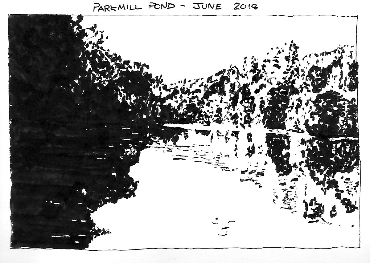
Parkmill Pond
Notan - Drawing and Painting the Landscape
Ink
Stillman & Birn Alpha Series Sketchbook
21.5cm x 15.25cm (8.5" x 6")

Lesson 13 of Drawing and Painting the Landscape by Philip Tyler is about notan – the word derives from a Japanese term meaning light dark harmony. Artists use notan studies to explore the arrangement of the light and dark shapes in a composition. It is common to see 2 value notans (black and white), but greys can be introduced to create 3 or more value notans.

Trent Towards Radcliffe on Trent
Notan - Drawing and Painting the Landscape
Ink
Stillman & Birn Alpha Series Sketchbook
21.5cm x 15.25cm (8.5" x 6")

The lesson initially employs brush and ink to create black and white studies – I used a Pentel Brush pen. I’ve got a couple. The older one can't keep a fine point. I used it for these exercises because it is good for painting bigger shapes when a bit of unpredictability in the edges is unimportant and maybe a good thing.

Sunshine After Hail
Notan - Drawing and Painting the Landscape
Ink
Stillman & Birn Alpha Series Sketchbook
21.5cm x 15.25cm (8.5" x 6")

Philip recommends training your eye to see values by manipulating the tonal range of digital images to remove all grey values.

I worked mostly from photographs but did a couple of drawings outside. It is a challenge to decide what is black and white without the help of a photo editor. In Lesson 11 (Drawing and Painting the Landscape - Grey Scales) Phillip recommends squinting your eyes and looking through your eyelashes as a technique to blur details and more accurately perceive values. This sounds easy enough, but is going to take practice to perfect.

River Otter
Notan - Drawing and Painting the Landscape
Compressed Charcoal
Stillman & Birn Alpha Series Sketchbook
21.5cm x 30.55cm (8.5" x 12")

After a few pen and ink drawings, the lesson switches to compressed charcoal - mixing it with water to create subtle washes for 3 or 4 value notans. Phillips advises being physical and gestural in your mark making with the charcoal and not to worry whether the marks are in the right place.

Moor Close Plantation
Notan - Drawing and Painting the Landscape
Compressed Charcoal
Stillman & Birn Alpha Series Sketchbook
21.5cm x 30.55cm (8.5" x 12")

I was going to put the study of Moor Close Plantation at the top of the post, but Elaine is not sure whether she likes it. She suspects if she looks at it for too long, she will see sinister figures emerging from the trees.

Saturday 29 February 2020

Eyes

Doris' Eye
Ink and Watercolour
Stillman & Birn Alpha Series Sketchbook
20.3cm x 14.0cm (8.0" x 5.5")

Eyes is (are?) the second topic in the "The Look of Transparency" - Chapter 3 of Creating Textures in Pen & Ink with Watercolor by Claudia Nice.

My Eye
Watercolour and Ink on Paper
280mm x 190mm (11" x 7.5")

The picture of my eye was drawn while looking in the mirror. Initially, it was an accurate observation. After I made a couple of mistakes, I had to improvise (lie), to make it read properly. Doris' eye is an ink drawing with a watercolour tint. My eye is a watercolour with some ink details.

The Sixties Want Their Picture Back
Acrylic on Paper
84.1cm x 59.4cm (33.1" x 23.4")

The picture of Doris's eye was drawn from a photograph because she won't stay still long enough to draw anything other than a gesture - unless she is asleep - which isn't the best time for drawing eyes. I manipulated the photograph in a photo editor to explore the patterns of lights and darks. This was the inspiration for the more "abstract" version.

Sunday 23 February 2020

Drawing and Painting the Landscape - Block-Ins


Boats on the Dart
Block-Ins - Drawing and Painting the Landscape
Charcoal
Stillman & Birn Alpha Series Sketchbook
21.5cm x 15.25cm (8.5" x 6")

Lesson 12 of  Drawing and Painting the Landscape by Philip Tyler is about Block-ins. Philip's instructions are to think about the big tonal masses and try to see how light and dark they are. He advises using the side of a piece of charcoal to block-in these areas of tone.

Ladram Rock
Block-Ins - Drawing and Painting the Landscape
Charcoal
Stillman & Birn Alpha Series Sketchbook
21.5cm x 15.25cm (8.5" x 6")

These studies are drawn from photographs - except the view towards Gatcombe Farm - which I drew from my office window. I converted the photos to black-and-white before drawing them - which helped me to see the tones.

Isles of Sciliy
Block-Ins - Drawing and Painting the Landscape
Charcoal
Stillman & Birn Alpha Series Sketchbook
21.5cm x 15.25cm (8.5" x 6")

The pictures are probably too detailed to be called block-ins, but I enjoyed drawing them and started each one by blocking in the major shapes as Phillip instructed.

Waves Breaking - Mousehole
Block-Ins - Drawing and Painting the Landscape
Charcoal
Stillman & Birn Alpha Series Sketchbook
21.5cm x 15.25cm (8.5" x 6")

I used my fingers to blend the charcoal and smooth the tones. This isn't a recommended approach for creating refined charcoal drawings but added character to these sketches.

Towards a Gatcombe Farm
Block-Ins - Drawing and Painting the Landscape
Charcoal
Stillman & Birn Alpha Series Sketchbook
21.5cm x 15.25cm (8.5" x 6")

There are another 6 lessons in this chapter about tonal drawing. I intend to work from photographs to practice the techniques, but to complete at least one study in each lesson outside. As the weather improves, I will try to swing the balance more towards working directly from the landscape.

River Usk Near Gliffaes
Block-Ins - Drawing and Painting the Landscape
Charcoal
Stillman & Birn Alpha Series Sketchbook
21.5cm x 15.25cm (8.5" x 6")

A couple of the scenes have appeared in previous posts.There is a line drawing of a similar view of Gatcombe Farm on Measured Drawing and there is a painting of Ladram Rock from a few years ago on Ladram Rocks.