Showing posts with label tree. Show all posts

Sunday, 19 January 2025

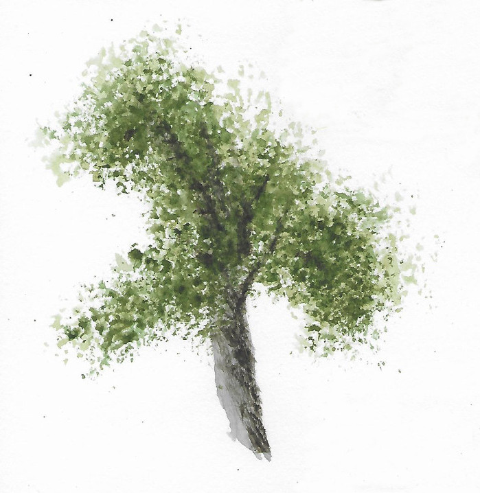
Foliage

In The Woods At Night
Watercolour on Paper
16.5cm x 24.5cm (6.5" x 9.5")

Foliage is the fifth topic in the Tree Techniques chapter of Creating Textures in Pen & Ink with Watercolor by Claudia Nice. 

In one of her examples she shades around some leaves to make them pop out of the picture. This reminded me of a layering technique John Lovett explains in his Textures, Techniques & Special Effects for Watercolor.  He uses negative painting to create the impression of layers of objects stacking on top of each other. Your start with a light wash, then you paint everything that’s not in the top layer with a slightly darker wash, then everything that’s not in the top 2 layers with a darker wash again, and so on. Once you have built up the layers, you go back to add texture and details.

The picture at the top of the post is based on 8 layers. Before I started painting, I painstakingly worked out the shape of what I was painting in each layer. 

In The Woods At Night - Layer 3

This is the third layer. The black is the area that I am not painting over. 

In The Woods At Night - Layer 4

This is the 4th layer. You paint less and less in each layer. Each time you paint an object it gets darker and recedes further into the shadows. I've been meaning to try this for years, so it's exciting to finally give it a try.

Sunday, 11 August 2024

Distant and Background Trees

Background Trees - Claudia Nice
Watercolour & Ink
Stillman & Birn Beta Series Sketchbook
11cm x 9cm (4.5" x 3.5")

Distant and Background Trees are the sixth and seventh topic in the Tree Techniques chapter of Creating Textures in Pen & Ink with Watercolor by Claudia Nice. It’s a few months since I’ve picked up Claudia’s book. An exercise from Liz Steel’s SketchingNow Watercolour on Location course inspired me to return. By chance, I’ve picked it up at almost the same point as I left off.

In an exercise about common landscape elements, Liz suggests studying how other artists paint and draw the subject. The first topic on the list is trees, providing the perfect opportunity to revisit Claudia's book.

Distant Trees - Claudia Nice
Watercolour
Stillman & Birn Beta Series Sketchbook
15cm x 14cm (6" x 5.5")

I made some notes about Claudia’s treatment of distant and background trees and tried to copy a couple of her examples. 

Middle Distance Trees - John Lovett
Watercolour & Ink
Stillman & Birn Beta Series Sketchbook
14cm x 11cm (5.5" x 4.5")

I also looked at advice from John Lovett. I studied his suggestions about trees in Textures, Techniques & Special Effects for Watercolor and Getting Started and tried to copy some of his examples.

Tree - John Lovett
Watercolour
Stillman & Birn Beta Series Sketchbook
15cm x 14cm (6" x 5.5")

I’m pleased to get back to Claudia’s book and intend to continue learning from her content.

Sunday, 7 January 2024

Branches


Woodchester Beech
Watercolour on Paper
24.5cm x 15.5cm (9.75" x 6")

Branches is the fourth topic in the Tree Techniques chapter of Creating Textures in Pen & Ink with Watercolor by Claudia Nice.

This post has been a long time coming. The topics in this chapter are continuing to be challenging and educational. I made a few false starts on this subject trying to paint winter trees in sunsets. I’ve also been distracted by my new YouTube channel - Mark Bateman Art.

There are two videos about this painting: 

The blurred soft-focused background is painted with the same technique I used in the post about painting A Fuzzy Background.

I gave the tree some form with a modelling wash (mostly light grey with some dark in the shadows) and then slowly built up the shape and texture in layers using drybrush.

The finishing touch was to add some foreground leaves in gouache.

Hopefully, creating videos will become less time consuming and I will be able to get back to drawing and painting.

Sunday, 28 May 2023

Roots

Roots
Watercolour on Paper
24.5cm x 15.5cm (9.75" x 6")

Roots is the third topic in the Tree Techniques chapter of Creating Textures in Pen & Ink with Watercolor by Claudia Nice.

The topics in this chapter are challenging and educational. They are providing the perfect opportunity to experiment with and to develop a feel for drybrush technique. The key skill seems to be patience. I made quite a few mistakes with this picture, but I managed to correct some of them and making mistakes is a good way to learn.

James Gurney recently published an interesting post about Andrew Wyeth's use of drybrush (see What did Andrew Wyeth mean by "drybrush?").

Sunday, 7 May 2023

Hardwood Tree Bark

Beech Tree Bark?
Watercolour on Paper
24.5cm x 15.5cm (9.75" x 6")

Hardwood Tree Bark is the second topic in the Tree Techniques chapter of Creating Textures in Pen & Ink with Watercolor by Claudia Nice. 

Pretty sure this is some kind of Beech tree, but I have to put more effort into identifying trees. I should start by making notes about what I photograph as Elaine, Doris, and I wander around Westonbirt Arboretum (Will I ever learn - I took some photos today and still forgot to take notes).

All the texture on this tree was created using dry brush. This was a break through because until now I’ve struggled with the technique. I also used a masking fluid applicator to reserve some highlights. This is the most delicate use of masking fluid I’ve achieved, so I am pleased with the purchase (see Drawing and Painting the Landscape - Masking). 

You may have noticed I’ve not been posting as regularly as usual, this is because I am distracted by a side project. I’ve started a YouTube channel - Mark Bateman Art.If you are interested, please take a look.

Sunday, 16 April 2023

Conifer Tree Bark

Conifer Tree Bark
Watercolour on Paper
24.5cm x 15.5cm (9.75" x 6")


Conifer Tree Bark is the first topic in the Tree Techniques chapter of Creating Textures in Pen & Ink with Watercolor by Claudia Nice. 

Claudia uses Indian Ink to draw the heavily textured bark in her examples and then tints them with watercolour. I tried this approach, but it didn’t turn out satisfactorily because my tree is less textured and a much lighter in tone than her subjects. 

The picture on this post is my second attempt. This time, I painted the tree with light watercolour washes and added the bark pattern with dry brush work and sponged texture. This version is better, but now the bark is not conspicuous enough. This chapter is looking like hard work and I am expecting to learn a lot.

Sunday, 13 January 2013

Silver Birch

Silver Birch
(Based on Geoff Kersey's Trees, Woodlands and Forests)
Watercolour on Paper
11cm x 16.5cm (4.25" x 6.5")

This is my version of another demonstration from Geoff Kersey's programmes about “Trees, Woodlands and Forests” on The Painting and Drawing Channel.

I have being using Geoff’s demonstrations from these programmes as warm ups at the start of each painting session (see Warming Up and Scratching and Scraping). They are ideal for this purpose because they are small vignettes rather than full-blown paintings.

The challenge in this picture is to make the tree trunk look solid and cylindrical. It is an exercise in modelling. The solution is to decide where the sun is relative to the tree. In this picture, it is to the left. The side of the tree facing towards the sun is practically white and the trunk becomes darker as it curves away from the direct sunlight.

The background is a simple wet in to wet wash of different greens. When the background was dry, Geoff wet the whole of the tree trunk with clean water. He added a pale purple mixture to the middle and right hand side of the trunk. While this was wet, he added some blotches of browny orange to the right of the middle and some dark brown at the extreme right hand edge. These colours merge and mingle to give a gradual darkening from left to right, which reads as the change from light to shadow on a cylinder. (I should have put a shadow on the ground to emphasise the direction of the sun).

Geoff finished the picture by adding the distinctive black rings to the bark of the tree. These curved lines help to accentuate the cylindrical effect. It is important to remember that the marks below eyelevel appear to curve downwards from the edge and the marks above eyelevel appear to curve up.

Cross-sections of a Cylinder

Before I started the Natural Way to Draw, I had to think about this sort of thing. Now I have done so much modelled drawing, it is second nature.

Geoff used dry brush marks to indicate the rings. He let the brush skate on the rough paper to create broken marks. This is something I didn’t get right in this picture and which I’ve been practicing since.

Sunday, 16 December 2012

Winter Landscapes

Snow On Old Hill
Watercolour on Paper
28cm x 18cm (11" x 7")

This is a view from the top of the hill that is the backdrop for Farm Boy Racer. It is further along the same track.

I painted this yesterday at the December meeting of the Shelford Group of Artists. The December get together is a good one to attend because everyone brings food to share. Elaine made some Raspberry Blondies (like brownies, but with white chocolate) for me to take, which went down very well.

Norwegian Island
Watercolour on Paper
28cm x 16cm (11" x 6.25")
 
The theme for the day was Winter Landscapes. Tony Slater provided his usual mix of wit and wisdom. He suggested chopping the bottom off Norwegian Island to move the horizon further away from the centre line.

The big news for the week is I’ve bought a work of art to celebrate my birthday. Its taken 6 months to find the right piece, but the wait was worthwhile. Thank you to everyone in my family who contributed – I appreciate your generosity.

Bright light to Samson by Stewart Edmondson
73cm x 73cm (29.75" 29.75")

This is Bright light to Samson by Stewart Edmondson, we bought it from the D'Art Gallery in Dartmouth.

Samson is a small, uninhabited island off the Scilly Isles. Elaine and I were thinking of visiting the Scillies next summer. Now we have even more of a reason.

Sunday, 2 December 2012

Scratching and Scraping

Winter Twigs
(Based on Geoff Kersey's Trees, Woodlands and Forests)
Watercolour on Paper
18cm x 15cm (7" x 6")

This is my interpretation of another demonstration from Geoff Kersey's third programme about “Trees, Woodlands and Forests” on The Painting and Drawing Channel.

In this demonstration, Geoff painted a dark background and then used a craft knife to scrape the branches and twigs out of the wet paint. He finished by continuing the branches on the white paper.

Timing is everything with this technique. If you scrape too early, the paint fills up the line. If you leave it too late the paint dries and will not scrape out in the same way.

Geoff used the craft knife to create a variety of line thicknesses, but I found it easier to use a pointed piece of plastic to scrape out the thicker lines. This is a tool recommended for the technique by Ann Blockley in her book “Watercolour Textures”.

Ann differentiates between the techniques of scraping (removing wet paint) and scratching (removing dry paint). Scraping wet paint creates the types of marks shown in the picture on this post.  Scratching off dry paint leaves a bright white highlight and requires a delicate touch to avoid gouging chunks out of the paper.

Sunday, 25 November 2012

Warming Up

Autumn Glow
(Based on Geoff Kersey's Trees, Woodlands and Forests)
Watercolour on Paper
18cm x 15cm (7" x 6")

This is my interpretation of a demonstration by Geoff Kersey. It is from his third programme on “Trees, Woodlands and Forests” from The Painting and Drawing Chanel.

I tend to paint something from the Painting and Drawing channel as a warm up at the start of each painting session. It gives me a chance to get into a painting frame of mind and to muster my eye-hand coordination before working on one of my own paintings. It is also a good way to experiment and learn about other people's techniques.

The background in this picture is painted wet in wet. Geoff started by wetting the paper and then adding a yellow gold, a red gold and a purple. The colours merge into each other to create gentle transitions and a soft golden glow.

After the background was dry, Geoff used a dry brush technique to create the broken effect of the foliage. He applied stronger mixtures of the same colours (and an autumnal green) using the side of dry brush to skate along the surface of the rough paper.

He used a similar technique to create the broken texture on the trunk and branches to give the impression there are leaves in front of them. The final step was to add some opaque yellow leaves to increase this effect.

I’ve had a productive day - I painted the picture on this post, finished painting my Christmas cards and did some more work on the painting of Coverack Harbour (see Preparations for Coverack Harbour).

Sunday, 19 August 2012

The Wild Wood

Wild Wood 3
Mixed Media on Paper
18.5cm x 12cm (7.25" x 4.75")

Recently I bought Watercolour Textures by Ann Blockley because of a recommendation on Jane Minter’s blog (http://janeminterssketchbook.blogspot.co.uk/).

The book is about creating textural effects using watercolour paint and a variety of other materials. Some of the techniques create actual physical texture by using gesso, texture paste or collage. Other techniques create the illusion of texture by manipulation of the paint.

The pictures on this post are the result of experimenting with some of the ideas.

Wild Wood 2
Mixed Media on Paper
19cm x 13.5cm (7.5" x 5.5")

I started the first picture by covering the paper with gesso and then with washes of blue and various greens. While they were wet, I added some sepia acrylic ink.

I dropped in more ink than I intended and it spread out wildly, so I used a colour shaper to tease it into the tree shapes. (What is a colour shaper? - A paintbrush with a rubber tip instead of a brush. Why did I buy one? - I can’t remember, but they are quire handy for jobs like this.)

Colour Shapers

The result was unexpectedly satisfying, so I messed around with the technique in the second and third paintings.

Wild Wood 1
Mixed Media on Paper
17cm x 13cm (6.75" x 5")

Once the initial washes were dry, I added some blue pastel and gouache to reinforce the skyholes and finished the pictures by suggesting a foreground.

Sunday, 15 January 2012

Blakemere Moss

Blakemere Moss
Watercolour on Paper
24cm x 34cm (9.5" x 13.5")

Blakemere Moss is in Delamere Forrest near Chester. This is a view on a sunny but cold spring morning.

The Moss was originally wetland. It was drained in the 19th century, planted with trees and subsequently re-flooded in the late 1990s (see Wikipedia - Delamere Forest). It is an attractive area and a bit otherworldly because there are trees and the remains of trees emerging from the lake.

This picture is my second painting based on the design ideas from a John Lovett workshop. (see Studio Workshop). My objective for this picture was to create depth by using soft edges in the background and hard edges in the foreground. I stuck to my resolution to use thumbnail sketches to explore the subject and compose the picture.

Blakemere Moss - Thumbnail Sketches

My first decision was whether to use a landscape or a portrait format. I then experimented with the position of the horizon, the size of the far bank, the position and angle of the floating logs and the height and spacing of the foreground trees.

I’ve never got on with thumbnails in the past, but now I find them useful and enjoy drawing them. This is a beneficial side effect of the Daily Composition exercise from the Natural Way to Draw (see Daily Composition). I used to be too tentative with thumbnails, but now I dash them off quickly – 203 scribbly daily compositions have made all the difference.

As well as helping with the composition, the thumbnails serve as a rehearsal for the real drawing. By the time I start the painting I have already drawn the main elements half a dozen times, which makes starting the drawing less daunting.

Sunday, 18 December 2011

Snowy Lane

Snowy Lane
Watercolour on Paper
38cm x 27cm (15" x 10.5")

No - we haven’t had a dump of snow, but it feels like it might be on the way. I painted this scene at Tony Slater’s December workshop for the Shelford Group of Artists - the subject for the day was winter trees.

As with all of Tony’s workshops - I enjoyed working with a larger brush and at faster pace than normal. These workshops are definitely improving my brush control.

I’ve been travelling a lot recently and as a result I am a few days behind with my exercises for the Natural Way to Draw. I am going to make a determined effort to be back on schedule before Christmas and to be ahead of the plan for the start of the New Year.

Sunday, 11 September 2011

Windswept?

Windswept?
Watercolour on Paper
25cm x 35cm (9.75" x 13.75")

Elaine and I spent the August Bank holiday at Eagle Tor in the peak district.

We had a pleasant weekend walking and visiting the local pubs. On Saturday, we had lunch at The Flying Childers Inn - an excellent little pub in Stanton in Peak.

One of our walks took us past Robin Hood’s Stride and the Arbor Low stone circle. I was looking for a view of the circle to paint and this windblown tree caught my eye.

Arbor Low isn’t that far from civilisation, but when the wind howls and the rain comes down, it feels isolated and remote.

This picture was an experiment in painting atmosphere and trying some new techniques. It was also a bit of an antidote to my previous two paintings, which were based on detailed drawings and contained some fiddly details. It doesn't look as windswept and weather blasted as I intended, but it is an interesting first try.