Showing posts with label Composition. Show all posts

Sunday, 5 February 2023

Drawing and Painting the Landscape – Masking

Dart Moorings
Watercolour on Paper
15.5cm x 23.5cm (6" x 9.25")

Lesson 36 of Drawing and Painting the Landscape by Philip Tyler starts with a discussion of masking and then introduces a number of other watercolour topics.

Masking is the technique of using a fluid (rubber solution) or tape to preserve the white of the paper. You could just carefully paint around the white areas, but masking them makes life easier. I wrote about this approach recently (see A Fuzzy Background).

Some people never use masking because it can cause problems. Most notably, the edges created by masking can appear too hard and prominent. Masking fluid is also notorious for wrecking brushes. You have to use an old brush and protect the bristles by covering them in soap; which can make it difficult to apply the masking fluid accurately. It can also tear the paper if you leave it too long before removing it.

In honour of this lesson, I bought a fine tipped masking fluid applicator (Jackson's Masking Fluid Applicator) to mask the boats in this painting. It was the least stressful masking fluid experience I can remember.


A monochrome study of this scene in which the horizon was much lower (see Drawing and Painting the Landscape – Monochrome Study) made me suspect the composition would work better with more water and less sky.

Dart Moorings -  Thumbnail Sketch - 6.5cm x 10cm (2.5" x 4")
Pencil on Paper
Stillman & Birn Alpha Series Sketchbook

A thumbnail helped to confirm this before committing to paint.

Sunday, 8 January 2023

Polperro Cottages

Polperro Cottages
Watercolour on Paper
15.5cm x 23.5cm (6" x 9.25")

Last summer, Elaine, Doris and I spent a few days in Talland Bay, Cornwall to celebrate my birthday. It's a short walk along the costal path to Polperro in one direction and Looe in the other.

We all enjoyed the walk to and from Polperro, but our walk to Looe was less successful. It was a scorching hot day and Doris insisted on a taxi ride home (see Holiday Sketches).

Polperro is photogenic, but my photos didn't capture exactly what I wanted to paint. Some 7cm x 10cm thumbnails helped to explore and improve a composition. The initial pencil thumbnail was useful for deciding on the placement and configuration of shapes. It would have been handy if it had also given a definitive statement about dark, light and mid-toned shapes (see John Lovett - Thumbnail Sketches). I will include a 3 value tonal study when I next use thumbnails.

Polperro Cottages  – 7cm x 10cm (2.75" x 4") Thumbnail Sketches
Pencil and Watercolour on Paper
Stillman & Birn Alpha Series Sketchbook

The painting respects the spirit of the thumbnails except for the colour of the water. I prefer the turquoise in the second thumbnail, but if I try to adjust the painting, there is a chance I will spoil the reflections, so I will stick with what I have.

Sunday, 11 December 2022

Drawing and Painting the Landscape – Monochrome Study

Moorings on the Dart
Monochrome Study - Drawing and Painting the Landscape

Watercolour on Paper
16.5cm x 24cm (6.5" x 9.5")

Chapter 7 of  Drawing and Painting the Landscape by Philip Tyler is about painting. Philip provides an introduction to a variety of media and techniques. The first is watercolour which he suggests is a big mistake for beginners because:

Watercolour is the most difficult painting medium to use well as it is unforgiving, allowing you little room for error.

He also points out:

It is a good idea to create a crisp linear drawing to establish the placement of the key elements of the landscape. 

This advice made me realise I’ve let my drawing practice slip and I need to do something about it.

Lesson 35 is a monochrome study in watercolour. Phillip recommends monochromes as a way to get started with watercolour while avoiding the additional complexity of having to think about colour.

The exercise is similar to Lesson 18 Wash Media, but in watercolour instead of ink. It provided an opportunity to experiment with the composition and approach for two pictures I am planning to paint. In both of them, I overdid the masking fluid and applied it too clumsily – lesson learnt.

The study of the boats on the Dart helped me to work out how to build up the layers of the landscape and how to paint the distant background..

Tree Tunnel - Westonbirt
Monochrome Study - Drawing and Painting the Landscape

Watercolour on Paper
16.5cm x 24cm (6.5" x 9.5")


I wasn’t sure the tree tunnel would work without a lot of painstaking detail. The monochrome has persuaded me it will

Sunday, 27 November 2022

Aged Fencing

Aged Fencing
Watercolour on Paper
24.5cm x 15.5cm (9.75" x 6")

Aged Fencing is the fourth topic in the Wood Grain Patterns chapter of  Creating Textures in Pen & Ink with Watercolor by Claudia Nice. 

You can see the preparation for this and the first step of the paining in Thumbnail Sketches and A Fuzzy Background.

Decaying Fencing

The fence post in the main reference photo wasn’t as old as I wanted, so I enhanced it with some elements from this one. Combining bits from multiple images is an important part of painting from photographs.

Sunday, 30 October 2022

Thumbnail Sketches

Aged Fencing - Preliminary Thumbnail Sketch - 15cm x 10cm (6" x 4")
Ink and Pencil on Paper
Stillman & Birn Alpha Series Sketchbook

Many art teachers and authors stress the importance of using quick thumbnail sketches to check and improve a composition before investing too much time and material in a painting that is doomed to fail – (see John Lovett - Thumbnail Sketches).

I used this approach recently while preparing for the Aged Fencing topic in Creating Textures in Pen & Ink with Watercolor by Claudia Nice.

Over the summer, I collected a load of reference photos while out walking with Elaine and Doris. 

Aged Fencing

This stile has the makings of an interesting subject, but the composition can probably be improved. I drew a couple of simple thumbnails to explore some ideas using a rectangle with the same proportion as the paper I will paint on. 

Aged Fencing - Preliminary Thumbnail Sketch - 7.5cm x 5cm (3" x 2")
Ink on Paper
Stillman & Birn Alpha Series Sketchbook

Thumbnail sketches are also a good way to find the challenges in the drawing. These highlighted the importance of perspective on the step. If the step is out of whack, it upsets the whole picture.

I drew the slightly larger version at the top of the page to finalize the composition and to think about the tones in the picture. I will do a couple of simple colour studies before starting to paint.

Sunday, 16 October 2022

Drawing and Painting the Landscape – Format

Composition for Parkmill Pond (1:2)

Lesson 34 of  Drawing and Painting the Landscape by Philip Tyler is a the last lesson in the chapter on Composition. Phillip starts by pointing out:

Changing the format of your image can have a profound impact on your work.

He urges:

Don’t fall into the trap of complacency, stretch yourself, challenge how you approach the composition of the landscape.

He goes on to suggest a number of ways to train your compositional muscles, but doesn’t suggest a specific exercise. One of his first suggestions is to cut up an image so you can see all the positive and negative shapes because:

Often, good composition is a way of ensuring that each shape in your image is interesting and different, yet their overall effect is to create harmony through the opposition of different forces.

As an exercise I decided to break a photo into shapes and use them as the basis for a composition.
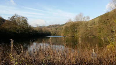
Parkmill Pond, Woodchester Park

This is Parkmill Pond in Woodchester Park.
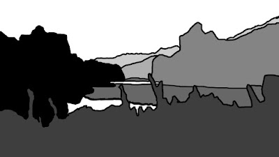
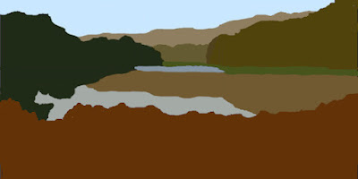
Parkmill Pond (17 Shapes)

My first attempt at identifying shapes, resulted in 17 shapes. The frilly foreground overlaps the objects behind it, dividing them into multiple small shapes. This is too many - Tom Hoffman suggests a maximum of 10 shapes in the Five-Value Monochrome Study from his Watercolor-Painting. 
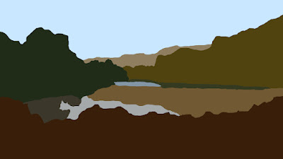
Parkmill Pond (10 Shapes)

Simplifying the foreground shape, reduces the overall shape count to 10. I plan to paint the foreground grasses overlapping the water, but these are adornments. The "bulk" of the foreground shape is the simpler object in this second picture.
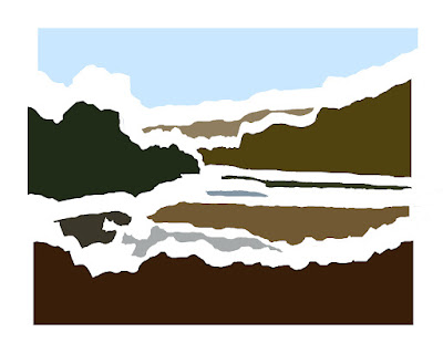
Parkmill Pond - Separating the Shapes

Separating the shapes shows they are interesting and varied, but they are predominately horizontal - they don't provide any contrast between horizontal and vertical. My plan is this tension will come from the rendering of the shapes. There will be lots of vertical lines to suggest the textures in the grasses, trees and reflections.

After identifying the shapes, the next step was to answer two compositional questions:

  • What format to use for the picture?
  • What is the focus / centre of interest?

Towards the end of the lesson, Phillip suggests:

By limiting yourself, maybe to a particular format or a particular use of media, you can begin to clarify your intention, to know what you want to say.

My initial format choice was 7 by 10 because I paint in water-based media (watercolour, acrylic and gouache) and I have two Arches watercolour blocks (a small and a large one) both with proportions of 7 by 10.

What is the centre of interest? There is a tower (“The Tower”) tucked away in the background trees, but this is a painting about the lake, so the patch of bright water towards the rear of the lake makes a good focal point.

I investigated a number of ways to resize the image to 7 by 10:

  • Just squashing it all in
  • Various zooms and crops

I also explored the position of the bright patch of water using a rule of thirds grid and a phi grid (see Drawing and Painting the Landscape – Rule of Thirds)
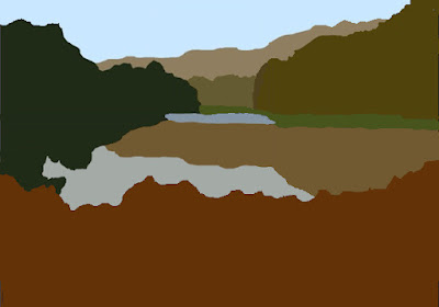
Composition for Parkmill Pond (7:10)

After a bit of tinkering, this is the result. I prefer the 1 by 2 version at the top of the post. There are some landscapes, probably those with mainly horizontal shapes, that I think look better in a more panoramic format. I've decided to limit myself to 3 formats for watercolour paintings: 7:10, 1:1 and 1:2. I chose 1:1 and 1:2 because they are simple to measure and they seem to work well for some subjects (see Drawing and Painting the Landscape – Root Rectangles).

Sunday, 21 August 2022

Drawing and Painting the Landscape – Compositional Principles

Farm Cottages - Latest Thumbnail - 7cm x 10cm (2.75" x 4")
Compositional Principles - Drawing and Painting the Landscape

Ink and Watercolour on Paper
Stillman & Birn Alpha Series Sketchbook

The bulk of Lesson 33 of  Drawing and Painting the Landscape by Philip Tyler is a review of John Ruskin’s 9 laws of composition from The Elements of Drawing:

  • Principality
  • Repetition
  • Continuity
  • Curvature
  • Radiation
  • Contrast
  • Interchange
  • Consistency
  • Harmony

Phillip sneaks in a couple of extras. Stillness might be accepted unchallenged, but Photo Manipulation isn’t getting on to a list published in 1857.

The exercise for the lesson involves taking as many different photos of a subject as possible and then making a series of compositional studies. 

I selected some local cottages and took a load of photos. My initial experiments concerned the placement of the major horizontal divisions. I tried a few different arrangements before settling on the first one; which is often the way. The next step was a small thumbnail to explore where the buildings fitted into this schema and some initial ideas about tone. 

Farm Cottages - Initial Thumbnails - Each 3.5cm x 5cm (1.5" x 2")
Compositional Principles - Drawing and Painting the Landscap
e
Ink on Paper
Stillman & Birn Alpha Series Sketchbook

Then I moved on to slightly bigger thumbnails to investigate the drawing, tones and colours. 

Farm Cottages - Thumbnails - Each 7cm x 10cm (2.75" x 4")
Compositional Principles - Drawing and Painting the Landscape

Ink, Watercolour and Graphite on Paper
Stillman & Birn Alpha Series Sketchbook
These studies didn't enthuse me, so I tried a few more small drawings to find a less central placement for the buildings.

Farm Cottages - Off-centre Thumbnails - Each 3.5cm x 5cm (1.5" x 2")
Compositional Principles - Drawing and Painting the Landscape

Ink on Paper
Stillman & Birn Alpha Series Sketchbook

The drawing at the top of the post investigates colour and tone for the repositioned buildings. I also plan to create some texture in the foreground and add some small flashes of bold colour in the focal point amongst the buildings.

Sunday, 19 June 2022

Drawing and Painting the Landscape – Rule of Thirds


St Ives Harbour - Buildings - Rule of Thirds

Lesson 32 of  Drawing and Painting the Landscape by Philip Tyler is about the rule of thirds - a popular technique for composing visual images. The “rule” divides a scene into thirds (both horizontally and vertically) using two equally spaced horizontal lines and two equally spaced vertical lines. Aligning important elements of a picture along these lines or at their intersections is supposed to create more visual interest than placing the subject at the centre.

Rule of Thirds Grid

Philip suggests exploring the rule of thirds in your compositions. As an exercise, I tried to improve the two images I picked in the Root Rectangle exercise. I used a rule of thirds and a phi grid to refine the selections - a phi grid is like a rule of thirds grid except it divides the image according to the Divine Proportion resulting in grid lines that are closer together; which in turn moves the more important elements of your picture closer to the centre.

Phi Grid

I looked at over 20 different options for each scene and ended up with selections almost identical to the ones I picked in the original exercise.

St Ives Harbour - Boats - Rule of Thirds

In both cases I favour images in which the lower third is a foreground of empty sand. As I work on the pictures some more, I may try to include some extra details and contrast at some of the points of intersection.

Sunday, 8 May 2022

Drawing and Painting the Landscape – Root Rectangles


St Ives Harbour - Root-4 Rectangle

Lesson 31 of  Drawing and Painting the Landscape by Philip Tyler is another lesson about composition with a foundation in mathematics. 

Wikipedia defines a root rectangle as 

A rectangle in which the ratio of the longer side to the shorter is the square root of an integer, such as √2, √3, etc..

Phillip explains how to draw a root-2 rectangle (√2 rectangle) by starting with a square, measuring the diagonal and extending two opposite sides to be the length of the diagonal. 

Root-2 Rectangle

You can then draw a root-3 rectangle by measuring the diagonal of the root-2 rectangle and extending the long sides to be the length of this diagonal.

Root-3 Rectangle

You draw a root-4 rectangle by extending the longer sides to be the length of the root-3 rectangle’s diagonal, and so on.

One of the interesting properties of root rectangles is:

If you divide a root-N rectangle along its long side into N equal subdivisions, all the little rectangles are also root-N rectangles, for example, if you divide a root-5 rectangle into 5 equal slices, all the little rectangles are also root-5 rectangles

Root-5 Rectangle with Subdivisions

Some people believe this symmetry is a thing of beauty and provides a good underlying structure for the composition of a picture (if you are interested, check out the Wikipedia article - Dynamic rectangle). 

Philp points out the paper sizes in the A series (A0, A1, A2, A3, A4, etc) are all root-2 rectangles. If you divide a root-2 rectangle in half, both halves are also root-2 rectangles. Cut a piece of A0 in half and you have 2 pieces of A1, cut a piece of A1 in half and you have 2 pieces of A2, and so on.

A Paper

Phillip suggests a sketchbook exercise creating a series of compositions in squares and different root rectangles. I did a slightly different exercise. I took a holiday photograph which isn't an obvious candidate to paint.

St Ives Harbour - Source Photo

I searched this picture for squares and root rectangles that have the most promise as paintings. My favourites are the image at the top of the post and this one.

St Ives Harbour - Square

I will refine and improve them in the next lessons.

Sunday, 10 April 2022

Drawing and Painting the Landscape - The Divine Proportion

Divine Mousehole Harbour

Lesson 30 of  Drawing and Painting the Landscape by Philip Tyler is about the Divine Proportion – probably the most aesthetically beautiful division of a line in the world. 

The Divine Proportion has many pseudonyms: the golden ratio, the golden section, the golden mean, the golden proportion, the golden cut, the golden number, the divine section, phi, etc, etc. 

If you want to learn more, Wikipedia has an article  (see Golden ratio).

Philip defines the divine proportion:

It is the division of a line into two parts, where the small part relates to the bigger as the bigger part relates to the whole.

This is what it looks like - and some equations for good measure

The Divine Proportion

Philip explains how to draw a golden rectangle (a rectangle with side lengths in the golden ratio) by starting off with a square and adding on a rectangle - using a ruler, setsquare and compass.

Drawing a Golden Rectangle

The interesting thing is, the rectangle we add on is also a golden rectangle because golden rectangles exhibit a form of self-similarity.

If we start off with a golden rectangle, and add a square to its long side, we end up with another golden rectangle

Another Golden Rectangle

Add another square to its long side, we end up with another golden rectangle

And Another
And so, on

Golden Spiral (Approximate)

Look familiar? (see Drawing and Painting the Landscape - What is the proportion of the rectangle?)

Philip suggests analysing some of your favourite landscapes to see if key parts of the composition conform to the divine proportion.

I studied quite a few pictures - new and old. I didn’t find a lot of correlations. One of the panels was almost a golden rectangle. 

The Beach at Trouville (with a Golden Rectangle)
Eugène Boudin
From Wikimedia Commons

The placement of the sun in Monet's "Impression, Sunrise" divides both the horizontal and vertical almost perfectly by their divine proportion.

Impression, Sunrise (with a Phi Grid)
Claude Monet
From Wikimedia Commons

That was about it. This analysis of historic paintings didn’t convince me that the great artists made/make use of the divine proportion, but as an exercise I applied it to a photo I am using as the source for a painting. 

Mousehole Harbour

I thought the composition of the photo was pretty good – lose some of the boats close to the left-hand side – job done. I investigated a lot of different crops using a phi grid to apply the divine proportion. Zooming in, aligning the strong horizontal under the buildings with the upper divine proportion and the major boats with the left-hand divine proportion gives (for me) a more pleasing composition (see the photo at the top of the post). I will emphasise these alignments some more in my preparatory sketches.

Sunday, 13 March 2022

Drawing and Painting the Landscape – What is the Proportion of the Rectangle?

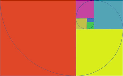
Fibonacci Spiral

Lesson 29 is the first lesson in the chapter on Composition in Drawing and Painting the Landscape by Philip Tyler.

Philip starts the chapter by defining composition:

Composition is the art of arranging the various elements of the image into a whole, a balancing act with the shapes, colour, tonalities and mark making to create a visually interesting, exciting landscape.

Most of the lessons in the chapter are about mathematical concepts that can help with composition, but lesson 29 includes the important message:

Mathematics underpins many things but one shouldn’t be bogged down by it.

The lesson starts by describing the golden logarithmic spiral. Wikipedia has a good explanation with a nice animation (Wikipedia - Golden spiral).

Philip explains a technique for drawing a Fibonacci spiral - which is an approximation of the golden spiral. He suggests using a pencil and compass to draw the spiral - which I found impossible to do accurately - the diagrams in this post are drawn in PowerPoint. The technique results in an approximation of a spiral. We draw a sequence of circular arcs. As the resulting shape transitions from one arc to another, the distance of the curve from the centre jumps and the centre moves. In a true spiral the centre stays in the same place and the distance to the centre changes continuously and smoothly. 

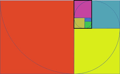
Philip points out the ratios of a lot of off the shelf canvases: 1 x 1, 1 x 2, 2 x 3, 3 x 5 and 5 x 8 are based on adjacent numbers in the Fibonacci sequence (0, 1, 1, 2, 3, 5, 8, 13, 21, 34, 65, 89, 144, 233, …) and the rectangles appear when drawing a Fibonacci spiral (the 5 x 8 rectangle is highlighted in the second diagram).

Fibonacci Spiral - 5 x 8  Rectangle

This leads into an exercise to explore alternative compositions for a scene by drawing it multiple times altering the format, scale, colour and placement. (I think Philip missed tone from this list).

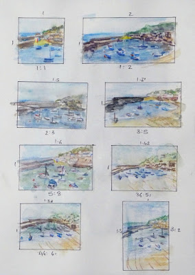
Mousehole - Thumbnails
Watercolour Pencil
Stillman & Birn Alpha Series Sketchbook
30.5cm x 21.5cm (12" x 8.5")

I made some mistakes with this exercise. 

  • The scene is too pretty and too detailed. It would be better to use an image that is simpler and less obviously attractive – something that needs some work to improve it
  • The rectangles are too repetitive. I drew rectangles based on the ratios of watercolour paper blocks. It would be better to use fewer more varied rectangles
  • Watercolour pencil is not the right medium
  • The most fundamental mistake was not doing some monochrome tonal studies first

This was still a useful exercise. I’ve learnt a couple of things that will help if I paint the scene. 

My favourite of the thumbnails is top right. I prefer this to the one directly below it which is closer to the proportions of the original photo – this challenges my assumption that I don’t need to work on the size and placement of the scene - maybe I can improve things by zooming in.

Most importantly I realise the importance of creating a pleasing tonal pattern for this scene and my next step will be to draw some simpler monochrome thumbnails using 4 or 5 tones.

Sunday, 17 May 2020

Compositions with Empty Space


Tranquillity
Watercolour on Paper
40.5cm x 34cm (16" x 13.35")

The duotone study of yachts moored off St Mary's in the Isles of Scilly (see Drawing and Painting the Landscape - Duotone) inspired me to try the largest watercolour I've painted in a long time – maybe 8 years.

Since I started painting, I've admired artists who have the confidence and ability to create pictures containing empty space - particularly big empty foregrounds. Whenever I tried it, the results just looked unfinished and I've ended up cropping the blank space. What was their secret?

The answer is (of course?) their compositional skills. Exercises like Duotone and the Five-Value Monochrome Study from Tom Hoffmann's  Watercolor Painting (see Five-Value Monochrome Study) help me to better understand where details are not needed in an image.

The Principles of Composition exercises from Composition by Arthur Wesley Dow have also given me some insight into how blank space fits into a satisfying composition. I’m sure the later chapters on Line and Notan would help even more, but they are not at the top of my study list because there are lots of other resources I am keen to experiment with and learn from.

Its interesting to reflect on what I’ve learnt from where. In March, Stephanie asked
I notice that you are often working your way through an instruction book or course. Do you have any recommendations for the order someone should choose these resources? I would love to see a page where you gather links to your posts that review your thoughts on a book once you've finished with it.
I’ve realised this is going to be a time-consuming undertaking. I’ve started the first steps:
  • Create a list of all the resources I've mentioned on this blog and others I’ve used but not discussed
  • Make sure the blog posts that discuss each source are properly tagged
  • Write two sentences for each resource to explain whether I finished the material and whether I would recommend it to someone else
I will post this information when it is ready.

Sunday, 14 October 2018

Expressive Drawing - Repetition


Repetition of a Motif
Expressive Drawing - Chapter 6 - Play 1
Mixed Media on Paper
59.4cm x 84.1cm (23.4" x 33.1")

Chapter 6 of Expressive Drawing by Steven Aimone is about Repetition. Steven defines repetition as the recurring appearance or presence of a visual element such as a line, mark, shape, texture, tone, colour, directionality, etc. He argues that drawings that feature repletion naturally hold together.

Repetition of a Motif
Expressive Drawing - Chapter 6 - Play 1
Charcoal and Graphite on Paper
59.4cm x 84.1cm (23.4" x 33.1")

Repetition is one of the five principles of composition identified by Arthur Wesley Dow in his work on Composition (see Repetition).

Repetition of Multiple Motifs
Expressive Drawing - Chapter 6 - Build 1
Charcoal and Graphite on Paper
59.4cm x 84.1cm (23.4" x 33.1")

The Play and Build exercises in this chapter involve creating drawings with one or more repeating motifs. The exercises employ the approach common to most exercises in the early part of the book: draw, observe, absorb, repeat, (undoing, covering up or veiling as necessary).

Repetition of a Motif
Expressive Drawing - Chapter 6 - Play 1
Mixed Media on Paper
28cm x 38cm (11" x 15")

I haven’t been doing much painting recently, and it’s years since I’ve painted in acrylics. As an experiment I painted over some of the drawings from these exercises.

Shape Motif Repetition
Expressive Drawing - Chapter 6 - Build 2
Charcoal on Paper
59.4cm x 84.1cm (23.4" x 33.1")

Work has been really busy recently, but I am beginning to get back into the habit of (and enjoying) more regular drawing and painting.