Showing posts with label drawing. Show all posts

Sunday, 9 August 2026

The Elements of Drawing - Exercise 6

The Elements of Drawing - Exercise 6
Graphite Pencil and Ink on Paper
18.5cm x 14cm (7.25" x 5.5")

The objective of Exercise 6 from John Ruskin’s The Elements of Drawing is 

not to draw a tree, but to learn how to do so

It is an exercise in accurately mapping out the overlapping branches of a tree. It has taken me months.

The key instructions are:

Choose any tree that you think pretty, which is nearly bare of leaves, and which you can see against the sky, or against a pale wall, or other light ground.

You will see that all the boughs of the tree are dark against the sky. Consider them as so many dark rivers, to be laid down in a map with absolute accuracy; and, without the least thought about the roundness of the stems, map them all out in flat shade, scrawling them in with pencil; 

then correct and alter them, rubbing out and out again, never minding how much your paper is dirtied (only not destroying its surface), until every bough is exactly, or as near as your utmost power can bring it, right in curvature and in thickness.

 Look at the white interstices between them with as much scrupulousness as if they were little estates which you had to survey, and draw maps of, for some important lawsuit, involving heavy penalties if you cut the least bit of a corner off any of them

Do not take any trouble about the little twigs, which look like a confused network or mist; leave them all out, drawing only the main branches as far as you can see them distinctly, 

When you have got the thing as nearly right as you can, take your pen, and put a fine outline to all the boughs, taking care, as far as possible, to put the outline within the edge of the shade, so as not to make the boughs thicker: the main use of the outline is to affirm the whole more clearly;

I started this at the beginning of summer when the trees were fully leaved, so I worked from a photograph. This allowed me to strive for a level of accuracy that would have been impossible working from life - which is also why this has taken so long. 

The Elements of Drawing - Exercise 6 - Just Getting Started
Graphite Pencil on Paper
18.5cm x 14cm (7.25" x 5.5")

I made a rooky mistake – I marked the quarters on the edge of the photograph. Drew a rectangle on my page and marked the quarters on that, but I was too casual in the alignment of the edges and the accuracy of my measuring. It took me a while to work out why the tree looked so out of whack and then make the necessary corrections. Note to self: if you are going to use a grid, do it properly or don’t bother.

Sunday, 10 May 2026

The Elements of Drawing - Exercise 5

The Elements of Drawing - Exercise 5
Graphite Pencil and Ink on Paper
5.5cm x 18cm (2.25" x 7")

Exercise 5 from John Ruskin’s The Elements of Drawing is a fusion of the shading, accuracy and line drawing elements from the previous exercises.

Ruskin’s instructions are:

get a good large alphabet, and try to tint the letters into shape with the pencil point. Do not outline them first, but measure their height and extreme breadth … and then scratch in their shapes gradually

when you are satisfied with the shape of the letter, draw pen-and-ink lines firmly round the tint

The straight lines of the outline are all to be ruled, but the curved lines are to be drawn by the eye and hand

remove any touches outside the limit, first with the india-rubber, and then with the penknife, so that all may look clear and right. 

If you rub out any of the pencil inside the outline of the letter, retouch it, closing it up to the inked line. 

He doesn’t specify a grade of pencil. I used the 2H pencil he suggested for the previous exercise. 

I drew the whole outline free hand using a fineliner – I didn’t use a ruler for the straight edges. I was embarrassed by the wonkiness of the outlines. It’s difficult to balance the need for accuracy and the desire for flowing confident lines. The wobbling is caused by moving painstakingly slowly, but I know if I drew more fluently, I would stray even further from the line. Its a difficult balancing act and I am gradually improving.

Ruskin offers some timely and reassuring advice:

All these exercises are very irksome, and they are not to be persisted in alone; neither is it necessary to acquire perfect power in any of them.

it is quite possible to draw very beautifully, without attaining even an approximation to such a power [the skills of the old masters] 

the main point being, not that every line should be precisely what we intend or wish, but that the line which we intended or wished to draw should be right. 

If we always see rightly and mean rightly, we shall get on, though the hand may stagger a little; but if we mean wrongly, or mean nothing, it does not matter how firm the hand is.

 Do not therefore torment yourself because you cannot do as well as you would like; but work patiently, sure that every square and letter will give you a certain increase of power

Scratching in the B

I still prefer the letters before I added the wobbly outline. My favourite part of the process is scratching in the letters gradually without drawing an outline first. 

Sunday, 26 April 2026

The Elements of Drawing - Exercise 4

The Elements of Drawing - Exercise 4
Graphite Pencil on Paper
2cm x 18cm (0.75" x 7")

Exercise 4 from John Ruskin’s The Elements of Drawing is the same as Exercise 3 – except you use a hard pencil (H or HH) instead of a pen. I've been using an old Faber Castel 2H pencil - found at the bottom of a box of neglected drawing tools.

Ruskin's instructions are to use the pencil:

in exactly the same manner as the pen, lightening, however, now with india-rubber instead of the penknife. 

He observes:

You will find that all pale tints of shade are thus easily producible with great precision and tenderness, but that you cannot get the same dark power as with the pen and ink, and that the surface of the shade is apt to become glossy and metallic, or dirty-looking, or sandy.

And cautions:

You will be perhaps also troubled, in these first essays at pencil drawing, by noticing that more delicate gradations are got in an instant by a chance touch of the india-rubber, than by an hour's labor with the point; and you may wonder why I tell you to produce tints so painfully, which might, it appears, be obtained with ease. 

Ruskin’s remark that “you cannot get the same dark power as with the pen and ink” is an understatement. It seems as though there is a maximum level of darkness you can achieve with a hard pencil. Once you reach this darkness, you can keep adding layers for the rest of time and its not going to get any darker.

The Elements of Drawing - Exercise 4
Graphite Pencil on Paper
8cm x 18cm (3" x 7")

I worked on two bars at the same time and I did some scribbling in between them to gauge the darkest possible dark. On a scale where 0 is absolute black and 10 is absolute white. The darkest dark in the ink scales from Exercise 3 is about 1.5 and the darkest I achieved with a 2H pencil is about 5 - so, not dark at all.

Munsell Value Scale

I used this handy values scale by Paul Centore to estimate the values of the darks.

Sunday, 15 February 2026

The Elements of Drawing - Exercise 2 (Take 3)

Narcissus - Common Daffodil
The Elements of Drawing - Exercise 2
Ink on Paper
23cm x 15cm (9" x 6")

This is my third go at Exercise 2 from John Ruskin’s The Elements of Drawing (see The Elements of Drawing - Exercise 2 and The Elements of Drawing - Exercise 2 (Take 2)). I repeated the exercise as I worked on exercises 3 (The Elements of Drawing - Exercise 3) and 4. I followed the same steps as in my previous attempts:

Narcissus - Common Daffodil

Copied the outline as closely as possible with a soft pencil on to a piece of scrap paper. 

Narcissus - Common Daffodil
The Elements of Drawing - Exercise 2
Pencil on Paper
23cm x 15cm (9" x 6")

Used Gimp (a free image editing package) to compare my drawing (in red) with the original. This is the most complex example I've tried. The comparison identified the need for more significant alterations than in my previous attempts.

Assessing Outline 1

Corrected my outline (by eye) based on the comparison. 

Made another comparison and repeated the correct and compare steps until I reached a reasonable level of accuracy (this is my sixth and final version). 

Assessing Outline 6

Transferred my drawing to a clean piece of paper (using a lightbox) and then drew over it in ink (the outline at the top of the post is the result).

I still can’t get on with Ruskin’s suggestion for the last step:

rest your hand on a book about an inch and a half thick, so as to hold the pen long; and go over your pencil outline with ink, raising your pen point as seldom as possible, and never leaning more heavily on one part of the line than on another.

I can’t draw with any fluidity while resting my hand on a book. Instead, I don’t rest my hand on anything. I try to hold the pen (a fineliner) so that it barely touches the paper and then draw from my shoulder while maintaining the slow control that Ruskin demands – its tricky.

Sunday, 11 January 2026

The Elements of Drawing - Exercise 3

The Elements of Drawing - Exercise 3
Ink on Paper
10cm x 18cm (4" x 7")

Exercise 3 from John Ruskin’s The Elements of Drawing is an extension to Exercise 1.

Ruskin says:

"As soon as you find you have some command of the pen as a shading instrument, and can lay a pale or dark tint as you choose, try to produce gradated spaces like Fig. 2"

The Elements of Drawing - Exercise 3

The instructions are 

"Draw, therefore, two parallel lines for limits to your work, and try to gradate the shade evenly from white to black, passing over the greatest possible distance, yet so that every part of the band may have visible change in it."

My lines were wobbly because I drew them free hand, without flattening the page - which was a mistake. The exercise would be easier with properly straight and parallel lines. After that, the exercise went  smoothly. One skill I improved was my ability to remove ink using 

"the edge of your penknife very lightly, and for some time,"

During Exercise 1, I was scratching the paper which made adding more ink difficult. In this exercise, I managed to scrape off ink without creating any noticeable damage. It seemed like I could have carried on for a lot longer adding and removing ink. Eventually, I stopped because I couldn’t tell whether I was improving the gradations or making them worse.

Ruskin says

"The perception of gradation is very deficient in all beginners (not to say, in many artists), and you will probably, for some time, think your gradation skilful enough, when it is quite patchy and imperfect."

He emphasizes: 

"Nearly all expression of form, in drawing, depends on your power of gradating delicately"

And suggests

"look for gradated spaces in Nature. …

At last, when your eye gets keen and true, you will see gradation on everything in Nature."

Tuesday, 23 December 2025

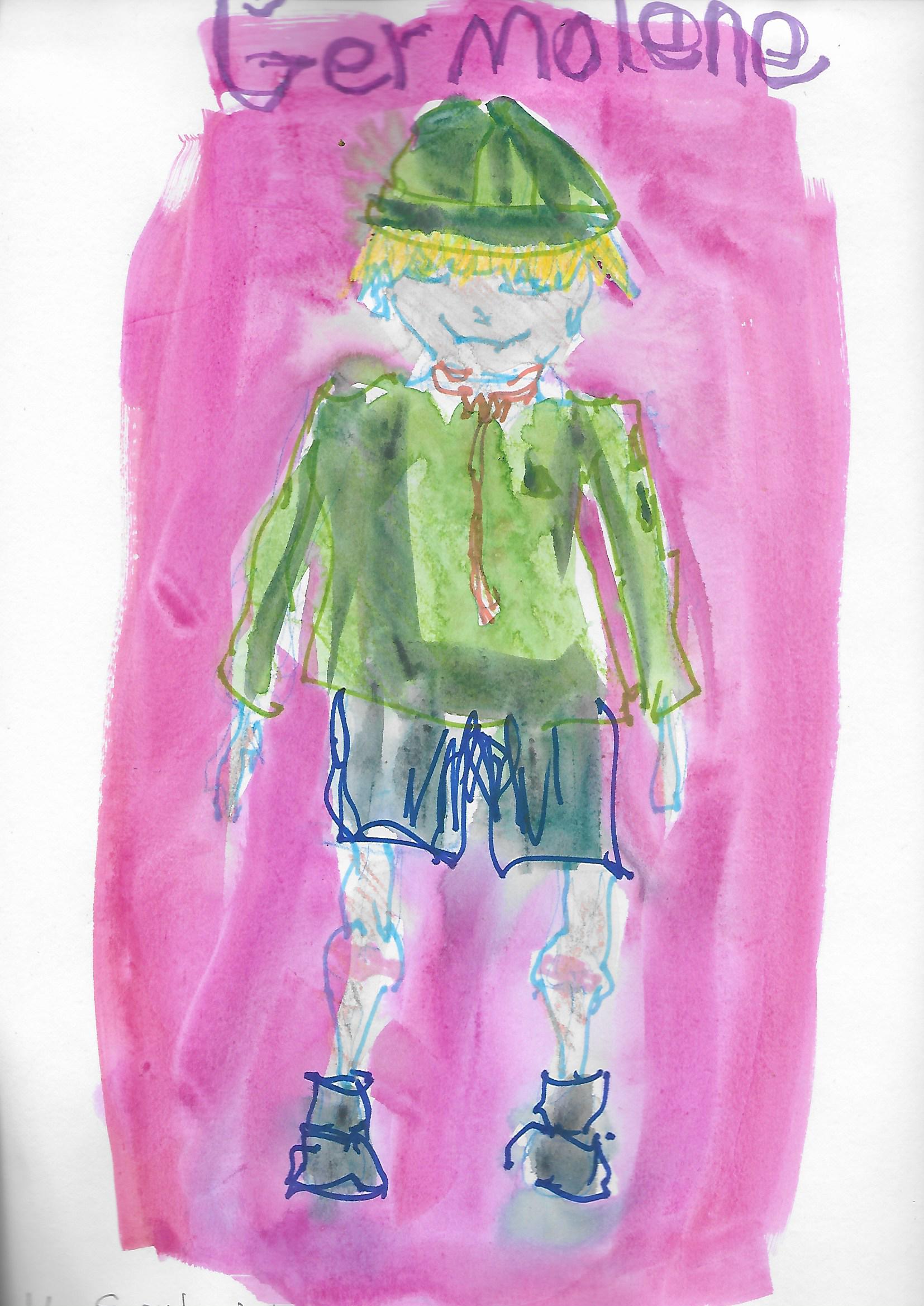
Happy Christmas 2025

Elf on a Mission
Watercolour & Ink
Stillman & Birn Alpha Series Sketchbook
14.0cm x 8.9cm (5.5" x 3.5")

Wishing You a Happy Christmas and a Wonderful 2026

Sunday, 7 September 2025

The Elements of Drawing - Exercise 2 (Take 2)

Mistletoe
The Elements of Drawing - Exercise 2

Ink on Paper
23cm x 16.5cm (9" x 6.5")

This is my second go at Exercise 2 from John Ruskin’s The Elements of Drawing (see The Elements of Drawing - Exercise 2). I followed the same variation of the exercise as last time:

Chose an illustration from British Phænogamous Botany; Or, Figures and Description of The Genera of British Flowering Plants

Viscum_Album, Mistletoe

Copied the outline as closely as I could with a soft pencil on to a piece of scrap paper.

Mistletoe
The Elements of Drawing - Exercise 2

Pencil on Paper
23cm x 16.5cm (9" x 6.5")

Used Gimp (a free image editing package) to compare my drawing (in red) with the original.

Assessing Outline 1

Corrected my outline based on the feedback from the comparison. 

Made another comparison and repeated the correct and compare steps until I reached a reasonable level of accuracy (this is my fifth and final version).

Assessing Outline 5

Transferred my drawing to a clean piece of paper (using a lightbox) and then drew over it in ink (the outline at the top of the post is the result).

The exercise provides good practice for drawing by eye. It offers an opportunity to think about and test different strategies to obtain an accurate result.

For the last step, Ruskin suggests:

rest your hand on a book about an inch and a half thick, so as to hold the pen long; and go over your pencil outline with ink, raising your pen point as seldom as possible, and never leaning more heavily on one part of the line than on another.

I can’t get on with resting my hand on a book. In my first attempt I contrived a hand position which allowed me to “hold the pen long” while lightly resting my wrist on the paper. This time I didn’t rest my hand on anything. I tried to draw from my shoulder and maintain the slow control that Ruskin demands. The crux (for me) is to hold the pen so that it barely touches the paper. This allows it to easily move in any direction without catching on the paper. I am still using a fineliner - which is cheating because it is far move forgiving than a nib and less likely to catch or cause a blot if you hesitate.

Sunday, 27 July 2025

The Elements of Drawing - Exercise 2

Wild Tulip
The Elements of Drawing - Exercise 2
Ink on Paper
25cm x 10cm (10" x 4")

Exercise 2 from John Ruskin’s The Elements of Drawing is about copying an outline drawing of a plant.

Ruskin recommends Baxter's British Flowering Plants.

I found on online copy of British Phænogamous Botany; Or, Figures and Description of The Genera of British Flowering Plants by William Baxter, but it’s not very inspiring. The illustrations aren’t just outlines. Most of the drawings have hatch line shading and are partially obscured with watercolour. 

The exercise has three almost distinct parts. The instructions for the first part are:

Copy any of the simplest outlines, first with a soft pencil, following it, by the eye, as nearly as you can; if it does not look right in proportions, rub out and correct it, always by the eye, till you think it is right.

I picked an image of a Tulip. 

Tulipa Sylvestris, The Wild Tulip

This is my first attempt at the outline:

Wild Tulip - Outline 1
The Elements of Drawing - Exercise 2
Pencil on Paper
25cm x 10cm (10" x 4")

The next step is 

lay tracing-paper on the book; on this paper trace the outline you have been copying, and apply it to your own; and having thus ascertained the faults, correct them all patiently, till you have got it as nearly accurate as may be. 

Instead of using tracing paper I overlayed the two drawings in Gimp (a free image editing package). This is my first outline (in red) superimposed on the original.

Assessing Outline 1

It took me 5 passes to get to this.

Assessing Outline 5

This is as accurate as I am going to achieve. Eventually, you get to a point of diminishing returns because depending on how you line up the drawings a part that looked good in the previous comparison, suddenly looks worse.

The third part is to draw the image in ink:

take a quill pen, not very fine at the point; rest your hand on a book about an inch and a half thick, so as to hold the pen long; and go over your pencil outline with ink, raising your pen point as seldom as possible, and never leaning more heavily on one part of the line than on another.

As soon as you can copy every curve slowly and accurately, you have made satisfactory progress; but you will find the difficulty is in the slowness. It is easy to draw what appears to be a good line with a sweep of the hand, or with what is called freedom; the real difficulty and masterliness is in never letting the hand be free, but keeping it under entire control at every part of the line.

The point of the exercise is:

The power to be obtained is that of drawing an even line slowly and in any direction

The pen should, as it were, walk slowly over the ground, and you should be able at any moment to stop it, or to turn it in any other direction, like a well-managed horse.

Ruskin bemoans:

 In most outline drawings of the present day, parts of the curves are thickened to give an effect of shade; all such outlines are bad,

I embraced the aim of the exercise, but I balked at the use of a quill and resting my hand on a book. I tried a variety of fountain pens and fineliners and contrived a hand position which allowed me to “hold the pen long” while lightly resting my wrist on the paper. The image at the top was drawn with a fineliner - which is probably cheating. My plan is to get the hang of using a fineliner for the exercise and then try using a dip pen.

Sunday, 29 June 2025

The Elements of Drawing - Exercise 1

The Elements of Drawing - Exercise 1
Ink on Paper
18cm x 15.75cm (7" x 6.25")

I seem to be “drawn” to old art instruction books. John Ruskin (1819-1900) wrote "The Elements of Drawing" in 1856. It’s amazing to follow lessons written by a contemporary and friend of J. M. W. Turner (1775-1851).

I like that Ruskin is more interested in helping his readers to learn to love nature and appreciate great art than he is in teaching them to draw, but the book won’t be to everyone’s taste. The writing and overall tone is old fashioned and authoritarian.

The first exercise is to create blocks of smooth tone using a fine pointed steel nib. Ruskin recommends using “one of Gillott's lithographic crowquills”. Surprisingly, 170 years later, you can still buy these. I am using the 659 mapping nib which seems very fine and very stiff.

One of Gillott's lithographic crowquills

You draw boxes and fill them in with crossed lines “so completely and evenly that it shall look like a square patch of gray silk or cloth, cut out and laid on the white paper”.

If areas of the square are too light, you darken them by drawing more lines or dots. If areas of the square are too dark, you “use the edge of your penknife very lightly, and for some time, to wear it softly into an even tone”. 

This is all more difficult than it sounds. The nib and the knife are both difficult to master. Every time you darken an area by adding more ink, the overall tone of the square gets darker. Every time you try to lighten the tone with the penknife, the paper gets rougher and becomes more unpredictable in how it takes ink. Eventually the paper becomes so rough that further improvement is impossible. 

It is difficult to know whether you've successfully completed the exercise. Initially, I thought my efforts were relatively poor when compared with the example for the exercise. 

The Elements of Drawing - Exercise 1

But the example is a dark square, which Ruskin acknowledges is easier to achieve than a lighter one. I flicked ahead to Exercise 3 in which you create a greyscale. 

The Elements of Drawing - Exercise 3

Parts of this look rougher than my efforts, so I’m calling Exercise 1 done and I will reevaluate my progress when I try the greyscale in Exercise 3.

Sunday, 2 March 2025

The Creative License

20. Make It Yours
The Creative License
Gouache & Watercolour Pencil
Stillman & Birn Alpha Series Sketchbook
16.0cm x 16.0cm (6.25" x 6.25")

 On January 1, I started Danny Gregory’s course The Creative License

4. Childs Play
The Creative License

Graphite Pencil
Stillman & Birn Alpha Series Sketchbook
28.0cm x 20.0cm cm (11" x 8")

The course is billed as 

Your invitation to reconnect with your creativity. It’s not about mastering technical skills or creating flawless masterpieces. It’s about discovering the artist inside you and giving yourself permission to create—without fear, judgment, or expectations.

5. Reinventing Our Tools
The Creative License

Watercolour, Ink and Wax Crayon
Stillman & Birn Alpha Series Sketchbook
20.0cm x 28.0cm cm (8" x 11")


Danny based the course on his book of the same name (The Creative License). He expanded the concepts from the book into 31 lessons, one for each day of the month.

11. It's Complicated
The Creative License

Watercolour & Ink
Stillman & Birn Alpha Series Sketchbook
28.0cm x 20.0cm cm (11" x 8")

The lessons are about:

  • Overcoming the fear and self-doubt about making art.
  • Experimenting, trying new things and embracing joyful, messy, playfulness.
  • Integrating creativity into your daily life.

14. Scent & Art
The Creative License
Watercolour, Gouache, Marker and Wax Crayon
Stillman & Birn Alpha Series Sketchbook
28.0cm x 20.0cm cm (11" x 8")

The course was a revitalising start to the year. Everything was going well until the 29th, when I slipped on some icy decking, tore a hamstring (badly), blacked an eye and gave Elaine an unpleasant shock when she found me unconscious at the bottom of the stairs. It’s taken a while, but I'm recovering and finished the last few exercises.

29. Integration Challenge
The Creative License

Gouache
Stillman & Birn Alpha Series Sketchbook
16.0cm x 16.0cm (6.25" x 6.25")

The pictures on this post are my favourite pieces from the course. The one at the top and this last one are loose copies of Kurt Jackson pictures. They are significant because they don’t look like anything I’ve created before. They indicate a direction I want to explore.

Sunday, 19 January 2025

Foliage

In The Woods At Night
Watercolour on Paper
16.5cm x 24.5cm (6.5" x 9.5")

Foliage is the fifth topic in the Tree Techniques chapter of Creating Textures in Pen & Ink with Watercolor by Claudia Nice. 

In one of her examples she shades around some leaves to make them pop out of the picture. This reminded me of a layering technique John Lovett explains in his Textures, Techniques & Special Effects for Watercolor.  He uses negative painting to create the impression of layers of objects stacking on top of each other. Your start with a light wash, then you paint everything that’s not in the top layer with a slightly darker wash, then everything that’s not in the top 2 layers with a darker wash again, and so on. Once you have built up the layers, you go back to add texture and details.

The picture at the top of the post is based on 8 layers. Before I started painting, I painstakingly worked out the shape of what I was painting in each layer. 

In The Woods At Night - Layer 3

This is the third layer. The black is the area that I am not painting over. 

In The Woods At Night - Layer 4

This is the 4th layer. You paint less and less in each layer. Each time you paint an object it gets darker and recedes further into the shadows. I've been meaning to try this for years, so it's exciting to finally give it a try.

Sunday, 22 December 2024

Happy Christmas 2024


Christmas Tree 2024
Ink and Watercolour
Stillman & Birn Alpha Series Sketchbook
14.0cm x 8.9cm (5.5" x 3.5")

Happy Christmas and Best Wishes for 2025

This is our Christmas Tree. It is 48cm (19") tall from the bottom of the pot. We can't get at our usual decorations (it's a long story), so we are down sizing. Sorry for not posting much this year. Normal service should be resumed in 2025.

Sunday, 11 August 2024

Distant and Background Trees

Background Trees - Claudia Nice
Watercolour & Ink
Stillman & Birn Beta Series Sketchbook
11cm x 9cm (4.5" x 3.5")

Distant and Background Trees are the sixth and seventh topic in the Tree Techniques chapter of Creating Textures in Pen & Ink with Watercolor by Claudia Nice. It’s a few months since I’ve picked up Claudia’s book. An exercise from Liz Steel’s SketchingNow Watercolour on Location course inspired me to return. By chance, I’ve picked it up at almost the same point as I left off.

In an exercise about common landscape elements, Liz suggests studying how other artists paint and draw the subject. The first topic on the list is trees, providing the perfect opportunity to revisit Claudia's book.

Distant Trees - Claudia Nice
Watercolour
Stillman & Birn Beta Series Sketchbook
15cm x 14cm (6" x 5.5")

I made some notes about Claudia’s treatment of distant and background trees and tried to copy a couple of her examples. 

Middle Distance Trees - John Lovett
Watercolour & Ink
Stillman & Birn Beta Series Sketchbook
14cm x 11cm (5.5" x 4.5")

I also looked at advice from John Lovett. I studied his suggestions about trees in Textures, Techniques & Special Effects for Watercolor and Getting Started and tried to copy some of his examples.

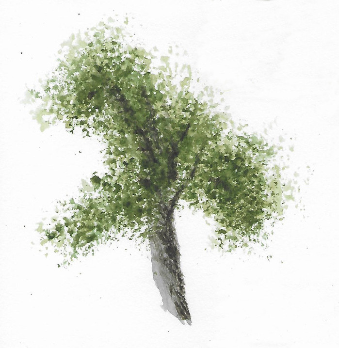
Tree - John Lovett
Watercolour
Stillman & Birn Beta Series Sketchbook
15cm x 14cm (6" x 5.5")

I’m pleased to get back to Claudia’s book and intend to continue learning from her content.

Sunday, 28 January 2024

Sketching From Nature

Lump of Moss
Ink and Watercolour
Stillman & Birn Alpha Series Sketchbook
14.0 x 20.3cm cm (5.5" x 8.0")

Since October 2023, I've been reading a section of the Curious Nature Guide by Clare Walker Leslie each week and using it as the inspiration for a sketching exercise. 

Rosemary
Ink and Watercolour
Stillman & Birn Alpha Series Sketchbook
14.0 x 20.3cm cm (5.5" x 8.0")

Using a prompt for what to sketch is helpful for a couple of reasons: 

  • It cuts down the time I need to procrastinate about what to draw.
  • It encourages me to try subjects I might not have otherwise chosen.


Early Autumn
Ink and Watercolour
Stillman & Birn Alpha Series Sketchbook
14.0 x 20.3cm cm (5.5" x 8.0")

The sketches have been of varying quality, but the results aren't that important. What matters is the time I've spent drawing and intently studying a subject. The pictures on this post are my favourites. You can see all 13 sketches on my YouTube channel (Sketching From Nature – Getting Started).

Lavender
Ink and Watercolour
Stillman & Birn Alpha Series Sketchbook
20.3 x 14.0cm cm (8.0" x 5.5")

My motivation for drawing at least one sketch from life a week is to make sure I keep training my hand eye coordination and the skills to accurately draw a subject. I want sketching from nature to be a reason to get outside and explore. I would like to become more knowledgeable and to develop a joyful appreciation of my environment. I'm keen to visually document my feelings about a place; the mood, the atmosphere and other things that a camera doesn't always capture. The sketches can then be a source of inspiration and reference material for paintings.

Sunday, 7 January 2024

Branches


Woodchester Beech
Watercolour on Paper
24.5cm x 15.5cm (9.75" x 6")

Branches is the fourth topic in the Tree Techniques chapter of Creating Textures in Pen & Ink with Watercolor by Claudia Nice.

This post has been a long time coming. The topics in this chapter are continuing to be challenging and educational. I made a few false starts on this subject trying to paint winter trees in sunsets. I’ve also been distracted by my new YouTube channel - Mark Bateman Art.

There are two videos about this painting: 

The blurred soft-focused background is painted with the same technique I used in the post about painting A Fuzzy Background.

I gave the tree some form with a modelling wash (mostly light grey with some dark in the shadows) and then slowly built up the shape and texture in layers using drybrush.

The finishing touch was to add some foreground leaves in gouache.

Hopefully, creating videos will become less time consuming and I will be able to get back to drawing and painting.

Sunday, 28 May 2023

Roots

Roots
Watercolour on Paper
24.5cm x 15.5cm (9.75" x 6")

Roots is the third topic in the Tree Techniques chapter of Creating Textures in Pen & Ink with Watercolor by Claudia Nice.

The topics in this chapter are challenging and educational. They are providing the perfect opportunity to experiment with and to develop a feel for drybrush technique. The key skill seems to be patience. I made quite a few mistakes with this picture, but I managed to correct some of them and making mistakes is a good way to learn.

James Gurney recently published an interesting post about Andrew Wyeth's use of drybrush (see What did Andrew Wyeth mean by "drybrush?").

Sunday, 7 May 2023

Hardwood Tree Bark

Beech Tree Bark?
Watercolour on Paper
24.5cm x 15.5cm (9.75" x 6")

Hardwood Tree Bark is the second topic in the Tree Techniques chapter of Creating Textures in Pen & Ink with Watercolor by Claudia Nice. 

Pretty sure this is some kind of Beech tree, but I have to put more effort into identifying trees. I should start by making notes about what I photograph as Elaine, Doris, and I wander around Westonbirt Arboretum (Will I ever learn - I took some photos today and still forgot to take notes).

All the texture on this tree was created using dry brush. This was a break through because until now I’ve struggled with the technique. I also used a masking fluid applicator to reserve some highlights. This is the most delicate use of masking fluid I’ve achieved, so I am pleased with the purchase (see Drawing and Painting the Landscape - Masking). 

You may have noticed I’ve not been posting as regularly as usual, this is because I am distracted by a side project. I’ve started a YouTube channel - Mark Bateman Art.If you are interested, please take a look.