Showing posts with label John Lovett. Show all posts

Sunday, 19 January 2025

Foliage

In The Woods At Night
Watercolour on Paper
16.5cm x 24.5cm (6.5" x 9.5")

Foliage is the fifth topic in the Tree Techniques chapter of Creating Textures in Pen & Ink with Watercolor by Claudia Nice. 

In one of her examples she shades around some leaves to make them pop out of the picture. This reminded me of a layering technique John Lovett explains in his Textures, Techniques & Special Effects for Watercolor.  He uses negative painting to create the impression of layers of objects stacking on top of each other. Your start with a light wash, then you paint everything that’s not in the top layer with a slightly darker wash, then everything that’s not in the top 2 layers with a darker wash again, and so on. Once you have built up the layers, you go back to add texture and details.

The picture at the top of the post is based on 8 layers. Before I started painting, I painstakingly worked out the shape of what I was painting in each layer. 

In The Woods At Night - Layer 3

This is the third layer. The black is the area that I am not painting over. 

In The Woods At Night - Layer 4

This is the 4th layer. You paint less and less in each layer. Each time you paint an object it gets darker and recedes further into the shadows. I've been meaning to try this for years, so it's exciting to finally give it a try.

Sunday, 11 August 2024

Distant and Background Trees

Background Trees - Claudia Nice
Watercolour & Ink
Stillman & Birn Beta Series Sketchbook
11cm x 9cm (4.5" x 3.5")

Distant and Background Trees are the sixth and seventh topic in the Tree Techniques chapter of Creating Textures in Pen & Ink with Watercolor by Claudia Nice. It’s a few months since I’ve picked up Claudia’s book. An exercise from Liz Steel’s SketchingNow Watercolour on Location course inspired me to return. By chance, I’ve picked it up at almost the same point as I left off.

In an exercise about common landscape elements, Liz suggests studying how other artists paint and draw the subject. The first topic on the list is trees, providing the perfect opportunity to revisit Claudia's book.

Distant Trees - Claudia Nice
Watercolour
Stillman & Birn Beta Series Sketchbook
15cm x 14cm (6" x 5.5")

I made some notes about Claudia’s treatment of distant and background trees and tried to copy a couple of her examples. 

Middle Distance Trees - John Lovett
Watercolour & Ink
Stillman & Birn Beta Series Sketchbook
14cm x 11cm (5.5" x 4.5")

I also looked at advice from John Lovett. I studied his suggestions about trees in Textures, Techniques & Special Effects for Watercolor and Getting Started and tried to copy some of his examples.

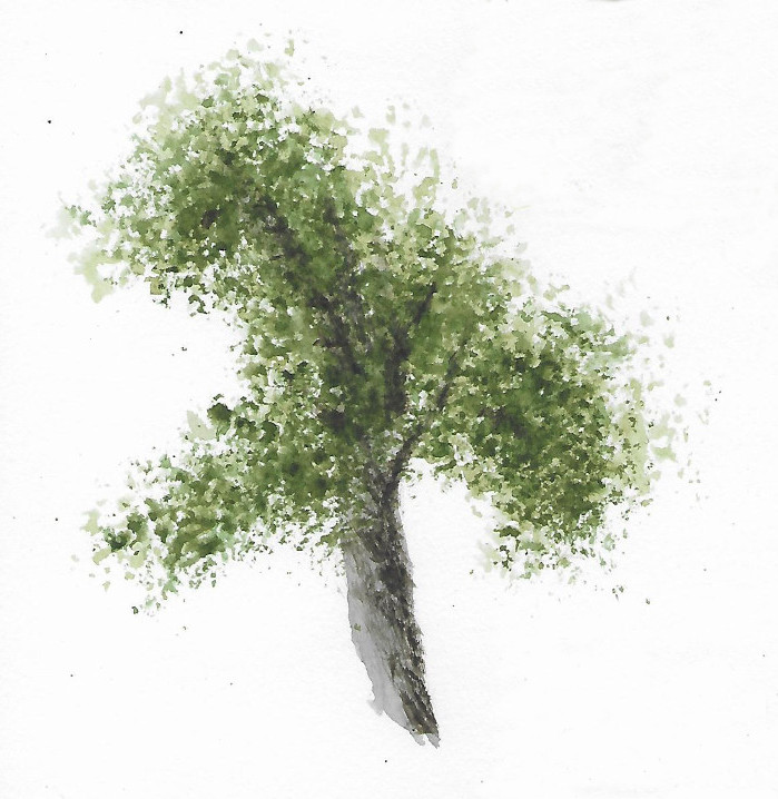
Tree - John Lovett
Watercolour
Stillman & Birn Beta Series Sketchbook
15cm x 14cm (6" x 5.5")

I’m pleased to get back to Claudia’s book and intend to continue learning from her content.

Friday, 17 February 2023

Old Wooden Structures

Winery Barns
Watercolour on Paper
16.5cm x 24cm (6.5" x 9.5")

Old Wooden Structures is the sixth and penultimate topic in the Wood Grain Patterns chapter of Creating Textures in Pen & Ink with Watercolor by Claudia Nice. 

These are some barns at one of the wineries in Niagara on the Lake. I took the photo in 2011, so I can’t be sure which winery and I suspect the barns have gone. The one on the right was the tasting room.

I cross referenced Claudia’s guidance with suggestions from John Lovett‘s book Textures, Techniques and Special Effects for Watercolor; which is sadly out of print.

Painting the texture of the timbers was harder than I expected even with two sources of advice - I need more practice.

Sunday, 8 January 2023

Polperro Cottages

Polperro Cottages
Watercolour on Paper
15.5cm x 23.5cm (6" x 9.25")

Last summer, Elaine, Doris and I spent a few days in Talland Bay, Cornwall to celebrate my birthday. It's a short walk along the costal path to Polperro in one direction and Looe in the other.

We all enjoyed the walk to and from Polperro, but our walk to Looe was less successful. It was a scorching hot day and Doris insisted on a taxi ride home (see Holiday Sketches).

Polperro is photogenic, but my photos didn't capture exactly what I wanted to paint. Some 7cm x 10cm thumbnails helped to explore and improve a composition. The initial pencil thumbnail was useful for deciding on the placement and configuration of shapes. It would have been handy if it had also given a definitive statement about dark, light and mid-toned shapes (see John Lovett - Thumbnail Sketches). I will include a 3 value tonal study when I next use thumbnails.

Polperro Cottages  – 7cm x 10cm (2.75" x 4") Thumbnail Sketches
Pencil and Watercolour on Paper
Stillman & Birn Alpha Series Sketchbook

The painting respects the spirit of the thumbnails except for the colour of the water. I prefer the turquoise in the second thumbnail, but if I try to adjust the painting, there is a chance I will spoil the reflections, so I will stick with what I have.

Sunday, 30 October 2022

Thumbnail Sketches

Aged Fencing - Preliminary Thumbnail Sketch - 15cm x 10cm (6" x 4")
Ink and Pencil on Paper
Stillman & Birn Alpha Series Sketchbook

Many art teachers and authors stress the importance of using quick thumbnail sketches to check and improve a composition before investing too much time and material in a painting that is doomed to fail – (see John Lovett - Thumbnail Sketches).

I used this approach recently while preparing for the Aged Fencing topic in Creating Textures in Pen & Ink with Watercolor by Claudia Nice.

Over the summer, I collected a load of reference photos while out walking with Elaine and Doris. 

Aged Fencing

This stile has the makings of an interesting subject, but the composition can probably be improved. I drew a couple of simple thumbnails to explore some ideas using a rectangle with the same proportion as the paper I will paint on. 

Aged Fencing - Preliminary Thumbnail Sketch - 7.5cm x 5cm (3" x 2")
Ink on Paper
Stillman & Birn Alpha Series Sketchbook

Thumbnail sketches are also a good way to find the challenges in the drawing. These highlighted the importance of perspective on the step. If the step is out of whack, it upsets the whole picture.

I drew the slightly larger version at the top of the page to finalize the composition and to think about the tones in the picture. I will do a couple of simple colour studies before starting to paint.

Sunday, 13 February 2022

More Quick Paintings

Castle Cove
Watercolour on Paper
12cm x 16.5cm (4.75" x 6.5")

These were all painted more slowly (with more layers) than the pictures on the original post (see Quick Paintings), but they have the same focus on experimentation, spontaneity, interesting washes and exploiting opportunities to work wet in wet.

Beachgrass
Watercolour on Paper
12cm x 16.5cm (4.75" x 6.5")

The picture of Castle Cove is based on the same photos I used for Castle Cove, Dartmouth in 2014.

Atlantic Waves
Watercolour and Gouache on Paper
16.5cm x 12cm (6.5" x 4.75")

The seascape uses an approach described by John Lovett (see Painting The Sea). It is inspired by the same photos I used as  reference for the waves in Granite.

Sunday, 11 July 2021

Stone Masonry

Harbour Wall
Watercolour on Paper
 22.5cm x 16.5cm (8.75" x 6.5")

Stone Masonry is the penultimate topic in the Earth Textures chapter from Creating Textures in Pen & Ink with Watercolor by Claudia Nice.

The picture is of a piece of St. Michael’s Mounts’ harbour wall. The outbreak of little white spot's are small limpets attached to the stones.

You find a photo of a section of the wall here https://www.stmichaelsmount.co.uk/images/uploads/feature/Village_and_Harbour/_2560px/st-michaels-mount-village-harbour-kathryn-yengel.jpg. The bit I painted is further round towards the mouth of the harbour - close to where you get on and off the ferries that operate at high tide.

As well as taking Claudia’s advice I also took some more of John Lovett’s advice from his book Textures, Techniques and Special Effects for Watercolor – as I have done for the last couple of topics.

Sunday, 13 June 2021

Adobe and Brick


Its Always Sunny
Watercolour and Charcoal on Paper
16.5cm x 22.5cm (6.5" x 8.75")

It’s always sunny in Kingswear. Whenever Elaine and I visit, we inevitably end up enjoying a drink on the Ship Inn’s patio after a long walk in the blistering sunshine. The Kingswear Hall is the other side of the road and the blue sky on a sunny day is the perfect back drop for its brickwork.

This picture was inspired by the Adobe and Brick topic in Creating Textures in Pen & Ink with Watercolor by Claudia Nice and those summer evenings at the Ship Inn.

As well as taking Claudia’s advice I also revisited John Lovett’s guidance  about brickwork from his book Textures, Techniques and Special Effects for Watercolor – which is now out of print, but there is plenty of good training material on his website.

Sunday, 4 April 2021

Drawing and Painting the Landscape – Drawing Games (Part 2)


Woodchester Park Boathouse
Drawing Games - Drawing and Painting the Landscape

Charcoal Pencil on Paper
30.5cm x 21.5cm (12" x 8.5")

This is the second instalment of my drawings from Lesson 22 of Drawing and Painting the Landscape by Philip Tyler..

The “game” for these drawings was inspired by a lesson from John Lovett about Drawing, Sketching and Scribbling

For this game, I used a charcoal pencil - a medium I do not normally use. I held the pencil further back from the point than usual and as though I had just picked it up from the desk - rather than using the normal tripod writing grip. These changes allow you to make more fluid marks by drawing from the shoulder instead of the wrist and to easily switch between using the very tip of the pencil and the side of the lead. The new grip initially felt clumsy, but John’s premise is that confidence and conviction are more important than accuracy.

One of the most important aspects of drawing is confidence. Make your marks with conviction and don't be too concerned with accuracy. It is much better to have a clean, confident mark in the wrong place than a timid, overworked line in the right place.

The picture at the top of the post is the boathouse in Woodchester park. I think it featured in some episodes of the Crown as the boathouse at Gordonstoun, but I can’t say for sure.

Winery Barns
Drawing Games - Drawing and Painting the Landscape

Charcoal Pencil on Paper
30.5cm x 21.5cm (12" x 8.5")

These are some barns at one of the wineries in Niagara on the Lake. I think it was Iniskillin, but I took the photo in 2011, so I can’t be sure about this either.

Digger Graveyard
Drawing Games - Drawing and Painting the Landscape

Charcoal Pencil on Paper
30.5cm x 21.5cm (12" x 8.5")

There is a digger graveyard in our local woods. These are the two latest arrivals. They seem much younger than the other residents. I was hoping they were just on holiday, but things were looking bleak because they hadn’t moved for weeks. Even Doris seemed worried about them. They just sat there slowly seizing up and rusting. Until yesterday. They’ve started to do some digging and it looks like they are trying to tidy the place up a bit. Happy Days.

Sunday, 25 October 2020

Rust

Heavy Duty
Watercolour and Ink on Paper
240mm x 135mm (9.5" x 5.25")

"Rust" is the last topic in the "Metallic Impressions" chapter of Creating Textures in Pen & Ink with Watercolor by Claudia Nice. This is the largest section in the chapter. Claudia provides advice about depicting rust on household objects and rusty objects in the landscape - like abandoned tractors and corrugated iron roofs. 

I couldn’t find many interesting rusty objects in or around the house and I didn’t want to work from a photograph. I settled for this adjustable spanner that is showing signs of age. The treatment is based on still life examples from John Lovett's books, videos and online content.

Sunday, 17 February 2019

Valentine’s Day Card Doodle


Happy Valentine’s Day Elaine

Hearts are difficult - to draw. They are all curves and changes of direction. It is easy to hesitate while drawing them and this results in scrappy looking lines. My trick is to use a brush pen on rice paper. This combination gives a pleasantly blotchy line – a bit of hesitancy is just lost in the noise.

I used Winsor and Newton alcohol based ProMarkers to colour the design and lettering. They also spread unpredictably on rice paper – which means they can be blamed for any tendency to stray outside the lines.

The overall effect is controlled untidiness (a phrase borrowed from John Lovett).

The pattern was inspired by an exercise on rhythm from Expressive Drawing by Steven Aimone. I sketched it out, then refined it by tracing it and tweaking it multiple times using an LED light box.

I drew the motif and the letters on separate pieces of rice paper before combining them in GIMP (GNU Image Manipulation Program - a free alternative to Photoshop) and uploading onto a Moonpig card.

Happy Valentine’s Day Elaine.

Sunday, 26 October 2014

It’s All About Preparation

Old Mill Creek (Work in Progress)
Watercolour on Paper
24cm x 34cm (9.5" x 13.5)

This is my current watercolour project – a view of Old Mill Creek near Dartmouth.

The picture is at a make or break point where I need to start adding details to bring it all together.

This phase highlights any weaknesses in a composition and there are a few issues I wish I’d addressed before starting the painting.

Old Mill Creek, Dartmouth

I should have been more diligent in my preparatory thumbnails. The trouble is I liked the slightly unorthodox composition of the main reference photograph. This lulled me into a false sense of security. I drew a couple of sketches to experiment with the sizes and positions of the swan and the boats, but I didn't complete a full exploration of the the composition with tonal and colour thumbnails (see  Castle Cove - Thumbnail Sketches and John Lovett's article Thumbnail Sketches)

Background Trees - Test Swatches

One piece of preparation that paid off was some experiments I did before painting the background trees. The basic technique is similar to one I've used previously (see Silver Birch) - paint a pale green wash and add darker and darker greens to it as it dries, I refined the technique for this picture in a number of trial swatches.

Sunday, 8 June 2014

Castle Cove - Thumbnail Sketches

Castle Cove
Watercolour and Acrylic Ink on Paper
7cm x 10cm (3" x 4")

At the last meeting of the Shelford Group of Artists (see Into the Light), I considered painting a view of Castle Cove in Dartmouth. I decided against it because I realised the picture would require a strong composition – a composition I was unlikely to get right first time.

Castle Cove, Dartmouth

Since the meeting, I’ve used thumbnail sketches to work on a composition – inspired by a recent article by John Lovett on his online watercolour workshop (see http://johnlovettwatercolorworkshop.com/thumbnail-sketches).

Thumbnails are small quick sketches. The sketches on this post are all about 7cm x 10cm (3" x 4"). John advises spending no more than a couple of minutes on each drawing.

Castle Cove, Pencil Thumbnails

John advocates thumbnail sketches as a technique for deciding on the tonal and colour composition for a picture work before committing your ideas to watercolour paper.

They are also fun to do and a great way to become more familiar with a subject which you haven’t sketched and are drawing from photographs.

Castle Cove, Coloured Thumbnails

John suggests using pencil sketches to decide on the tonal composition and coloured sketches to establish the colour palette.

Castle Cove - Initial Wash
Watercolour on Paper
24cm x 34cm (9.5" x 13.5")

This is the resulting composition transferred to watercolour paper with the initial wash in the sky and the sea.

Sunday, 29 December 2013

You Say Potato

Messing About with Gouache
Gouache on Paper
9.5cm x 3.75cm (4" x 3.25")

I am not sure how to pronounce gouache. British painters seem to say goo-ash, but John Lovett and other Australians seem to favour gw-ash. It may be unpatriotic, but I'm with the Australians on this one.

Sunday, 4 August 2013

This Little Piggy


This Little Piggy
Watercolour on Paper
34cm x 24cm (13.5" x 9.5")

Elaine and I saw this little piglet in one of the fields around the village. He was very young and seemed to be stumbling around with his eyes closed. The famer was feeding the elder pigs with huge buckets of left over cream cakes, iced buns and pastries. This little chap didn’t get his fair share.

I drew the picture with a soft carbon pencil, which makes a strong black line that the watercolour does not completely obscure. As a result, the initial drawing is visible in the final picture. This is quite appropriate for a blog that is about learning to draw. I used a similar technique in the painting of the sea gull on the What Comes Next? post.

The treatment of the painting is based on a short demonstration from John Lovett’s excellent book John Lovett’s Textures, Techniques and Special Effects for Watercolor.

Sunday, 26 May 2013

Fishing Boats

Brixham Fishing Boats
Watercolour on Paper
34cm x 24cm (13.5" x 9.5")

This group of fishing boats is alongside the New Pier in Brixham Harbour. I started the painting during the April meeting of the Shelford Group of Artists (see Water and Reflections) and I finished it yesterday.

The picture became a test bed on which to experiment with some of the techniques from  John Lovett’s Textures, Techniques and Special Effects for Watercolor. The book has a chapter about Boats and Water. I like a term John uses to describe his style – “controlled untidiness”. It is exactly what I am trying to achieve.

The first post on this blog included a painting of some trawlers in Brixham Harbour (see The Natural Way to Draw). The trawlers were moored the other side of the pier.

These pictures provide bookends to this part of the blog that documents my progress through the Natural Way to Draw.This evening I am going to start the last schedule. My original plan (from January 2011) was to finish next Saturday, but I’ve a busy week ahead. My current plan is to finish two days late on Monday 3rd of June.

Sunday, 3 June 2012

Peggy’s Neighbours

Peggy’s Neighbours
Watercolour on Paper
34cm x 24cm (13.5" x 9.5")

These are the buildings just to the right of the Peggy Guggenheim Collection (the Palazzo Venier dei Leoni) on the Grand Canal in Venice.

This is another picture in which I’ve used a design idea from John Lovett’s Studio Workshop post as a starting point.

The objective was to make a strong focal point from a uniform façade.

I used thumbnail sketches to reorganise the elements of the picture to create a focal point around the boats and the base of the pink building.

Peggy’s Neighbours - Thumbnail Sketches

I wanted to paint the picture in a loose style. With this in mind, I applied the first few washes with a 1-inch bristle decorating brush.

I am quite accurate with a half-inch brush, but this 1-inch brush is just too big and bushy for me to apply paint precisely.

It may seem obvious, but I am only just realising that for a loosely painted picture to work, the background usually has to be the loosest part of the whole painting.

An additional benefit of the large brush is if the initial paint marks are unfussy, I am less inclined to paint the details in a rigid fashion.

When I started to write this post, I tried to remember the location of the buildings. I looked at the photo for clues and for the first time recognised the distinctive palazzo creeping in from the left. I’ve been working with the reference photo for weeks without really looking at its left hand edge because it is not in my picture.

Saturday, 21 April 2012

On The Mud


On The Mud
Watercolour on Paper
34cm x 52cm (13.5" x 20.5")

Wells-Next-The-Sea is an attractive harbour and tourist resort on the North Norfolk coast.

The harbour is about a mile from the sea. The channel that connects them shrinks to a trickle at low tide. Boats that are moored along the channel sink on to the sand as the tide goes out and float again as the tide comes in.

The stimulus for the picture was another idea from John’s Lovett's Studio Workshop post.  The objective was to incorporate empty space into the picture and to confine details to one part of the image.

On The Mud - Thumbnail Sketches

The composition is taken almost directly from of one of my reference photos. I made most of the design decisions by drawing different framing options on the photograph. I drew a couple of thumbnail sketches to experiment with some variations, but did not discover any improvements. The main benefits of drawing the thumbnails were to improve my understanding of the composition and to practice drawing it before starting work on the watercolour paper.

One of the things that attracted me to this scene was the opportunity to paint a large graded wash (see Wash Swatches).  I knew there was a fair chance that I would not get a perfect graduation of colour in such a large wash, but I anticipated that any imperfections would add atmosphere rather than spoil the painting.

Sunday, 11 March 2012

Sky Wash 5

Sky Wash 5
Watercolour on Paper
26cm x 18.5cm (10.25" x 7.25")

This is the last and most complex of the simple sky demonstrations from John Lovett’s Splashing Paint DVD.

The sky starts with a watery dirty yellow wash in the middle of the paper. While this is still wet, grey is added to the lower part of the sky and blue is added to the top. Some of the yellow and some clean paper is left showing in the middle to form the brightest part of the clouds. The area around this bright area is then blotted with a crumpled paper towel to create the clouds.

After this first wash is dry, the bottom of the sky is glazed with blue to make it seem further away. Darker blue is added to the top to create some stronger edges on the clouds and some dark grey is added to strengthen the shadows in the bottom of the clouds.

Once the sky is dry, the foreground is added to give the sky some context.

This was a difficult sky to paint - the version on this post is is my third attempt. Making the clouds seem fluffy and cloudlike was particularly tricky.

My next wash experiment will be to paint some flat and graded washes. Then I will move on to some more skies from programmes on the Painting and Drawing channel.

Sunday, 26 February 2012

Sky Washes 3 and 4

Sky Wash 3
Watercolour on Paper
26.5cm x 19cm (10.5" x 7.5")

These are another two demonstrations from John Lovett’s Splashing Paint DVD.

The skies are atmospheric and direct the eye towards the centre of interest rather than accurately portraying a specific skyscape.

In both exercises the bulk of the foreground is painted first, the sky is painted around it and finally some details are added to the foreground.

Sky Wash 3 is painted as two wet in wet washes. The first wash is a light pink wash in the centre of the paper. Once this is dry, the blue wash is added, leaving a patch of light pink in the middle.

Sky Wash 4 is painted as a single wet in wet wash. The indigo is painted first - leaving a space for the white gouache. When this is added, it spreads out and fuses with the indigo.

I had a couple of goes at both these skies and I am tempted to repeat them again, but the Painting and Drawing channel is providing an ever expanding list of skies for me to try.

Sky Wash 4
Watercolour on Paper
26.5cm x 19cm (10.5" x 7.5")