Showing posts with label Cornwall. Show all posts

Sunday, 3 July 2016

June 2016 Sketches

Mousehole Harbour
22 June 2016
Ink and Watercolour
Stillman & Birn Alpha Series Sketchbook
20.3cm x 14.0cm (8.0" x 5.5")

June has been another productive month for sketching. My focus was Liz Steel’s online sketching class - SketchingNow. I completed lessons 6 and 7 and started lesson 8.

  • Lesson 6 is about drawing with minimal or no measuring of relative sizes and angles.
  • Lesson 7 is the halfway point in the course. It is an opportunity to put the ideas from the previous 6 lessons into practice. It coincided very neatly with Elaine and my holiday in Cornwall.
  • Lesson 8 is about exploring the balance between the amount of ink and colour in a sketch

The sketch at the top of this post is a view of Mousehole. The harbour was a pleasant place to sit and sketch.

A Handbag
1 June 2016
Watercolour and Watercolour Pencil
Stillman & Birn Alpha Series Sketchbook
20.3cm x 14.0cm (8.0" x 5.5")

The sketch of the handbag is one of the minimal setup sketches from lesson 6. I drew a quick sketch in watercolour pencil and then added watercolour and more watercolour pencil to build up texture and tone. I don’t use watercolour pencils very much and I enjoyed this exercise, so I plan to use them more often.

Cottage Roofs
4 June 2016
Ink and Watercolour
Stillman & Birn Alpha Series Sketchbook
20.3cm x 14.0cm (8.0" x 5.5")

These are the roofs of a row of cottages we can see from our back garden. The roofs on the foreground cottages look in need of repair, but they are not quite as wonky as the sketch suggests. This is another minimal setup exercise from lesson 6.

Another Pinecone
8 June 2016
Ink and Watercolour
Stillman & Birn Alpha Series Sketchbook
20.3cm x 14.0cm (8.0" x 5.5")

The instructions for lesson 7 suggest sketching seasonal things. I’ve never associated pinecones with June, but there were a lot falling from the trees at the beginning of the month. This sketch was based on a quick gestural setup in watercolour pencil. I drew the pinecone in ink, painted in watercolour and built up the texture and shadows with more ink, more watercolour and more watercolour pencil.

A Coachman's Posy
23 June 2016
Ink and Watercolour
Stillman & Birn Alpha Series Sketchbook
14.0cm x 20.3cm (5.5" x 8.0")

This is a vase of flowers in the lovely cottage we rented in Marazion - Coachman’s Cottage.
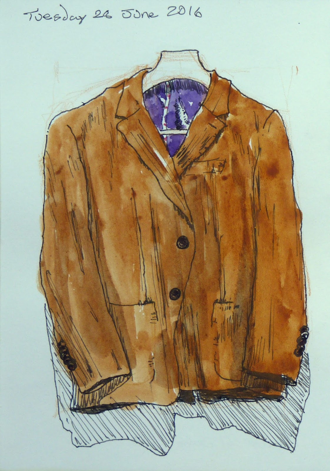
My Brown Jacket
28 June 2016
Ink and Watercolour
Stillman & Birn Alpha Series Sketchbook
14.0cm x 20.3cm (5.5" x 8.0")

This is a brown linen jacket with a fine blue pinstripe - which you can’t really see. I bought it for my sister Heather's wedding. The sketch is an experiment (from lesson 8) in using more ink line work than I normally do.  I’ve made the fabric look more like corduroy than linen, but I’m quite pleased with the result.

Nice Shorts
29 June 2016
Ink and Watercolour
Stillman & Birn Alpha Series Sketchbook
14.0cm x 20.3cm (5.5" x 8.0")

These are my gaudiest swimming shorts. The sketch is an exercise (from lesson 8) in drawing and painting a complicated pattern. I started with the intention of drawing the pattern accurately, but this was beyond my attention span. The drawing represents the spirit of the pattern rather than the actuality.

Sunday, 1 June 2014

An Atmospheric Sky

Across St Ives Bay
Watercolour on Paper
18cm x 28cm (7" x 11")

I learnt a lot from my experiments with skies at the last meeting of the Shelford Group of Artists (see Into the Light). They gave me an insight into how I want to paint and have inspired me to further experimentation.

The sky on this post is an attempt to emulate the atmospheric skies painted by Randall David Tipton. It was painted on to dry paper. I started with patches of yellow ochre in the clouds and then added some shadow colours, some clean water and  the blue of the sky. As the paints merged and dried, I softened some edges with a damp brush and dabbed at others with a paper towel.

This is basically the same technique as Sky Wash 5 painted with more confidence and bolder colours.

The scene is loosely based on the view of Godrevy Point and Island from St Ives.

Sunday, 16 March 2014

Making Corrections With Gouache

Smeaton’s Pier, St Ives
Watermedia and Oil Pastel on Paper
24cm x 34cm (9.5" x 13.5")

Smeaton’s Pier protects St Ives harbour from the sea. The pier was originally half its current length. The lighthouse was added when the pier was extended in the 1890s.

The picture started as an experiment in mixing oil pastels and acrylic inks with watercolour. I didn’t have any aspiration to produce a finished painting, but as it developed, I began to like it and started to wish I had taken more care painting the figures at the bottom of the wall.

What figures at the bottom of the wall?

Smeaton’s Pier, St Ives
Watermedia and Oil Pastel on Paper
24cm x 34cm (9.5" x 13.5")

I painted over them with gouache.

I started by lifting off as much of the figures as I could. I then painted over where they had been with a relatively thick layer of gouache and feathered this out to blend in with the rest of the wall. I used this as an opportunity to tone down some of the markings on other parts of the wall by glazing them with gouache.

I’ve never used gouache in this way before, but it’s a technique I will practice and refine. It won’t work in all paintings, but the flat matt appearance of gouache work lends itself to some materials, such as, harbour walls.

Sunday, 7 July 2013

What Comes Next?


Sorry About the Chips
Watercolour on Paper
24cm x 34cm (9.5" x 13.5")

I am back, completely refreshed after a break from blogging. Elaine and I spent a relaxing couple of weeks in Cornwall and the Isles of Scilly.

We saw the herring gull at the top of this post while we were enjoying a glass of Pimms in the garden of the Turks Head in Penzance. I cannot decide whether he looks contrite or like an evil Bond villain planning his next nefarious scheme.

Since we returned, I’ve been deciding on which aspects of drawing I want to improve:

  • Accuracy – The Natural Way to Draw does not offer much guidance about accurate draughtsmanship. The instructions for the Extended Gesture Study include the advice “You may use any and all methods at your command to arrive at the correct proportions and the posture”. I am going to reread Keys to Drawing by Bert Dodson as a refresher course on some of the methods to arrive at the correct proportions.
  • Composition - Composition by Arthur Wesley Dow looks like a good starting point to learn more about composition and design. Its approach seems to be learning by experimentation, which is exactly what I want. It is another old book - even older than The Natural Way to Draw. It was first published in 1899. 
  • Mark making – Dow recommends brush and ink as the best medium for the exercises in his book. I hope these exercises will also improve my line drawing and brushwork.
  • Visual memory – Studio Rousar started a memory-drawing group with weekly exercises in January 2013. I’ve started to follow these exercises, but I am half a year behind.

This seems like quite a workload. On top of this, I want to continue with the Daily Composition and Composition from Reproductions exercises from the Natural Way to Draw and find time to paint.

Lets see how it works out.

Sunday, 30 December 2012

Coverack Harbour

Coverack Harbour
Watercolour on Paper
19cm x 28cm (7.5" x 11")

This is a view of Coverack harbour for which I posted some preliminary sketches in October (see Preparations for Coverack Harbour). In the original post, I was hopeful the painting would be finished by the next weekend. In retrospect, this was slightly optimistic.

It has been great to have some time over Christmas to finish this off and to catch up with some other painting.

Coverack is a fishing village on the Lizard peninsula in Cornwall. Elaine and I are planning a visit in the summer as part of our excursion to Cornwall and the Scilly Isles. The picture is based on some of David and Jane’s holiday photographs.

Sunday, 14 October 2012

Preparations for Coverack Harbour

Coverack Harbour - Underdrawing
Carbon Pencil on Paper
38cm x 28cm (15" x 11")

This is the underdrawing for a painting of Coverack harbour. It is inspired by one of David and Jane’s holiday photographs.

It is a complicated scene, so I decided to explore it and get ready for the painting by drawing a preliminary study.

In the first attempt, I tried taking detailed measurements and alignments from the photo. After a while, I realised I wasn’t enjoying myself and the result was dreadful. It was stilted, unappealing and the dimensions were all wrong.

I started again by making an extended gesture study (see Section 13). I made refinements and corrections as I went along, but I focused on capturing the atmosphere of the scene rather than getting bogged down by measuring. It was an enjoyable way to spend a couple of evenings in a hotel.

Coverack Harbour - Gesture Drawing
Graphite Pencil on Paper
42cm x 29.7cm (16.5" x 11.75")

I continued the steps of the sustained study by making a contour drawing on tracing paper placed over the gesture drawing. I then used the tracing paper to transfer the image to the watercolour paper.

The result is not a particularly accurate or detailed interpretation of the photograph, but it suits my needs. I want to create the impression of a jumbled mass of boats in the harbour. I will use the drawing as a guide to where to paint, but I am not going to follow it slavishly.

I hope the painting will be ready to post next weekend, but more likely it will be the one after that.

Sunday, 15 July 2012

Bessy’s Cove

Bessy's Cove
Watercolour on Paper
36cm x 25.5cm (14" x 10")

Bessy’s Cove is on the south coast of Cornwall. It is part of Prussia Cove and is a few miles east of Marazion.

The picture was inspired by a photo from Coast magazine of a stormy sky over Prussia Cove.

My intention was to paint the gesture of the coastline without going into too much detail.

I drew some preliminary thumbnail sketches. The first sketch was an experiment to decide between a portrait or landscape composition. The second, third and fourth sketches were all about understanding the shape of the shoreline and cliffs. I drew the last sketch to decide where to place the main elements and as a rehearsal for the real drawing.

Bessy's Cove - Thumbnail Sketches

This picture has given me an urge to paint some sea cliffs – which is a good excuse for another trip to the South West. Fortunately, Elaine enjoys walking on the coastal path. We could even rent a boat.

Sunday, 6 May 2012

Tonal Studies


Porthmeor Beach
Watercolour on Paper
13.5cm x 18.5cm (5.25" x 7.25")

Maggie Latham is writing an informative series of tutorials about Exploring Colour in Watercolour. She is being very generous with her knowledge.

In the third post, she explores the use of water in creating tonal value.

For some time, I’ve intended to experiment with painting tonal sketches. Maggie’s tutorial has provided the spur for me to start. An extra incentive is I am spending a lot of time in hotels and I’ve been looking for something to do in the evenings. Until now, I have shied away from painting because of transporting my painting paraphernalia, but I can cope with the one brush and one tube of paint I need for this tutorial.

The first assignment is to paint a value scale from black to white in 10 steps – starting with almost pure pigment and then adding more and more water to create lighter and lighter greys.

Tonal Scales
Watercolour on Paper
28cm x 38cm (11" x 15")

In my first attempt (the leftmost), I added a brush full of water between each step. In the last few sections, I added more water because the mix wasn’t becoming light enough.

In the second attempt (the middle one), I added 2 brushes of water between each step.

In the third attempt (the rightmost), I started by adding one brush of water and gradually increased the amount of added water as I moved down the page.

I intend to repeat these scales using a more scientific approach. I will print a 10 step grey scale, and attempt to replicate the tones while making notes about how much water I add.

After the scales, the tutorial progresses to painting tonal sketches. Maggie’s guidance is to work without a preliminary pencil sketch and to build the pictures up in layers working from light to dark.

Saint Michael's Mount
Watercolour on Paper
18cm x 13cm (7" x 5")

The pictures on this post are coastal views from Devon and Cornwall. I painted them with a number 10 round brush. It would have been nice to use a rigger to create some finer lines, but I need to practice painting details with a larger brush.

Towards Stoke Fleming
Watercolour on Paper
18.5cm x 13cm (7.25" x 5")

When I am next away from home I will paint more of these studies. I may even start working on the rest of Maggie’s tutorials because if I can cope with packing 1 tube of paint, I must be able to manage 3 or 4 tubes.

Sunday, 20 November 2011

Starfish

Starfish
Watercolour on Paper
25.5cm x 35.5cm (10" x 14")

This picture has been on my to do list since I started painting. It is based on some photos I took on my birthday in 2005 while Elaine and I were on holiday with Paul and Wendy in Cornwall.

I worked hard during the week to have this painting ready for today because I’ve spent the weekend with David in the Peak District.

We did some walking, but probably not enough to offset the eating and drinking we did in Ashbourne.

I spent Saturday looking for a particular type of river view. This must have blinded me to other ideas because now I realise I want to paint the cliffs in Dovedale. Unfortunately, I didn’t take any photographs so I am planning a return visit with Elaine.

Sunday, 14 August 2011

Across the Bay


Across the Bay
Watercolour on Paper
24cm x 35.5cm (9.5" x 14")

Do you know where this is? I took the photo on a day when Elaine and I visited Tate St Ives. It must be somewhere around there, but I cannot place it exactly. It might be Cardis Bay.

It is scene I’ve tried to paint before because of the incredible colours in the sea. A few years ago, I spent weeks working on a painting in acrylics and gave up because I couldn’t do it justice.

This was a much less pressured attempt. I painted it as a warm up over the last couple of mornings. It was an opportunity to try a few things out and to practice painting in a more carefree style. I really enjoyed it.