Showing posts with label Paul Foxton. Show all posts

Sunday, 8 February 2015

Repetition


Repetition is the fourth of five principles of composition identified by Arthur Wesley Dow in Chapter 3 of Composition.


The first three principles are:


Dow defines Repetition as:
"The production of beauty by repeating the same lines in rhythmical order."
He identifies repetition as the basis of all music and poetry, but stresses that repetition by itself does not create beauty:
"A mere row of things has no art-value. Railroads, fences, blocks of buildings and all bad patterns are like doggerel rhyme examples of repetition without art."


The chapter contains exercises based on creating repetition in borders and surface patterns.  I gave them up last April because the hand position required to hold the Japanese brush upright was stressing my forearm, but I restarted them a few weeks ago. I am experimenting with different hand positions, but I don’t enjoy using the brushes and this has led me to question the benefit of the assignments and whether completing the book is a good use of time.

Happily, Paul Foxton published a post about Repetition this week that has encouraged me to persevere (see Hidden Patterns: How to design pictures like Veronese). 


Sunday, 12 January 2014

Subordination

Subordination - Apples
Ink on Rice Paper
15cm x 18cm (6" x 7")

Subordination is the third of the five principles of composition from chapter 3 of Composition by Arthur Wesley Dow.

The first two principles are:


Dow defines subordination:
"To form a complete group the parts are attached or related to a single dominating element which determines the character of the whole. A tree trunk with its branches is a good type of this kind of harmony; unity secured through the relation of principal and subordinate, even down to the veinings of leaves - a multitude of parts organized into a simple whole." 

Examples of Subordination - copied from Composition
Ink on Rice Paper
18cm x 19cm (7" x 7.5")


He identifies 3 types of subordination that can appear in line drawings - subordination:

  • By grouping about an axis, as leaf relates to stem, branches to trunk.
  • By radiation, as in flowers, the rosette, vault ribs, the anthemion (a motif in decorative art that resembles the fan-shaped leaves of a palm tree – also called a palmette). 
  • By size, as in a group of mountain peaks, a cathedral with its spire and pinnacles, tree clusters, or Oriental rug with centre and border 

Subordination - Sailing Off Brighton
Ink on Rice Paper
16.5cm x 25.5cm (6.5" x 10")

Dow stresses Subordination is about fine relationships – it is not as simple as making one object bigger than the others:
"A work of fine art constructed upon the principle of Subordination has all its parts related by delicate adjustments and balance of proportions, tone and color. A change in one member changes the whole."

Subordination - Orchids
Ink on Rice Paper
12.5cm x 24cm (5" x 9.5")

There is a variety of exercises:

  • Copying examples from the book
  • Arranging drawings of flower or fruit with stem and leaves in various rectangular spaces
  • Designing rosettes, anthemions, and palmettes
  • Finding examples of subordination in nature and the landscape 

Subordination - Scallop Shell Palmette
Ink on Rice Paper
20cm x 18cm (8" x 7")

Dow’s instructions for the exercises are:
"After choosing the best out of many trial sketches, draw in line with the Japanese brush. Then, for further improvement in arrangement, and refinement of line-quality, trace with brush and ink upon thin Japanese paper." 

Preparing the Apples

The photograph shows some of my preparatory sketches for the apple composition. I used a marker pen or a brush pen on tracing paper for most of the drawings. The photocopies on the right of the picture are the images from the book that I used as a starting point.

Subordination - Holly
Ink on Rice Paper
14cm x 12.5cm (5.5" x 5")

The first sketches of the orchid and the holly appear on Why Can't Plants Keep Still? and Preparing for Christmas. The drawings on this post are the result of many experiments with cropping and rearrangement of the elements.

The process of tracing and refinement is more enjoyable than I anticipated. I could happily spend more time improving the drawings, but I've been working on them for weeks - its time to move on.

Paul Foxton has some interesting posts about Subordination (see A Powerful Way To Improve Your Compositions You (Probably) Haven't Tried and Designing Nature: A Series of Composition Exercises - Part One)

Sunday, 6 October 2013

Transition

Transition - Towards Stoke Fleming
Ink on Rice Paper
28.5cm x 20cm (11.25" x 8")

Transition is the second principle of composition from chapter 3 of Composition by Arthur Wesley Dow. The first principle is Opposition. Dow defines Transition as a step beyond Opposition.
"Two straight lines meeting in opposing directions give an impression of abruptness, severity or even violence."
"If a third line is added, the opposition is softened and an effect of unity and completeness in produced."
"This combination typifies beauty itself which has been defined as consisting of elements of difference harmonized by elements of unity."

Examples of Transition - copied from Composition 
Ink on Rice Paper
18cm x 9cm (7" x 3.5")

The exercises for Transition include:

  • Copying examples from the text
  • Designing corner ornaments for panels and book covers
  • Drawing examples from nature

Captial - Example of Transition - copied from Composition
Ink on Rice Paper
9cm x 10cm (3.5" x 4")

The drawing at the top of the post is a scene from the South Devon coast. The same view appeared as a tonal sketch on Tonal Studies. This is probably quite a subtle example of transition, because the opposing lines meet off the page, but I couldn't find many better examples in my collection of photographs.

Corner Design with Diagonals
Ink on Rice Paper
14cm x 14cm (5.5" x 5.5")

I am persevering with using Japanese brushes for the exercises, but I struggle to draw pleasing lines with them. This is a good indication I should keep practicing, but it is frustrating because I can draw better lines with a marker pen.

Corner Design with Chequers
Ink on Rice Paper
14cm x 14cm (5.5" x 5.5")

You can find another description of Transition in the post Principles of Composition: Opposition and Transition  on Paul Foxton’s  Learning To See blog.

Sunday, 25 August 2013

Opposition

Opposition - Blakemere Moss
Ink on Rice Paper
28cm x 20cm (11" x 8")

Chapter 3 of Composition by Arthur Wesley Dow is about creating harmony in line drawings. His central premise is that harmony requires good spacing. He identifies five ways of arranging and spacing lines that he calls “Principles of Composition”. The first of these is Opposition, which he defines as:

Opposition - Two lines meeting form a simple and severe harmony.

The initial exercise for the topic is to copy examples from the text. This provided me with some useful extra practice in line drawing with a Japanese brush (see Line Drawing).

Examples of Opposition - copied from Composition
Ink on Paper
25cm x 29cm (10" x 11.5")

Dow recommends holding the brush perpendicular to the paper. At first, I was in danger of giving myself an RSI because my hand position was so cramped and unnatural, but I’ve gradually found a more relaxed way to hold the brush.

This has made the exercises more enjoyable and has reduced the unsteadiness in my lines, but they are still quite shaky. The brush exaggerates every movement, but Dow suggests not worrying because “Slight waverings are not objectionable; in fact they often give character to the line.”

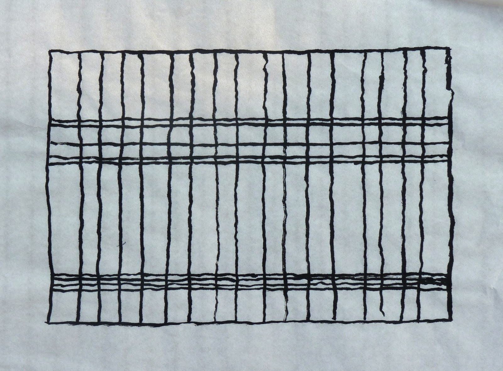
The second exercise is to design mouldings, plaids and rectangular panels based on arrangements of straight lines.

Dow recommends the proportions of the Parthenon, so I started by designing a plaid based on a view of the Parthenon.

Parthenon Plaid
Ink on Rice Paper
26cm x 18.5cm (10.25" x 7.25")

I followed this by trying to spoil the underlying grid from Mondrian’s “Composition with Yellow, Blue and Red”


Mondrian Plaid
Ink on Rice Paper
18cm x 18cm (7" x 7")

I discovered that if you add too many lines you can spoilt it, but you can add a couple of lines just about anywhere with relative impunity.


Spoiling Mondrian Plaid
Ink on Rice Paper
18cm x 18cm (7" x 7")

I concluded the exercise with some plaids based on famous design maxims: rules of thirds, golden ratio, rabatment, L shaped composition and H shaped composition.

Design Maxim Plaids
Ink on Paper
11.5cm x 23cm (4.5" x 9")

Do plaids based on these divisions look any better than plaids based on arrangements that are more random? I don’t think they do. To my eye:
  • A single division along the centre line is the only arrangement that particularly jars 
  • The intersections of horizontal and vertical lines are pleasing - precise placements don’t seem to be that important
  • Equally spaced lines are agreeable, but some disorder is more interesting
  • Repetition with variation is particularly appealing

The last exercise is to find and draw examples of Opposition from nature. The drawing at the top of the post is based on the photographs I used as reference for Blakemere Moss.

You can find another description of Opposition in the post Principles of Composition: Opposition and Transition on Paul Foxton’s  Learning To See blog.


Sunday, 14 July 2013

Line Drawing


Sarah in Ink
Ink on Rice Paper
29cm x 21.5cm (11.5" x 8.5")

Arthur Wesley Dow recommends Japanese brushes, ink and paper for the majority of the exercises in Composition.

I’ve invested in some Japanese brushes, but I’m using bottled Indian ink instead of a Japanese ink stick. The ritual of grinding ink at the start of each practice session appeals, but I don’t have room for any more art paraphernalia – especially anything with the potential for causing ink related disasters.

Line Drawings - mainly copied from Composition
Ink on Paper
28cm x 38cm (11" x 15")

The purpose of the initial exercises is to become accustomed to the tools and to “put the hand under control of the will”.  I started by copying illustrations from the book and then (for variety) copied some of my own pencil and crayon drawings.

The picture at the top of the post is based on a drawing from a Natural Way to Draw exercise that I posted in April (Another Modelling the Straight and Curve Study).

Dow says not to spend too much time on these initial exercises, so this week I am moving on to the first exercises in composition.

Sinister Eyes
Ink on Paper
18cm x 10cm (7" x 4")

You can find more information about the exercises in the post Meditations on Line: Dow Composition Practice, Chapter Two on Paul Foxton’s Learning To See blog. This is where I first learnt about Dow’s book and was the inspiration for including it in my art education.