Showing posts with label Sky Wash. Show all posts

Sunday, 5 June 2022

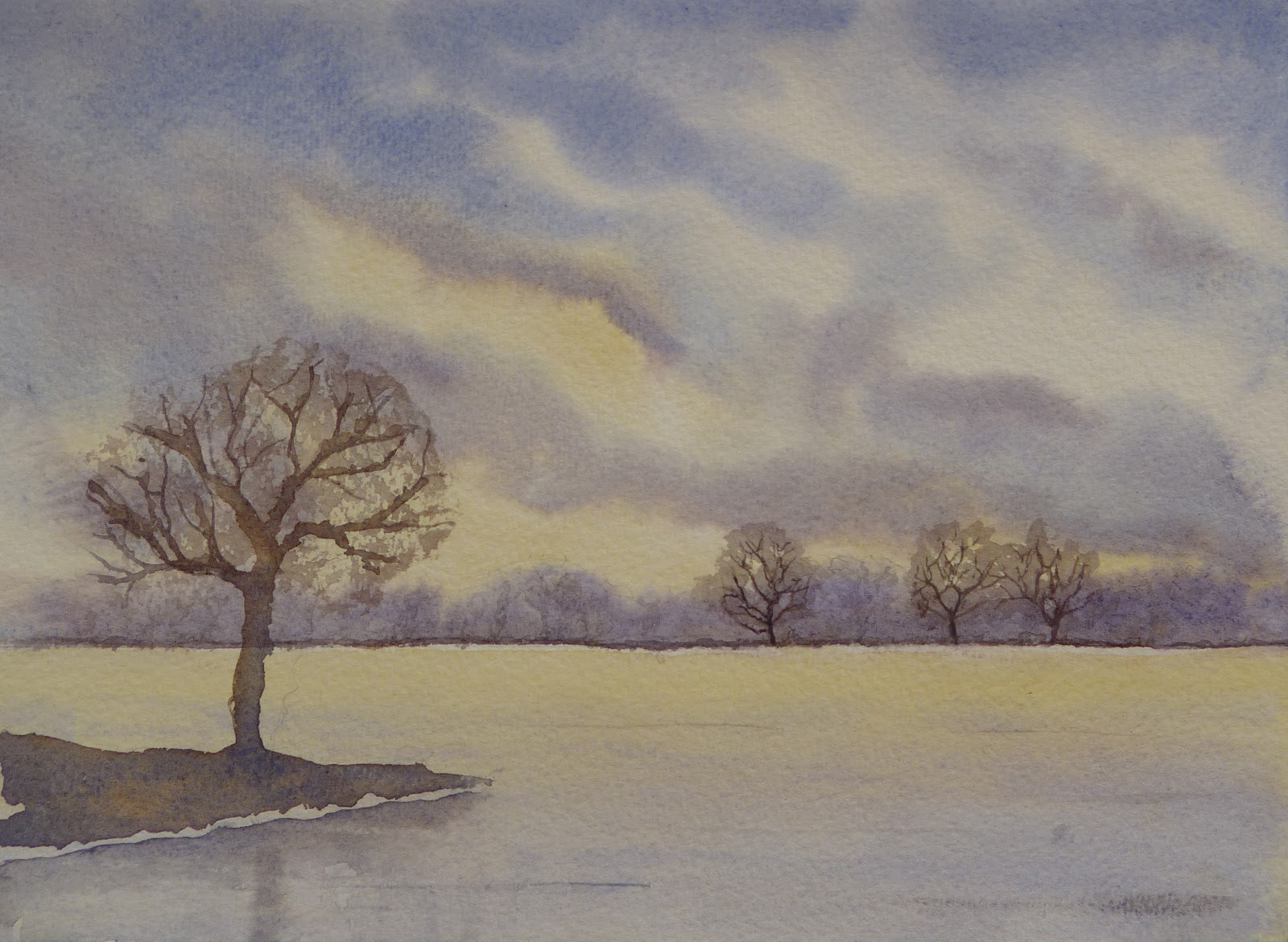
Sunrise

Sunrise
Watercolour on Paper
12cm x 16.5cm (4.75" x 6.5")

Sunrise is the seventh topic in the Skies and Weather chapter of Creating Textures in Pen & Ink with Watercolor by Claudia Nice.

Claudia observes 

Traditionally the sunrise has been thought of as pastel and delicate. In truth the sunrise can rival the sunset in colouration.

This matches my experiences – I’ve seen some spectacular sunrises – but not very many - I am usually asleep. I should make more effort to get up to draw and paint in the early morning. Sunrise is an easier time to draw and paint than sunset because at sunset you are racing to finish before it gets dark - at sunrise you can always finish off from memory as the sky gets lighter.

This is another sky based on a Javid Tabatabaei demonstration - How to paint sky in watercolor painting. This one was a learning experience, this picture is my twelfth attempt at the sky and there is still room for improvement. It is critical to have the right relative intensity of yellow and blue (and the right pigments), so you don’t end up with green. Then there is the timing of the different layers – waiting until the sky has just the right amount of wetness before adding the clouds. Javid’s clouds look much more natural than mine – which is something for me to work on.

Sunday, 24 April 2022

Sunset


Javid's Sunset
Watercolour on Paper
12cm x 16.5cm (4.75" x 6.5")

Sunset is the sixth topic in the Skies and Weather chapter of Creating Textures in Pen & Ink with Watercolor by Claudia Nice.

Once again I cross referenced Claudia’s advice with a section in James Gurney’s Color and Light (A Guide for the Realist Painter). I also watched a YouTube video about painting sunsets by Javid Tabatabaei - How to paint sunset and landscape in watercolor. The picture at the top of the post is my version of Javid’s painting. I watched his video in short segments in one room and ran in to another to work on my painting. Elaine asked me to turn off the sound. If you watch the video, you will understand why.

West Pier Sunset
Watercolour on Paper
12cm x 16.5cm (4.75" x 6.5")

This is a view of the approach to the ruined West Pier in Brighton from some photos I took in 2007. I sent the best part of a year working in Brighton – I’ve had worse jobs.

Porth Mellon Sunset
Watercolour on Paper
12cm x 16.5cm (4.75" x 6.5")

This is a view from Porth Mellon beach on St Marys (Isles of Scilly) from some photos I took in 2014. Elaine and I were walking to Juliet’s Garden for dinner.

Sunday, 27 March 2022

Snow

Snow
Watercolour on Paper
12cm x 16.5cm (4.75" x 6.5")

Snow is the fifth topic in the Skies and Weather chapter of Creating Textures in Pen & Ink with Watercolor by Claudia Nice.

I cross referenced Claudia’s advice with a section on Snow and Ice in the Atmospheric Effects chapter in James Gurney’s Color and Light (A Guide for the Realist Painter)

The first painting is based on some photos I took on the outskirts of Swindon back in January 2013. I drew the snow-covered tree trunks with masking fluid before starting the painting. Claudia suggests adding salt crystals to a wash to create snowflakes – I mistimed the application because the snowflakes are not particularly prominent.

Snow 2
Watercolour on Paper
12cm x 16.5cm (4.75" x 6.5")

The second picture is based (loosely) on one of James’ studies. This time, I created the light tree trunks on the darker background by applying the paint and partially scraping it off before it dried.

Sunday, 27 February 2022

Thunderstorms

Lightning
Watercolour on Paper
12cm x 16.5cm (4.75"x 6.5")

Thunderstorms is the fourth topic in the Skies and Weather chapter of Creating Textures in Pen & Ink with Watercolor by Claudia Nice.

I haven’t seen lightning in ages and I don’t have any photographs. This picture is based on Claudia’s example, memory and imagination.

Claudia suggests drawing the lightning with masking fluid (frisket), so you can paint clouds over it, rather than having to carefully paint around it. This worked reasonably well, but if I paint lightning again, I will make the lines thinner and more spidery (is spiderier a word?). I was glad for the prod to check my bottle of masking fluid because I am planning to use it soon on a bigger picture. I don’t use it very often and usually when I reach for the bottle, I find its all dried up, rubbery and unusable.

Sunday, 16 January 2022

Quick Paintings


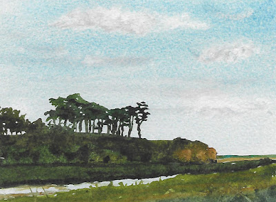
Otter Estuary
Watercolour on Paper
16.5cm x 12cm (6.5" x 4.75")

Watercolour is a medium with personality. The inexperienced find it unpredictable. It appears to have a mind of its own - there is even a YouTube channel called The Mind of Watercolor.

While novices flounder, experts charm the paint to their will. The only way to develop and maintain this rapport is by painting a lot - something I haven't been doing for the last few years. My plan to rectify this is to paint at least a couple of quick watercolours each week. They should only take 10 minutes (ish), so I can’t use a lack of time as an excuse.

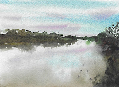
Trent Evening
Watercolour on Paper
16.5cm x 12cm (6.5" x 4.75")

My main goals are to experiment and to create interesting washes by painting everything as a single big shape - letting the colours mix on the paper. In the initial pictures, I painted everything in a single pass without waiting for things to dry. Now, I am painting the background (usually the sky) in one sitting and the major shape as a single wash in the next sitting.

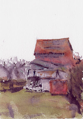
East Bridgford Barns
Watercolour on Paper
12cm x 16.5cm (4.75" x 6.5")

I am pleased that I’ve painted 8 of these little pictures in the first 16 days of 2022. It is a huge increase on the amount of painting I did last year. The emphasis is on quantity, not quality, but these are my favourites.

Saturday, 1 January 2022

Rainbows

Happy 2022
Watercolour on Paper
16.5cm x 12cm (6.5" x 4.75")

Rainbows is the third topic in the Skies and Weather chapter of Creating Textures in Pen & Ink with Watercolor by Claudia Nice.

I cross referenced Claudia’s advice with the section on rainbows in James Gurney’s Color and Light (A Guide for the Realist Painter). James explains  “The colors of the rainbow should be lighter than the background”. I think this is the main challenge for painting rainbows in watercolour - how do you keep the colours vibrant, but lighter than the sky. I didn’t pull it off this time, so I will have another go.

The tree in the foreground was in a neighbour’s garden. Sadly, it was sick and had to be cut down last year. I had a grandstand view from my office window of the tree surgeon taking down a tall tree in a confined space. It distracted me for a whole afternoon when I should have been working.

Happy 2022.
May the New Year bring us all peace, health and happiness.

Sunday, 3 October 2021

Rain Clouds

Walking Home
Watercolour on Paper
15cm x 24cm (6" x 9.5")

 Rain Clouds is the second topic in the Skies and Weather chapter of Creating Textures in Pen & Ink with Watercolor by Claudia Nice.

The approach is similar to the one Claudia used for Cumulus Clouds, but with darker colours. Claudia finished her examples with ink work to darken the cloud shadows and indicate rain, but currently, I prefer to stick with watercolour. 

This is the end of a walk in April 2009 - we set out in the morning, had lunch in the Horse Chestnut and are hoping to get home before it gets much darker or starts raining.

Sunday, 5 September 2021

Cumulus Clouds

Along the Valley
Watercolour on Paper
16.5cm x 12cm (6.5" x 4.75")

Cumulus Clouds is the first topic in the Skies and Weather chapter of Creating Textures in Pen & Ink with Watercolor by Claudia Nice.

Across the Valley
Watercolour on Paper
12cm x 16.5cm (4.75" x 6.5")

Claudia uses a wet-on-wet approach in her examples. I painted lots of skies - there were plenty of disasters and these are my favourites. I used to prefer painting skies on dry paper (see Lake District Sky Studies) because it is more controlled, but with a bit of practice (and patience), wet-on-wet seems a better technique for painting fluffy clouds. It is important not to rush in while the paper is soaking. You need to wait until the paper is beginning to dry and not to be too precious about painting exactly the clouds you can see – I ended up aiming for atmosphere not accuracy.

Sunday, 12 April 2015

Lake District Sky Studies


Lake District Sky - Sunday
Watercolour on Paper
18cm x 11.5cm (7" x 4.5")

Elaine and I spent last weekend in the Lake District at the beginning of my Brother Adrian’s month long birthday celebrations.

The weather was unexpectedly good – so good and so unexpected I managed to get sun burnt in northern England in the first week of April.

Lake District Sky - Saturday
Watercolour on Paper
18cm x 15cm (7" x 6")

The skies on this post are a tribute to the weekend. I painted them both using my favourite cloudy sky technique:

Paint the cloud shapes on to dry paper with a very pale dirty orange. Add some shadows with dirty purples and greens. Paint around them with blue, varying the colour a bit and lightening it towards the bottom. It’s simple, forgiving and reasonably effective.

I painted both skies as the background for bigger paintings, but in both cases I botched the main subject and ended up cropping the skies to keep them for reference.

Sunday, 1 June 2014

An Atmospheric Sky

Across St Ives Bay
Watercolour on Paper
18cm x 28cm (7" x 11")

I learnt a lot from my experiments with skies at the last meeting of the Shelford Group of Artists (see Into the Light). They gave me an insight into how I want to paint and have inspired me to further experimentation.

The sky on this post is an attempt to emulate the atmospheric skies painted by Randall David Tipton. It was painted on to dry paper. I started with patches of yellow ochre in the clouds and then added some shadow colours, some clean water and  the blue of the sky. As the paints merged and dried, I softened some edges with a damp brush and dabbed at others with a paper towel.

This is basically the same technique as Sky Wash 5 painted with more confidence and bolder colours.

The scene is loosely based on the view of Godrevy Point and Island from St Ives.

Sunday, 18 May 2014

Into the Light

Into The Light
Watercolour on Paper
28cm x 14cm (11" x 5.5")

Yesterday was the Shelford Group of Artists’ painting day for May. Tony Slater's theme was Into the Light.

Painting “Into the Light” involves placing the subject directly in front of a strong light source, usually the early morning or late evening sun. The subject is silhouetted against the light which may seem to create a halo around it. Long shadows stretch towards the viewer. The results are often atmospheric and evocative of time and place.

Before the workshop, Tony suggested we look at the paintings of David Curtis who is a master of the this sort of lighting.

James Gurney also acknowledges David as an expert in the technique (see http://gurneyjourney.blogspot.co.uk/2014/02/book-review-painting-on-location.html) and supplies the posh term for the lighting effect - Contre-jour lighting. This is one of the topics that James discusses in his excellent book "Color and Light".

The only good source photograph I had was a scene of a graveyard on a sunny evening. When I started the picture, I realised I wasn't in the mood for such a complex subject. Instead I experimented with a view of some clouds with the sun behind them from a summer evening in Dartmouth.

I painted the same scene five times using different techniques: sometimes using gouache to create sunlight on the water, sometimes relying on just dry brush work and sometimes using wax as a resist. This is my favourite of the five - it was also the simplest and fastest to paint. I didn't create a finished painting, but I had fun, plenty of painting practice and learnt from my experiments.

Sunday, 6 April 2014

New Skies

Sky Wash 11 (Late Afternoon on the Garrison, St Mary's)
Watermedia and Oil Pastel on Paper
28cm x 18cm (11" x 7")

Back in 2012, I did a number of exercises to practice painting skies. See:


The skies on this post are a couple of recent experiments I painted as warm up exercises.

Both skies started off in the same way. I painted the main area of blue on to dry paper and then painted the rest of the sky around this with water – trying not to get the paper too wet.

As the blue pigment diffused, I dabbed the cloud shapes with paper towel. This can cause hard edged clouds, so to avoid this:

  • I was gentle with the paper towel – I didn’t press too hard, 
  • I always used clean paper – I didn’t dab with a piece of paper that already had paint on it
  • If a hard edge started to form, I either dabbed it again or softened it with a damp brush

For the picture of Saint Martins, I added extra shadows to the clouds after the initial wash had dried.

The main intention of both of these pictures was to experiment with using oil pastels to resist the watercolour. This is a technique Chris Forsey uses in his “Pushing The Boundaries Of Watercolour” and “Beyond Watercolour” DVDs.

Sky Wash 12 (St Martin's)
Watermedia and Oil Pastel on Paper
28cm x 18cm (11" x 7")

So far, the technique is not working for me. The oil pastel dissolves into the paint and makes a watery oily soup. I suspect I am applying too much pastel and not pressing heavily enough to push it into the paper.

Sunday, 9 February 2014

A Break in the Clouds

A Break in the Clouds
Watercolour on Paper
28cm x 18cm (11" x 7")

Last Saturday, I went for a walk in the Peak District. This is the view from above Castleton towards Win Hill. There is a patch of blue sky above Win Hill and an area of bright sunlight underneath it.

The sky is based on some of the sky washes I experimented with in 2012. First, I painted the blue patch onto wet paper. After this was dry, I added the clouds.

The red patch on the hillside is oil pastel. Elaine gave me Chris Forsey’s “Pushing The Boundaries Of Watercolour” and “Beyond Watercolour” DVDs as Christmas presents. He uses oil pastel as a resist to the watercolour in his paintings. This is my first small trial of the technique.

Sunday, 17 February 2013

Limited Palette

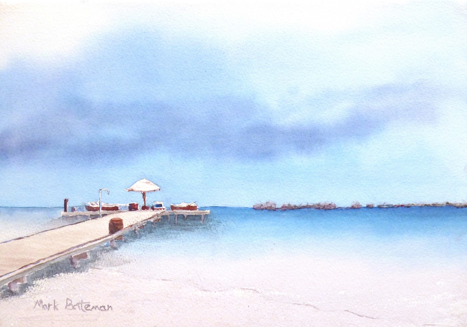
Storm Clouds Over the Maldives
Watercolour on Paper
34cm x 24cm (13.5" x 9.5")

Yesterday was my first painting day with the Shelford Group of Artists of 2013.

Tony Slater's topic for the day was painting with a limited palette. This was the same topic as one of the first Shelford painting days I attended - back in April 2011 (see Sarah Jane).

I took the opportunity to knuckle down and paint a subject I’ve been messing around with for the best part of a year.

In March of last year, Elaine and I had an incredible holiday in the Maldives (see Holiday Sketch). While we were there, I took a photo of a spectacular storm approaching the islands.

Since we got home, I've tried to paint more than 20 versions of the sky, but I’ve never got it right. Most of my attempts suffered from being too moody and threatening. Yesterday, I realised that I’d been painting British storm clouds. The atmosphere I wanted to recreate was “yes, there’s a storm coming, but we're sitting on the beach drinking cocktails.”

Tony suggested we select two or three harmonious colours. Initially, I picked a warm colour (Burnt Sienna) and a cool colour (Winsor Blue (Green Shade)). I couldn’t mix a good colour for the cloud shadows from them, so I added Permanent Rose which also helped to spice up some of the details on the platform.

Sunday, 3 February 2013

Sheep

Lost Sheep
Watercolour on Paper
14cm x 28cm (5.5" x 11")

Sheep are inquisitive animals. If you stop to take a photo or draw them, they all turn to look at you. Perhaps they are vain or perhaps they are part of a neighbourhood watch organisation that keeps track of undesirables in the countryside.

The cows in Waiting for Rain - Summer 2012 were fun to paint. I've been intending to paint more animals, but have only just got around to it.

The sky is based on the wash I practiced as sky wash 10 (see Sky Washes 8, 9 and 10). It was good to have the opportunity to incorporate it in to a picture.

We're Watching You
I'll Remember Your Face
You're Not From Around Here

Sunday, 22 July 2012

Sky Washes 8, 9 and 10


Sky Wash 10
(Improve Your Skies in Watercolour - Demonstration 3)
Watercolour on Paper
25.5cm x 15cm (10" x 6")

These pictures are based on the demonstrations from Geoff Kersey's Improve Your Skies In Watercolour programme on The Painting and Drawing Channel.

The first two demonstrations (the second and third pictures on the post) are wet into wet skies.

Sky Wash 8
(Improve Your Skies in Watercolour - Demonstration 1)
Watercolour on Paper
25.5cm x 18.5cm (10" x 7.25")

I found it difficult to achieve results that look anything like the demonstrations. Geoff makes them look easy, but they are not. He suggests these skies need repeated practice and he is right.

The most difficult aspects to gauge are the wetness of the paper and the dilution of the paint. These factors govern how much the paint disperses and the strength of the resulting colours.

In both of these exercises I used paint that was too strong and added it while the paper was too wet.

I am not sure I would use either of these skies in a painting (even if I painted them perfectly), but trying to replicate them is a good way to practice wet into wet technique.

Sky Wash 9
(Improve Your Skies in Watercolour - Demonstration 2)
Watercolour on Paper
25.5cm x 17.5cm (10" x 6.75")

The third demonstration (the picture at the top of the post) is my favourite.

Geoff started by wetting the paper and leaving some dry patches as starting points for the clouds. He added the blue and blotted out some more cloud shapes with a paper towel. He then let the sky dry before adding the grey cloud shadows.

An important part of this sky (and most realistic skies) is that it appears lighter towards the horizon. One of the techniques Geoff uses to achieve this is to paint the top part of the sky when his brush is full of paint and the lower parts as it runs out.

Sunday, 24 June 2012

Sky Wash 7


Sky Wash 7
(Geoff Kersey's Winter Barn)
Watercolour on Paper
25.5cm x 16.5cm (10" x 6.5")

Geoff Kersey is a master of the wet in to wet background. He uses the technique to create soft background shapes with colours that gently blend into each other. It is particularly effective for distant trees.

This is my version of the Winter Barn from his programme on the Painting and Drawing Channel.

Geoff wet the paper down to the barn and the horizon line. He painted the sky using the side of a large brush. He used angled strokes and made the sky darker towards the top and lighter towards the horizon to give a feeling of perspective.

While the sky was still wet, he applied a dark brown mix to create the soft edged shapes of the background trees. He spiced this up with a few warmer orangey brown patches and then finished by adding the fir trees and dark green bushes to the left of the barn. He did all this before the sky had time to dry.

Previously, I have had problems with this type of background. I have tended to add the trees while the sky is still too wet. The result is the paint spreads wildly and creates shapes that look more like horrible clouds than trees.

This time I was more careful and paid attention to Geoff’s advice. The crucial moment to add the trees is just as the shine starts to leave the wet paper. When you look for this, it is quite easy to spot. The other important factor is the paint you are adding has to be less watery than the paint already on the paper. This gives the desired effect - soft edged trees that don't crawl off the paper.

Sunday, 29 April 2012

Sky Wash 6


Sky Wash 6
(The Mill on Kneeton Road)
Watercolour on Paper
28cm x 19cm (11" x 7.5")

This sky is based on a Terry Harrison sky from his Improve Your Trees in Watercolour programme on the Painting and Drawing Channel.

Terry wet the paper, loaded the brush with French Ultramarine Blue and then created a graded wash by painting horizontal stripes from the top without adding any more pigment. The intensity of the wash faded as his brush ran out of paint.

When the sky was still wet, he added a grey mixture to suggest the shadows at the bottom of the clouds and then created the cloud shapes by blotting them with a paper towel.

The graded wash technique that Terry used is different to the technique I used in Wash Swatches.  I think the method from the swatches provides a better approach to get a smooth colour transition, but Terry's technique gives more time to work on the clouds before the sky dries.

The foreground is the mill on Kneeton Road seen from across the fields.

Sunday, 11 March 2012

Sky Wash 5

Sky Wash 5
Watercolour on Paper
26cm x 18.5cm (10.25" x 7.25")

This is the last and most complex of the simple sky demonstrations from John Lovett’s Splashing Paint DVD.

The sky starts with a watery dirty yellow wash in the middle of the paper. While this is still wet, grey is added to the lower part of the sky and blue is added to the top. Some of the yellow and some clean paper is left showing in the middle to form the brightest part of the clouds. The area around this bright area is then blotted with a crumpled paper towel to create the clouds.

After this first wash is dry, the bottom of the sky is glazed with blue to make it seem further away. Darker blue is added to the top to create some stronger edges on the clouds and some dark grey is added to strengthen the shadows in the bottom of the clouds.

Once the sky is dry, the foreground is added to give the sky some context.

This was a difficult sky to paint - the version on this post is is my third attempt. Making the clouds seem fluffy and cloudlike was particularly tricky.

My next wash experiment will be to paint some flat and graded washes. Then I will move on to some more skies from programmes on the Painting and Drawing channel.

Sunday, 26 February 2012

Sky Washes 3 and 4

Sky Wash 3
Watercolour on Paper
26.5cm x 19cm (10.5" x 7.5")

These are another two demonstrations from John Lovett’s Splashing Paint DVD.

The skies are atmospheric and direct the eye towards the centre of interest rather than accurately portraying a specific skyscape.

In both exercises the bulk of the foreground is painted first, the sky is painted around it and finally some details are added to the foreground.

Sky Wash 3 is painted as two wet in wet washes. The first wash is a light pink wash in the centre of the paper. Once this is dry, the blue wash is added, leaving a patch of light pink in the middle.

Sky Wash 4 is painted as a single wet in wet wash. The indigo is painted first - leaving a space for the white gouache. When this is added, it spreads out and fuses with the indigo.

I had a couple of goes at both these skies and I am tempted to repeat them again, but the Painting and Drawing channel is providing an ever expanding list of skies for me to try.

Sky Wash 4
Watercolour on Paper
26.5cm x 19cm (10.5" x 7.5")