Sunday, 25 August 2013

Opposition

Opposition - Blakemere Moss
Ink on Rice Paper
28cm x 20cm (11" x 8")

Chapter 3 of Composition by Arthur Wesley Dow is about creating harmony in line drawings. His central premise is that harmony requires good spacing. He identifies five ways of arranging and spacing lines that he calls “Principles of Composition”. The first of these is Opposition, which he defines as:

Opposition - Two lines meeting form a simple and severe harmony.

The initial exercise for the topic is to copy examples from the text. This provided me with some useful extra practice in line drawing with a Japanese brush (see Line Drawing).

Examples of Opposition - copied from Composition
Ink on Paper
25cm x 29cm (10" x 11.5")

Dow recommends holding the brush perpendicular to the paper. At first, I was in danger of giving myself an RSI because my hand position was so cramped and unnatural, but I’ve gradually found a more relaxed way to hold the brush.

This has made the exercises more enjoyable and has reduced the unsteadiness in my lines, but they are still quite shaky. The brush exaggerates every movement, but Dow suggests not worrying because “Slight waverings are not objectionable; in fact they often give character to the line.”

The second exercise is to design mouldings, plaids and rectangular panels based on arrangements of straight lines.

Dow recommends the proportions of the Parthenon, so I started by designing a plaid based on a view of the Parthenon.
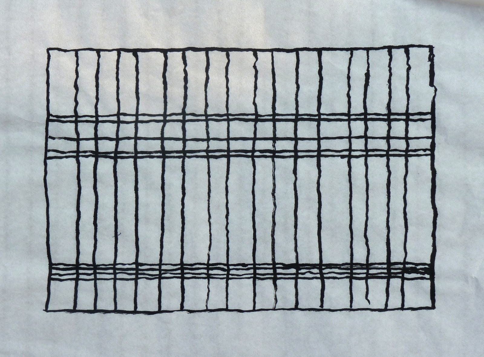
Parthenon Plaid
Ink on Rice Paper
26cm x 18.5cm (10.25" x 7.25")

I followed this by trying to spoil the underlying grid from Mondrian’s “Composition with Yellow, Blue and Red”


Mondrian Plaid
Ink on Rice Paper
18cm x 18cm (7" x 7")

I discovered that if you add too many lines you can spoilt it, but you can add a couple of lines just about anywhere with relative impunity.


Spoiling Mondrian Plaid
Ink on Rice Paper
18cm x 18cm (7" x 7")

I concluded the exercise with some plaids based on famous design maxims: rules of thirds, golden ratio, rabatment, L shaped composition and H shaped composition.

Design Maxim Plaids
Ink on Paper
11.5cm x 23cm (4.5" x 9")

Do plaids based on these divisions look any better than plaids based on arrangements that are more random? I don’t think they do. To my eye:
  • A single division along the centre line is the only arrangement that particularly jars 
  • The intersections of horizontal and vertical lines are pleasing - precise placements don’t seem to be that important
  • Equally spaced lines are agreeable, but some disorder is more interesting
  • Repetition with variation is particularly appealing

The last exercise is to find and draw examples of Opposition from nature. The drawing at the top of the post is based on the photographs I used as reference for Blakemere Moss.

You can find another description of Opposition in the post Principles of Composition: Opposition and Transition on Paul Foxton’s  Learning To See blog.


Sunday, 18 August 2013

Keys to Drawing – Chapter 2

 
Keys to Drawing - Exercise 2F
40 Minutes
1 August 2013
Graphite Pencil on Paper
26cm x 37cm (10.25" x 14.5")

Chapter 2 of the Keys to Drawing is called “The Artist's Handwriting”. It is another well-balanced mixture of explanation and exercises.

Keys to Drawing - Exercise 2A
20 Minutes
18 July 2013
Ink on Paper
29cm x 34.5cm (11.5" x 13.5")

The chapter starts with an exploration of the “handwriting” in some master drawings. Exercise 2A is a copy of one of the drawings and Exercise 2B is a drawing in the same style. The objective is to get inside the mind of a great artist and to experience their process by emulating their handwriting.

Keys to Drawing - Exercise 2B
20 Minutes
18 July 2013
Ink on Paper
26cm x 32cm (10.25" x 12.5")

These are intriguing exercises. I’m not sure whether I approached the drawings in the say way as Matisse, but I had a definite sense that the flow and arrangement of the lines was more important than accurate proportions and draughtsmanship.

Keys to Drawing - Exercise 2C
1-Minute Gesture Drawings
23 July 2013
Graphite Pencil on Paper
26cm x 36.5cm (10.25" x 14.5")

The chapter introduces the concepts of the control hand and the free hand. The control hand is similar to the tight, close to the point grip we use for writing. The free hand is a looser grip and the pencil is held further away from the point.

Keys to Drawing - Exercise 2C
2-Minute Connected Line Drawing
23 July 2013
Graphite Pencil on Paper
23cm x 36cm (9" x 14")

More importantly (for me) are the mindsets that Bert Dodson associates with the different grips. The free hand is associated with a carefree, exploratory, big picture frame of mind. The control hand is associated with a more precise, detail-oriented attitude. The remaining exercises in the chapter explore the differences between these two hands/mindsets.

Keys to Drawing - Exercise 2C
5-Minute Burn
23 July 2013
Graphite Pencil on Paper
38cm x 29cm (15" x 11.5")

Exercise 2C is a collection of gestural drawings using the free hand.
 
Keys to Drawing - Exercise 2D & 2E
30 Minutes each
30 July 2013
Graphite Pencil and Ink on Paper
27cm x 37cm (10.5" x 14.5")

Exercise 2D and Exercise 2E are exercises in control hand drawing. Exercise 2D is a tonal bar and Exercise 2E is an attempt to match the tones in a photograph from the book.

Exercise 2F (at the top of the post) is my favourite exercise from the chapter – it is a drawing in which you alternate between the free and control hand. 

Keys to Drawing - Exercise 2F 2009
40 Minutes
10 September 2009
Graphite Pencil on Paper
18cm x 26.5cm (7" x 10.5")

This last picture on the post is my drawing for exercise 2F from when I first read the Keys to Drawing in 2009. I can still remember how challenging I found these exercises without the experience of two and half years following the Natural Way to Draw.

Sunday, 11 August 2013

Sketching in the Grounds of Flintham Hall


Lion - Flintham Hall
10 August 2013
Watercolour and ink
Moleskine A4 watercolour album

Yesterday was the August meeting of the Shelford Group of Artists. Sir Robert Hildyard kindly gave us permission to spend the day sketching and painting in the extensive grounds and gardens of Flintham Hall.

We spread out to the four corners of the estate and Tony Slater must have walked miles as he circulated around the group to offer advice. The day gave me an opportunity to work on my mental block about drawing and painting outside.

My only problem with working “en plein air” is I don’t like people being able to look at quick sketches and work in progress, but this manifests as uncharacteristic dithering – I pack too much stuff and then can’t decide what to use and what to paint.

Yesterday, I had a plan. Pack very lightly and draw the first thing that interested me.

On my last sketching trip, I took three sketchbooks, two watercolour blocks and a piece of watercolour paper stuck to a board. Yesterday, I took one sketchbook.

I decided in advance that I wanted to draw something in which accurate proportions would be important, so as soon as I saw the lion, I put down my stuff and got on with it.

Statue - Flintham Hall
10 August 2013
Watercolour and ink
Moleskine A4 watercolour album

I don’t know why the thought of unsolicited criticism bothers me. I know it is more of a phobia than a sensible concern and I am gradually getting over it. I’m sure that if I fill up a few sketchbooks this will speed up the cure.

Sunday, 4 August 2013

This Little Piggy


This Little Piggy
Watercolour on Paper
34cm x 24cm (13.5" x 9.5")

Elaine and I saw this little piglet in one of the fields around the village. He was very young and seemed to be stumbling around with his eyes closed. The famer was feeding the elder pigs with huge buckets of left over cream cakes, iced buns and pastries. This little chap didn’t get his fair share.

I drew the picture with a soft carbon pencil, which makes a strong black line that the watercolour does not completely obscure. As a result, the initial drawing is visible in the final picture. This is quite appropriate for a blog that is about learning to draw. I used a similar technique in the painting of the sea gull on the What Comes Next? post.

The treatment of the painting is based on a short demonstration from John Lovett’s excellent book John Lovett’s Textures, Techniques and Special Effects for Watercolor.

Sunday, 28 July 2013

Studio Rousar Memory Drawing Group - Weeks 1 to 6


Studio Rousar Memory Drawing - Week 6 Day 4

Each Daily Composition (see The Daily Composition Revisited) is a reminder that I want to improve my visual memory.

I would like to be able to draw the things and scenes I have seen during the day, but wasn’t able to record at the time.

More importantly, I want to improve my visual memory because virtually every drawing is drawn from memory. The first chapter of Keys to Drawing explains this (see Keys to Drawing - Chapter 1). Bert Dodson describes the process as Look, Hold (Remember), Draw. There is always a small delay from looking at the subject and making a mark on the paper. Being able to remember more detail with greater accuracy can only help.

Studio Rousar are running a memory drawing class. It started in January 2013 and it runs for a year. Each week, they publish a new exercise. I started the course in June, so I hope they are going to keep the exercises on the website after the end of the year.

Studio Rousar Memory Drawing - Week 3 Day 3

The exercises for the first 6 weeks are outline images with 3 reference lines and 3 reference dots. If you are interested, you should take a look at http://www.studiorousar.com/2013/01/01/memory-drawing-group-week-one/.

The images for the first 3 weeks are various bones, weeks 4 and 5 are vases and week 6 is an outline of a foot in a sandal – each week the outline becomes more complicated.

Studio Rousar Memory Drawing - Week 4 Day 3

The instructions are simple:
  • Copy the reference lines and dots on to piece of tracing paper.
  • Study the image for a few minutes
  • Hide the image and try to draw it on the tracing paper
  • Once you have finished drawing, put the tracing paper over the image to see how well you have done and correct your drawing
  • The next night, repeat the process, starting with a review of your drawing from the previous day
The instructions for weeks 5 and 6 include the direction not to analyse the shape on the first night – just look at it and remember it. I find this remarkably difficult because normally I would try to remember the shape by describing the object as I look at it. Perhaps I've been stopping my purely visual memory from developing by using my analytical and verbal skills as an unnecessary crutch. I am doing my best to respect the instruction and I’ve already started to notice an improvement. I’ve started to be able to remember shapes without having verbal descriptions of them.

Sunday, 21 July 2013

Keys to Drawing – Chapter 1


Keys to Drawing - Exercise 1B
30 Minutes
3 July 2013
Graphite Pencil on Paper
24cm x 36cm (9.5" x 14")

Chapter 1 of the Keys to Drawing is about the drawing process. It is primarily a chapter about contour drawing and seeing the world as shapes.

Keys to Drawing - Exercise 1A
45 Minutes
1 July 2013
Graphite Pencil on Paper
29cm x 34.5cm (11.5" x 13.5")

Bert Dodson starts by discussing a basic drawing process of Look, Hold (Remember), Draw. He stresses the importance of drawing what we see rather than what we expect to see and towards the end of the chapter, he presents 4 rules:
  • Draw the big shapes first and then add smaller shapes
  • Look for enrichment shapes – shadows, reflections, highlights, etc
  • Merge adjoining shapes of similar tone
  • Draw trapped shapes (negative space)

Keys to Drawing - Exercise 1C
30 Minutes
7 July 2013
Graphite Pencil on Paper
23cm x 23m (9" x 9")

The chapter includes two important ideas:
  • Restatement - correcting mistakes without erasing the original inaccurate lines. Initially, this can be a bit demoralising, but it is an important concept for a number of reasons. In the early stages of a drawing, the mistakes can help you to work out what needs to change. Time spent erasing can be used more productively for studying the subject. Multiple restatements can add a sense of energy to a sketchy drawing.
  • Focus - in a limited time, you can’t draw everything. Once you have drawn the big shapes, focus on the details in the most important/interesting areas. The less important areas don't need the same level of attention. 

Keys to Drawing - Exercise 1D
20 Minutes
8 July 2013
Graphite Pencil on Paper
19cm x 10cm (7.5" x 4")

The chapter is interspersed with plenty of challenging exercises. After completing The Natural Way to Draw, I was expecting to breeze through these exercises, but this is not the case. These are difficult subjects.

Keys to Drawing - Exercise 1E
60 Minutes
13 July 2013
Graphite Pencil on Paper
39cm x 19cm (15.5" x 7.5")

It is interesting to see the difference in how the authors of The Naural Way to Draw and the Keys to Drawing handle similar ideas, for example:
  • Dodson recommends repeating trigger words to describe the feeling of the subject - spiky, furry, etc.
  • Nicolaides suggests you imagine you are touching the contour with the pencil and can feel the surface you are drawing through the pencil
 
Keys to Drawing - Exercise 1F
40 Minutes
15 July 2013
Graphite Pencil on Paper
38cm x 21.5cm (15" x 8.5")

I still have the sketchbooks from when I first read the Keys to Drawing in 2009. It is interesting to compare the two sets of drawings and pleasing to notice some improvement.
 
Keys to Drawing - Exercise 1D 2009
20 Minutes
25 August 2009
Graphite Pencil on Paper
13cm x 8cm (5" x 3")

Keys to Drawing - Exercise 1C 2009
20 Minutes
24 August 2009
Graphite Pencil on Paper
16.5cm x 13m (6.5" x 5")

Sunday, 14 July 2013

Line Drawing


Sarah in Ink
Ink on Rice Paper
29cm x 21.5cm (11.5" x 8.5")

Arthur Wesley Dow recommends Japanese brushes, ink and paper for the majority of the exercises in Composition.

I’ve invested in some Japanese brushes, but I’m using bottled Indian ink instead of a Japanese ink stick. The ritual of grinding ink at the start of each practice session appeals, but I don’t have room for any more art paraphernalia – especially anything with the potential for causing ink related disasters.

Line Drawings - mainly copied from Composition
Ink on Paper
28cm x 38cm (11" x 15")

The purpose of the initial exercises is to become accustomed to the tools and to “put the hand under control of the will”.  I started by copying illustrations from the book and then (for variety) copied some of my own pencil and crayon drawings.

The picture at the top of the post is based on a drawing from a Natural Way to Draw exercise that I posted in April (Another Modelling the Straight and Curve Study).

Dow says not to spend too much time on these initial exercises, so this week I am moving on to the first exercises in composition.

Sinister Eyes
Ink on Paper
18cm x 10cm (7" x 4")

You can find more information about the exercises in the post Meditations on Line: Dow Composition Practice, Chapter Two on Paul Foxton’s Learning To See blog. This is where I first learnt about Dow’s book and was the inspiration for including it in my art education.