Sunday, 8 September 2019

Drawing and Painting the Landscape – Constructing Space


Coaley Peak
Constructing Space - Drawing and Painting the Landscape
July 2019
Watercolour
Stillman & Birn Alpha Series Sketchbook
30.5cm x 12.5cm (12" x 8.5")

Lesson 9 of Drawing and Painting the Landscape by Philip Tyler is about using perspective to convey depth in a picture.

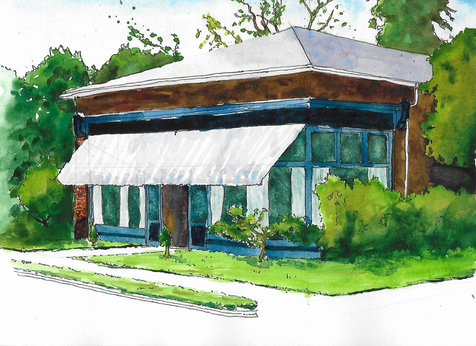
Constructing Space 3
Constructing Space - Drawing and Painting the Landscape
July 2019
Ink
Stillman & Birn Alpha Series Sketchbook
21.5cm x 18.5cm (8.5" x 7.25")

The lesson starts with an exercise to create a perspective grid as a frame of reference for a room receding away from the viewer. Philip then explains how a recessional grid can be a frame of reference for the rise and fall of the real landscape. I used this concept while sketching the view of Coaley Peak. It is one of Elaine, Doris and my regular walking spots. The last time we went there with Mum and Dad there were para-gliders launching themselves from the other side of the hedge.

Constructing Space 5
Constructing Space - Drawing and Painting the Landscape
July 2019
Ink
Stillman & Birn Alpha Series Sketchbook
21.5cm x 18.5cm (8.5" x 7.25")

Philip’s instructions for drawing the perspective grid are good, apart from the steps to make the grid look square - I found them arbitrary. My grid does not look square and the grid in the book does not look square. I searched the internet for alternative explanations, but most descriptions fudge the issue. Eventually I found a detailed geometrical / mathematical explanation of perspective (Handprint - elements of perspective). The author, Bruce MacEvoy puts an immense amount of effort into research. Handprint contains a wealth of information about watercolour. I always consult it when buying new paints, but I didn’t realise it had a section on perspective.

Perspective Notes 1
Constructing Space - Drawing and Painting the Landscape
September 2019
Ink
Stillman & Birn Alpha Series Sketchbook
18.5cm x 21.5cm (7.25" x 8.5")

Understanding the theory of perspective to this level of detail is not top of my learning to draw and paint to do list, but it will keep nagging at me until I find time to read and understand it. As I read it, I am adding clarifications in my sketchbook. I had to consult Sarah for a reminder of  mathematical notation – thank you for your help Sarah.

Sunday, 1 September 2019

Drawing and Painting the Landscape – Cubes


The Queen and Albert
Watercolour and Ink
Moleskine A4 Watercolour Album
297mm x 210mm (11.69" x 8.27")

Chapter 3 of  Drawing and Painting the Landscape by Philip Tyler is about perspective. The chapter begins with simple perspective (see Drawing and Painting the Landscape – Simple Perspective). Lesson 8 continues the topic by looking at the impact of perspective on cubes and objects that are at an angle to our line of sight or inclined either uphill or downhill.

There isn’t a clearly defined exercise, so I drew this view of the cubic Queen and Albert Bed and Breakfast in Stratford, Ontario from a photo I took when Elaine and I stayed there in June 2011.

I also took the opportunity to practice the skills I recently picked up from Liz Steel’s SketchingNow Watercolor course  (see SketchingNow Watercolor (Lessons 1 to 2) and SketchingNow Watercolor (Lessons 3 to 4)).

Sunday, 25 August 2019

SketchingNow Watercolor (Lessons 3 to 4)

Merry Fisher
Watercolour and Ink
Moleskine A4 Watercolour Album
297mm x 210mm (11.69" x 8.27")

I’ve completed Liz Steel’s SketchingNow Watercolor course. Lessons 3 and 4 have the same well-balanced mix of theory videos, demonstrations, handouts and exercises as the first half of the course (see SketchingNow Watercolor (Lessons 1 to 2)).

Master Palette
Watercolour and Ink
Moleskine A4 Watercolour Album
297mm x 210mm (11.69" x 8.27")

Lesson 3 is about Using Colour. Liz offers a pragmatic explanation of colour theory and suggests creating a master palette of your favourite colour mixes. She hypothesises you make sketching easier by using a palette of tried and tested mixes instead of trying to match a specific colour while you are out in the field. She also recommends using colour and value studies in preparation for a sketch as a useful discipline for novices.

Colour and Value Studies
Watercolour, Graphite Pencil and Ink
Moleskine A4 Watercolour Album
297mm x 210mm (11.69" x 8.27")

The assignments for this lesson are to create a master palette and to try some colour and value studies. I enjoyed the exercises. Some of the mixes in my master palette were experiments rather than my usual combinations, but I learnt from this and will adopt some of these new blends. I am also going to change some of the paints and will repeat the exercise using the new colours.

Lesson 4 is about Sketching with Watercolour. Liz discusses the traditional watercolour approach of working from light to dark and suggests starting with the darks as an alternative.

The assignments for the lesson are:

  • Paint some cakes either from life or Liz’s photo reference. You can decide whether to work from light to dark, or to start with darks, or to mix things up. I chose to use Liz’s photo and to start with the darks.
  • Sketch something you enjoy sketching, but use a different approach to your usual. It could be starting with darks, working wet or layering. I sketched the boat from a photo I took during Elaine’s, Doris and my recent holiday in Dartmouth. I chose to start with the darks and to work wet. I’m pleased I stopped when I did. My original intention was to add a tint to the background, but it doesn’t need it.

Liz's Cakes
Watercolour and Ink
Moleskine A4 Watercolour Album
297mm x 210mm (11.69" x 8.27")

The last section of the course is another review of sketches. There are also additional theory and demo videos. There is a final exercise to re-do a sketch you did prior to the course and to notice how different your approach is and how much you have improved.

I’ve learnt a lot and acquired some ideas I will incorporate into both my sketching and more considered watercolour paintings.

Sunday, 14 July 2019

SketchingNow Watercolor (Lessons 1 to 2)

Summer Collection 2019 (and 2018 and 2017)
Watercolour and Ink
Moleskine A4 Watercolour Album
297mm x 210mm (11.69" x 8.27")

I’ve reached the half way point in Liz Steel’s SketchingNow Watercolor course.

Liz’s premise is that watercolour sketching (particularly on location) requires a different technique to studio painting. Her focus is on a direct approach, trying to get the desired colours and effects first time, rather than the more traditional approach of gradually building up layers of washes.

In common with her other courses. there is lots of well thought out video content and exercises.

The first lesson is about controlling water and focuses on three types of washes:

  • Watery - a lot of water for the amount of pigment.
  • Juicy - a generous load of pigment for the amount of water.
  • Pasty - mainly pigment with a little bit of water.

The second lesson is about

  • Colour mixing: how to mix two colours
  • Layering: putting one wash over another dried wash
  • Working wet: mixing paints on the paper while they are wet

The third week is primarily a review of sketches from Lessons 1 and 2. There are also some additional theory videos, an extra demo, and an exercise to paint some of your wardrobe – the clothes not the cupboard.

I’ve learnt a lot, some of it stuff I already knew, but to which I wasn’t paying sufficient attention. Perhaps the most important lessons for me are: be generous, paint with confidence (regardless of whether this is warranted or not), and paint every day.

Being generous might seem like a strange comment. I'm referencing a French film (probably Leon) in which a character observes that only generous people can make good sandwiches (or something like that). I think the sentiment holds true for many things - including watercolour painting.

Sunday, 30 June 2019

Drawing and Painting the Landscape – Simple Perspective


Books in Perspective
Simple Perspective - Drawing and Painting the Landscape
June 2019
Ink and Watercolour
Stillman & Birn Alpha Series Sketchbook
18.5cm x 21.5cm (7.25" x 8.5")

Chapter 3 of Drawing and Painting the Landscape by Philip Tyler is about perspective. He starts the chapter by offering some pragmatic advice:

Linear perspective gives you an understanding of how objects behave in space. It is not a set of hard and fast rules that have to be adhered to, but a little bit of knowledge will go a long way and will certainly help you create a convincing depth in your landscapes, and help clarify how man-made objects, like buildings, recede and converge, making them seem more three-dimensional.

Lesson 7 provides some exercises on simple perspective. It begins with a diagram of a road in single point perspective with a line of equally spaced lampposts running off into the distance. This diagram illustrates a horizon line, a single vanishing point, and how to equally space objects in perspective.

Single Point Perspective
Simple Perspective - Drawing and Painting the Landscape
June 2019
Graphpite Pencil
Stillman & Birn Alpha Series Sketchbook
21.5cm x 18.5cm (8.5" x 7.25")

Philip then uses photos of piles of books to illustrate multiple vanishing points on the same horizon line and the impact when the books are not lying flat on the table.


My sketch reminded me of the setup from one of Liz Steel's Sketching Now - Foundations exercises (see May 2016 Sketches and Welcome Back)

I’m pretty pleased with the painting in this sketch, but I have a tendency to overwork. I’ve just started taking Liz’s SketchingNow Watercolour. During the use the course, I’m hoping to learn techniques and strategies to get the effects I want more consistently.

Sunday, 16 June 2019

Drawing and Painting the Landscape – Contoured Landscape

Contoured Landscape - Drawing and Painting the Landscape
May 2019
Graphite pencil, watercolour pencil, conte stick on brown paper
24cm x 13.5cm (9.5" x 5.25")

In Drawing and Painting the Landscape, Philip Tyler observes that contour lines describe the structure of the landscape. He asks us to imagine a net stretched over the land and to visualise how the net distorts as it moves over the shapes and planes of the landscape – by drawing the contours, we reveal the landscape.

Lesson 6 contains an exercise to clarify the concept. Philip suggests drawing a grid on a piece of paper, "scrunching" the paper to create a hilly landscape, lighting the paper dramatically and then drawing it.

Sunday, 2 June 2019

Keys to Drawing with Imagination – Mirror Imaging


Enjoying the Weather
Ink and Watercolour on Paper
23cm x 29.5cm (9" x 11.5")

Exercise 12 from Keys to Drawing with Imagination by Bert Dodson involves making a drawing of an interestingly shaped object and then drawing its mirror image aligned so the 2 images are touching to make a single symmetrical shape. The mind can read patterns and interpretations into the new shape. In Bert’s example, a crumpled shirt becomes two desert nomads in conversation.

I made a drawing of a miniature dog sculpture by Joanne Cooke. I call the sculpture Salty the Sea Dog. It is about 9cm high and sits on my computer desk. Weirdly, it looks a lot like Doris with her summer haircut.

Salty the Sea Dog
Ink on Paper
21cm x 29.7cm (8.3" x 11.7")

I couldn’t find an inspiring way to create a reflected shape. I suspect the exercise works better with less recognisable objects such as crumpled clothing. This gives the imagination more room to interpret an abstract shape – instead of immediately identifying two adjoining images of the same dog -and then moving on to something more interesting.

I abandoned the instructions for the exercise and drew Salty sitting in a puddle – which is a pastime Doris enjoys.