Sunday, 12 April 2020

Drawing and Painting the Landscape - Negative Painting


Woodchester Mansion
Negative Painting - Drawing and Painting the Landscape
Thick grey ground - Acrylic on MDF
16cm x 19cm (6.25" x 7.5")

Lesson 14 of Drawing and Painting the Landscape by Philip Tyler is called Negative Painting.

River Trent Evening
Negative Painting - Drawing and Painting the Landscape
Thick black on thin white ground - Acrylic on MDF
16cm x 19cm (6.25" x 7.5")

The instructions are to paint six rectangles on MDF with acrylic paint - two white, two black and two grey. For each colour, paint one rectangle with a thin layer of paint and the other with a thick layer stiffened with impasto or texture medium.

Langdale Fells
Negative Painting - Drawing and Painting the Landscape
Thin black on thick white ground - Acrylic on MDF
16cm x 19cm (6.25" x 7.5")

On the thick white background, paint a notan using a thin transparent layer of black acrylic. On the thin white background, use thick black paint. Similarly, thin white paint on the thick black background and thick white paint on the thin black background. On the grey backgrounds experiment with alternate thin and thick layers of white and black.

From the Mon & Brec
Negative Painting - Drawing and Painting the Landscape
Thick white on thin black ground - Acrylic on MDF
16cm x 19cm (6.25" x 7.5")

Philip suggests using a palette knife to apply the thick paints. I ended up using a variety of different tools including a painting knife, old plastic loyalty cards and tatty decorating brushes. I embraced the advice from lesson 13 of trying to instil energy into the studies and not to be frightened of making marks in the wrong place.

Old Hill Tree
Negative Painting - Drawing and Painting the Landscape
Thin white on thick black ground - Acrylic on MDF
16cm x 19cm (6.25" x 7.5")

Negative painting means painting the space around an object rather than painting the object. I painted the black on white images first and couldn't / wouldn't / didn't apply the idea of negative painting to them - these are simply 2 value notans (see Drawing and Painting the Landscape - The Notan). I was more successful with the studies on the black and grey grounds. These felt like negative painting. On the black background, I was conscious of creating the black shapes by painting around them in white. Similarly, on the grey background I was mindful of painting around the grey shapes.

From Gurnard's Head
Negative Painting - Drawing and Painting the Landscape
Thin grey ground - Acrylic on MDF
16cm x 19cm (6.25" x 7.5")

All these studies were painted indoors from photographs of our holidays and more local walks.

Sunday, 29 March 2020

Calm Water

Calm Clear Water
Watercolour on Paper
280mm x 190mm (11" x 7.5")

Calm Water is the third topic in the "The Look of Transparency" - Chapter 3 of Creating Textures in Pen & Ink with Watercolor by Claudia Nice.

The need to stay at home to combat coronavirus simplifies the decision about whether to paint from life or photographs. It suits me because my current inclination is to experiment with technique by painting inside.

The Bathing House on the Sharpham Estate
Ink and Watercolour
Moleskine A4 Watercolour Album
297mm x 210mm (11.69" x 8.27")

Both of these scenes are from our holidays. I took the photo of the Bathing House on the Sharpham Estate from the Dartmouth to Totnes river cruise – shortly before Doris let herself down. Elaine tidied things up before anyone noticed – even me. In Doris’ defence she was a young puppy on her first holiday adventure. She wouldn't do anything like that now - fingers crossed. You can rent the Bathing House as a romantic holiday getaway (The Bathing House at Sharpham House). It looks idyllic, but they don’t accept dogs, so it’s not an option for us.

The picture at the top of the post is of the river Otter between Otterton Mill (where we had sandwiches on bread made from the flour they mill) and the coast. I’m not sure what sort of fish this is. I’m guessing a trout, but who knows?

Sunday, 15 March 2020

Drawing and Painting the Landscape - The Notan


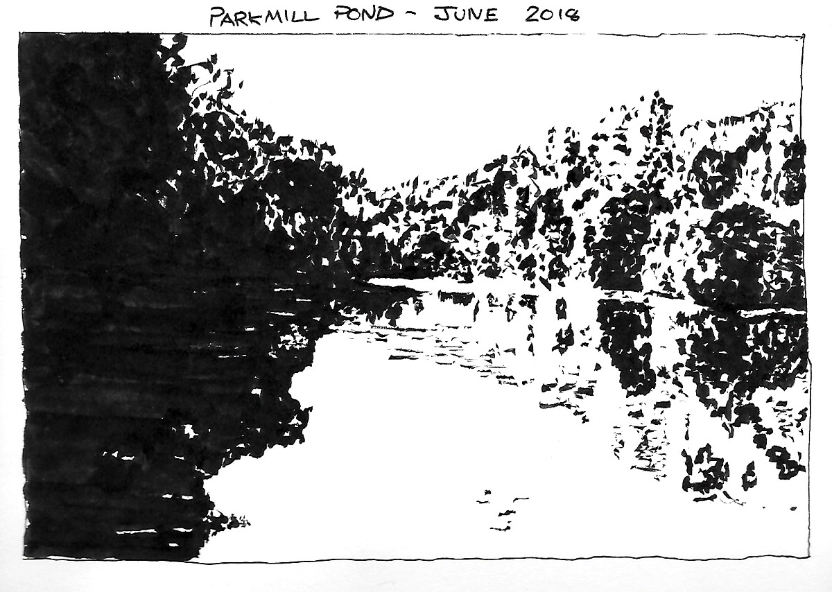
Parkmill Pond
Notan - Drawing and Painting the Landscape
Ink
Stillman & Birn Alpha Series Sketchbook
21.5cm x 15.25cm (8.5" x 6")

Lesson 13 of Drawing and Painting the Landscape by Philip Tyler is about notan – the word derives from a Japanese term meaning light dark harmony. Artists use notan studies to explore the arrangement of the light and dark shapes in a composition. It is common to see 2 value notans (black and white), but greys can be introduced to create 3 or more value notans.

Trent Towards Radcliffe on Trent
Notan - Drawing and Painting the Landscape
Ink
Stillman & Birn Alpha Series Sketchbook
21.5cm x 15.25cm (8.5" x 6")

The lesson initially employs brush and ink to create black and white studies – I used a Pentel Brush pen. I’ve got a couple. The older one can't keep a fine point. I used it for these exercises because it is good for painting bigger shapes when a bit of unpredictability in the edges is unimportant and maybe a good thing.

Sunshine After Hail
Notan - Drawing and Painting the Landscape
Ink
Stillman & Birn Alpha Series Sketchbook
21.5cm x 15.25cm (8.5" x 6")

Philip recommends training your eye to see values by manipulating the tonal range of digital images to remove all grey values.

I worked mostly from photographs but did a couple of drawings outside. It is a challenge to decide what is black and white without the help of a photo editor. In Lesson 11 (Drawing and Painting the Landscape - Grey Scales) Phillip recommends squinting your eyes and looking through your eyelashes as a technique to blur details and more accurately perceive values. This sounds easy enough, but is going to take practice to perfect.

River Otter
Notan - Drawing and Painting the Landscape
Compressed Charcoal
Stillman & Birn Alpha Series Sketchbook
21.5cm x 30.55cm (8.5" x 12")

After a few pen and ink drawings, the lesson switches to compressed charcoal - mixing it with water to create subtle washes for 3 or 4 value notans. Phillips advises being physical and gestural in your mark making with the charcoal and not to worry whether the marks are in the right place.

Moor Close Plantation
Notan - Drawing and Painting the Landscape
Compressed Charcoal
Stillman & Birn Alpha Series Sketchbook
21.5cm x 30.55cm (8.5" x 12")

I was going to put the study of Moor Close Plantation at the top of the post, but Elaine is not sure whether she likes it. She suspects if she looks at it for too long, she will see sinister figures emerging from the trees.

Saturday, 29 February 2020

Eyes

Doris' Eye
Ink and Watercolour
Stillman & Birn Alpha Series Sketchbook
20.3cm x 14.0cm (8.0" x 5.5")

Eyes is (are?) the second topic in the "The Look of Transparency" - Chapter 3 of Creating Textures in Pen & Ink with Watercolor by Claudia Nice.

My Eye
Watercolour and Ink on Paper
280mm x 190mm (11" x 7.5")

The picture of my eye was drawn while looking in the mirror. Initially, it was an accurate observation. After I made a couple of mistakes, I had to improvise (lie), to make it read properly. Doris' eye is an ink drawing with a watercolour tint. My eye is a watercolour with some ink details.

The Sixties Want Their Picture Back
Acrylic on Paper
84.1cm x 59.4cm (33.1" x 23.4")

The picture of Doris's eye was drawn from a photograph because she won't stay still long enough to draw anything other than a gesture - unless she is asleep - which isn't the best time for drawing eyes. I manipulated the photograph in a photo editor to explore the patterns of lights and darks. This was the inspiration for the more "abstract" version.

Sunday, 23 February 2020

Drawing and Painting the Landscape - Block-Ins


Boats on the Dart
Block-Ins - Drawing and Painting the Landscape
Charcoal
Stillman & Birn Alpha Series Sketchbook
21.5cm x 15.25cm (8.5" x 6")

Lesson 12 of  Drawing and Painting the Landscape by Philip Tyler is about Block-ins. Philip's instructions are to think about the big tonal masses and try to see how light and dark they are. He advises using the side of a piece of charcoal to block-in these areas of tone.

Ladram Rock
Block-Ins - Drawing and Painting the Landscape
Charcoal
Stillman & Birn Alpha Series Sketchbook
21.5cm x 15.25cm (8.5" x 6")

These studies are drawn from photographs - except the view towards Gatcombe Farm - which I drew from my office window. I converted the photos to black-and-white before drawing them - which helped me to see the tones.

Isles of Sciliy
Block-Ins - Drawing and Painting the Landscape
Charcoal
Stillman & Birn Alpha Series Sketchbook
21.5cm x 15.25cm (8.5" x 6")

The pictures are probably too detailed to be called block-ins, but I enjoyed drawing them and started each one by blocking in the major shapes as Phillip instructed.

Waves Breaking - Mousehole
Block-Ins - Drawing and Painting the Landscape
Charcoal
Stillman & Birn Alpha Series Sketchbook
21.5cm x 15.25cm (8.5" x 6")

I used my fingers to blend the charcoal and smooth the tones. This isn't a recommended approach for creating refined charcoal drawings but added character to these sketches.

Towards a Gatcombe Farm
Block-Ins - Drawing and Painting the Landscape
Charcoal
Stillman & Birn Alpha Series Sketchbook
21.5cm x 15.25cm (8.5" x 6")

There are another 6 lessons in this chapter about tonal drawing. I intend to work from photographs to practice the techniques, but to complete at least one study in each lesson outside. As the weather improves, I will try to swing the balance more towards working directly from the landscape.

River Usk Near Gliffaes
Block-Ins - Drawing and Painting the Landscape
Charcoal
Stillman & Birn Alpha Series Sketchbook
21.5cm x 15.25cm (8.5" x 6")

A couple of the scenes have appeared in previous posts.There is a line drawing of a similar view of Gatcombe Farm on Measured Drawing and there is a painting of Ladram Rock from a few years ago on Ladram Rocks.

Sunday, 26 January 2020

Glass


Kilner Jar
Ink and Watercolour
Moleskine A4 Watercolour Album
297mm x 210mm (11.69" x 8.27")

Sometimes it’s difficult to summon the enthusiasm to draw something else from around the house. When this happens, it's useful to have someone else suggesting interesting or unusual subjects - it's one less thing to procrastinate about. Creating Textures in Pen & Ink with Watercolor by Claudia Nice provides a useful list of prompts.

Elaine gave me the book as a Christmas gift. The first chapter is about materials and the second explains basic texturing techniques. In the remaining chapters, Claudia describes the techniques she uses to render a variety of surfaces. For each topic, she provides examples that are primarily ink drawings with a little bit of watercolour to tint them and other examples which are primarily watercolour paintings with a little bit of ink to add definition. Chapter 3 is called "The Look of Transparency" and Glass is the first subject.

Jar and Bottle
Watercolour and Ink on Paper
280mm x 190mm (11" x 7.5")

The green jar and pink bottle is predominantly watercolour, the Kilner jar is predominantly an ink drawing and the vinegar bottle uses my current sketching technique – heavily influenced by Liz Steel's SketchingNow courses.


Condiment
Ink and Watercolour
Stillman & Birn Alpha Series Sketchbook
14.0cm x 20.3cm (5.5" x 8.0")

I need to be more patient building up textures and shading in ink. This is something I will work on with the next subject - Eyes.

Sunday, 5 January 2020

Drawing and Painting the Landscape – Grey Scales


Chapter 4 of Drawing and Painting the Landscape by Philip Tyler is about tonal drawing (monochromatic drawings – often in pencil or charcoal).

Lesson 11 (the first lesson in the chapter) explores grey scales (a range of grey shades from white to black). I've posted greyscales in some early posts (see Tonal Studies and Keys to Drawing - Chapter 2).

Most dictionaries contain an entry for greyscale but not grey scale. Grey scale is probably the original spelling. Over the years grey scale became grey-scale which became greyscale (or grayscale) particularly when discussing technology. The contrary Blogger spellchecker recognises grey scale and grey-scale, but not greyscale - this is the only exception I've found.

The lesson includes an exercise to create greyscales in a variety of media. Philip recommends creating scales with between 9 and 12 tones. He suggests once you have generated a scale, you can use it as a reference to classify tones in the landscape.


I produced greyscales using pencils, charcoal, compressed charcoal and acrylic paint. I was too enthusiastic applying fixative to the charcoal greyscale and sprayed most of the charcoal across the page - this is an important lesson because the next exercise uses charcoal.

I spent most effort refining my acrylic grey scale. The upper part of the image at the top of the post shows my best attempt. In the lower part, the small blocks show a perfect greyscale with 7 equally spaced tones between white and black. The big blocks are a desaturated (black-and-white) version of my scale. This is useful for comparison because the black paint has a blue tinge in the paler mixtures - which makes it difficult to compare it against a pure grey.

I din't have enough patience for this exercise with the dry media. I will get some practice creating different tones of grey with charcoal in the next lesson "Block ins" and will create some more charcoal greyscales after that.